|
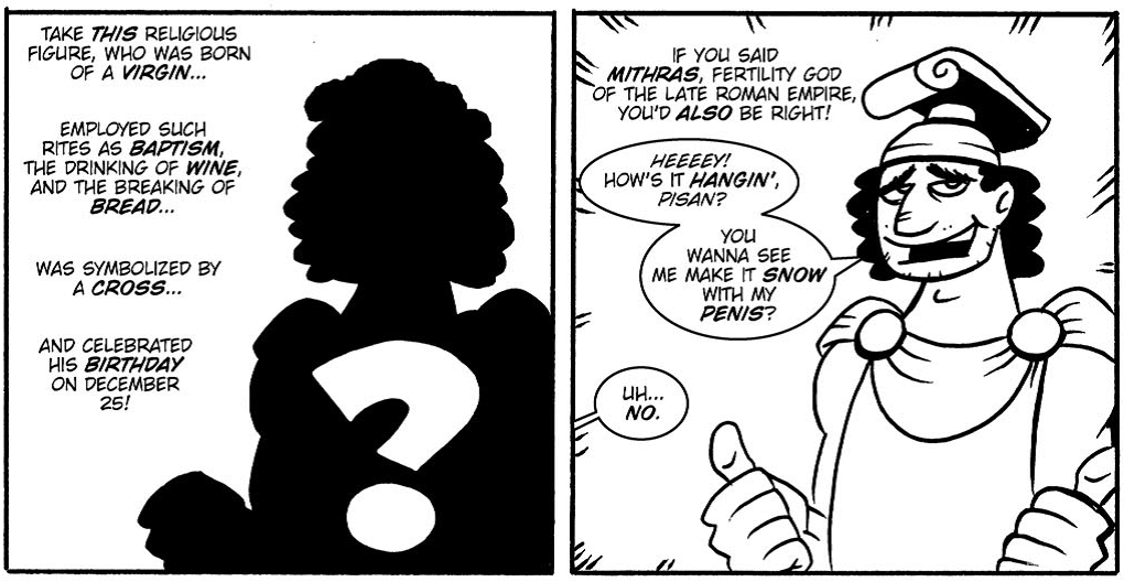
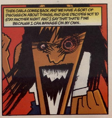
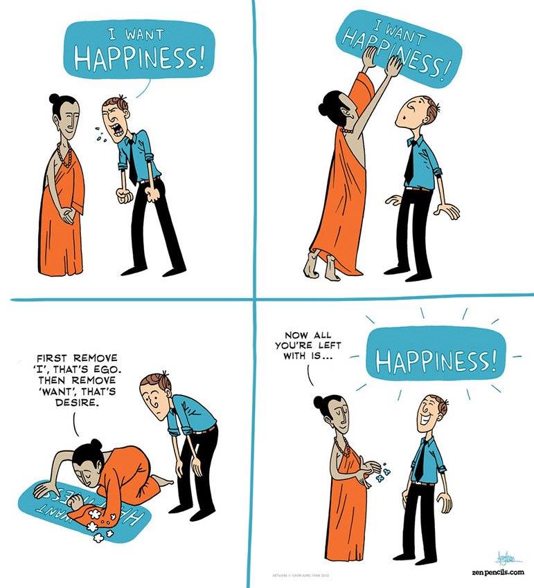
A rough outline of what I discussed in my lecture at my alma mater. Some of it is rehashing, but it’s becoming an autogenic training of how to keep it short and sweet … and still retain the depth of meaning. If nothing else, it’s just for shits and giggles. Comics is a medium/art filed that uniquely combines pictures and words, two central modes of human communication. Pictures and words in comics are arranged (and merged) in such multi-layered ways that in the comics equation the whole is greater than the sum of its parts. Comics convey a more complex connection between words and pictures, whereas the pictures in picture books for example generally express the same meaning as words for the obvious pedagogical reason of strengthening the meaning of what is being shown, aiding to better understanding of younger readers. The comics make use of the two basic means of visual communication known to humankind: pictures and words. Since words are just as visual as are pictures, we have to distinguish between verbal/linguistic elements and pictorial/artistic elements in comics. Comics can be called sequential art or more specifically juxtaposed sequential images. This refers to the nature of moving from one panel to another (like from one sentence to another in literature or from one frame to another in film), connecting the dots between what is being shown between two or more panels. The basic and visually most obvious comics unit is the panel, which represents a specific area or a window through which the artists try to capture a moment in time. This is not necessarily just a snapshot, but it can imply movement. We can compare a panel to a sentence in linguistic terms. Both constructions represent a structure of smaller units. The balloons (or bubbles) are the most striking, cartoonish elements, reflecting the original nature of comics as funny, easygoing stories. This especially holds true for the thought balloon and its gentle cloud-like child-friendly shape. While the thought balloon is used for indirect speech and inner monologue, the speech balloon is used for direct speech and general dialogue between characters. Words in comics are arranged in the process of lettering. In numerous cases they are not mechanical typefaces, but resemble handwriting, indicative of a more personal voice of either the character or the narrator. The caption is the “narrative box” that is often used at the beginning to establish a scene. Predominantly rectangular, reflecting a more serious voice of a character, who is often absent from the panel in which this caption is placed. While the panels can continue (bleed) one into another, they are mostly separated by the gutter, one of the most powerful elements in a comic and by far the least obvious. Gutter is simply the space between panels, but it reflects the nature of our brain, which in a lot of ways makes educated guesses and inferences from our surroundings (in light of oversaturation of visual stimuli). The “magic” of comics happens in the empty space of the gutter, because this is where the reader co-creates the story with the author. Think of it as a storytelling puzzle: the author provides some of the visual puzzle pieces, while the reader visualizes the missing ones, making the comic into the film in his/her mind. We do that with literature as well. P1 shows two panels separated by the gutter. The text without balloons or boarders reflects the narrator, while the text in the first two balloons in the right panel (through the balloon tail) points to the character Mithras. The smaller balloon points to a character, who is not present in either of the two pictures (because s/he is not important for the story itself … apart from providing a response to Mithra’s tongue-in-cheek comment). P2 uses a combination of speech balloons and captions, the latter used as Hellboy’s narrative voice. This means that the dialogue in speech balloons between the two characters here happens in present time, while the captions reflect future events and Hellboy’s internal monologue, so we get various levels of narrative flow. The complexity of this panel is extended though what I call intentional conflict. Since picture and words in a panel do not always carry the same meaning, IC can be a powerful tool for narrative complexity, as it forces the reader to look closer and really think what is happening in the given panel. IC can be context-dependent, unnoticed, partial or unwanted (a dreaded mistake). The Mithra’s example (P1) displays a context-dependent conflict, because the authors in the first panel begin describing a character that the western Christian tradition typically recognizes as Jesus. The revelation (or the joke) of the second panel is striking and conflicting with the description, since Mithras has some of the same characteristics as Jesus. IC in this case is more ideological and cultural. P2 exemplifies the sophistication of conflicting imagery. Hellboy, the dark, visually dominating, shadowy figure in the background dwarfs a seemingly feeble older man, whose pale disposition and bowed head add to the pictorial danger he seems to be facing. The dark silhouette towers over him, reflecting the fearful unknown, while the red eyes point to unnatural, even sinister nature of the creature. Since this is the first panel in which Hellboy interacts and speaks with another character in the story, the reader is also kept in the dark (pun intended) as to his intentions, resulting in greater unease and expectations. The linguistic elements, however, suppress danger in favor of Hellboy’s respect and perhaps even awe towards the old man. Conflict achieved! P3 depicts the most straightforward example of IC. The constrained verbal explanation of the emotional response of the female in this panel clashes with the powder keg of anger boiling inside of her. This is pictorially stressed by the angularly more unnatural, stronger, dangerous and darker lines that the reader immediately notices … and bears in mind, as s/he is reading the caption and slowly but surely discovering the visually powerful conflicting situation. Comicana refers to the onomatopoetic expressions, sound effects and the rest of the signs used in comics: like the lightbulb over a character’s head indicating an idea, stars indicating a blow to the head or wavy lines coming from a coffee cup indicating that the coffee in it is hot. While this can be seen as cartoonish, reading comics lacking these elements can be quite unnatural or even flat … depending on the genre and styles, of course. Context is always key. As P4 shows, onomatopoeic expressions are not just visual fillers. They can carry the story forward just as much as any dialogue can. They can reflect everything from time to space and in this case visual entrapment, creating a subtle background “noise” that carries profound emotional meaning. The captions on this page also act as thought balloons, since they reflect the child’s mental state. Because the comic in question has a more serious/philosophical theme it does not use thought balloons (as the norm is more and more). The search for happiness in P5 is an excellent example of visual complexity that only comics can display … or at least neither pictures nor words can alone convey. The ability to pictorially erase the modality/want goes hand in hand with the shock factor of the monk’s breaking the fourth wall, since metause and deconstruction of basic comics elements such as the word balloon is not the norm in most comics. The Buddhist decree to restrain oneself from desire is clearly stated here, perhaps even reinforced by the use of the light blue color, which has strong association to meditation. The so called circadian blue is further associated to alertness and this four-panel comic can certainly open the reader’s eyes (or the third eye) both through the unique use of comics parameters as well as the interplay of psychology, philosophy and mindfulness. The two characters are immediately disassociated on many levels merely through the contrast between the orange and blue. Note also the monk’s firm stance despite the man’s outburst in the first panel. Overall very simple and very effective means, but the idea behind it, its execution and reception are anything but straightforward.
0 Comments
Leave a Reply. |
Author
For reasons of extreme prejudice, the author of this blog wishes to remain anonymous … Archives
November 2017
Categories |


 RSS Feed
