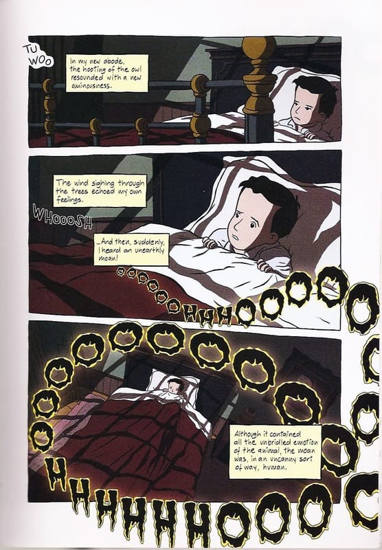
 Picture 4 (Doxiadis et at. 2009: 37) TEXT While the presence of text in comics is as obvious as are the pictures themselves, the words in comics can nevertheless carry more emotional and visual weight. What this specifically refers to is the font. The size and color of words can be distinguishing factors in a word balloon, since characters can be given a unique font that not only reflects their nature and mystique, but can be a constant visual clue to the reader who is speaking or thinking, even if that particular character is not present in a panel (cf. Sandman). Arguably, this can be a double-edged sword, since overplaying the fonts can result in a lackluster character portrayal, where the stress might be more on the unique font and not on the content of the words and consequent action portrayed. Further, an over-abundance of unique fonts in a comic can be visually distracting for the reader and can take away some of the emphasis of the pictorial background. If not used properly, this can further lead to a seemingly cartoonish perception of the comic itself. On the other hand, the less-is-more principle of using this technique sparingly can create a more powerful image, since it quite literally stands out (cf. Preacher). On the other hand, a different writing font may instantaneously point to a different story, different authors, or refer to a particular state of mind or dreams without having to directly refer to it, thus somewhat breaking the suspension of disbelief for the reader (cf. Unwritten, Fables). A similar effect can be achieved with identifiable characteristics of characters. Not only specific speech patterns and its consequent visualization, but their traits, clothing and even specific panel shots and background can be used as a leitmotif, which provides immediate recognition and thus offers viewers a greater, more intimate reading experience. COMICANA The word comicana is taken from Mort Walker’s The Lexicon of Comicana, which encapsulates the various devices used in cartoons and comics. While initially a tongue-in-cheek work, it has become a seminal work for understanding the uniquely odd symbolic representations in comics. This category features much more common elements than it might seem; particularly, the onomatopoeic words that can be seen as the bread-and-butter of comics expression. The large BOOM! and POW! words have been popularized through the satirical Batman TV series starting Adam West and are one of the typical elements of comics that the mainstream audience knows the most. Because of the way these elements came into the limelight, their perception is more clichéic and adds a degree of triviality, which again refers back to the comical, cartoonish elements in comics. The whole issue is largely twofold: while arguably not quite on the same level as the philosophy of Kant (but then again, what is), these words and phrases seem to reflect the most basic, id-driven impulses, plus they are also capitalized, in richly-colored fonts to specifically catch the eyes of the reader and guide them through the pages. They can also become a visually intentionally obtrusive overlay that mimics the nature and shock of a large sound (effect) to the ears that can consequently shake us and somewhat blind us to other stimuli. The illusion of sound … “Sound in comics is not a stylistic trait or a feature of a particular genre of comics, but is endemic to all comics due to the multimodal way words and pictures are formed and combined.” (Heer and Worcester 2009: 163) Paradoxically, these simple expressions represent one of the most powerful elements in comics. They uniquely blend the pictorial and linguistic elements, creating a “visual spectacle” that bridges the gap between pictures and words, and need to be read according to their environment and their specific use in a particular comic. Onomatopoeic expressions are not merely visual fillers or balancing elements within a panel. As we can see in Picture 4, when used correctly, they can carry the story forward just as much as any dialogue can. They can reflect everything from time to space and visual entrapment, creating a subtle background “noise” that carries profound emotional meaning. The other elements in this group are less connected to the linguistics and more to the artistry in comics. Ranging from emanata (lines drawn around the head of a character to indicate shock) to motion lines (lines drawn around or at the back of a character to indicate speed or general movement), these elements are the nuances that create the illusion of time within a static panel, indicate mood, smell or sound; in a sense bringing the comic to life (as in Picture 4). (While a light bulb in front of a character’s head may seem unrealistic, it has not only become accepted as having an idea in the comics world, but has spread beyond the medium as well, predominantly in the cartoon and animation world. However, note the different, culturally-specific use of symbols in manga, as Scott McCloud and Neil Cohn have shown for example.) Paradoxically, as much as this kind of portrayal can be criticized as being cartoonish, reading comics lacking these elements can be quite unnatural or even flat. Of course, this is again specific to genres and even more so styles and story types, but enriching a pictorial depiction enhances the reading experience. Indication of sound or smell can guide the story forward more seamlessly or naturally, while stressing a particular element can be used for foreshadowing as well. Lack of wavy lines in front of a coffee cup can hinder the portrayal, especially if the character is seen sniffing the aroma of the freshly baked beans. The lines serve both as indicators of smell and warmth, while the visual effect might even be that the character is not indulging in the aroma, but perhaps preparing to sneeze or is shocked. Again, these are minute nuances that can add or subtract from the reading experience, so the artistry and comprehension of narration come into play in every single panel. Another reason way making GOOD comics is far from straightforward. References: Bancroft, T. (2012). Character Mentor: Learn by Example to Use Expressions, Poses, and Staging to Bring Your Characters to Life. Waltham, Massachusetts: Focal Press. Cohn, N. (2013). The Visual Language of Comics: Introduction to the Structure and Cognition of Sequential Images. New York: Bloomsbury Publishing. Doxiadis, A., Papadimitriou, C., Papadatos, A., Karatzaferis, D., Paraskevas, T., Bardy, A., et al. (2009). Logicomix: An Epic Search for Truth. London: Bloomsbury Publishing. Duncan, R., & Smith, M. J. (2009). The Power of Comics: History, Form and Culture. New York: Continuum International Publishing Group Ltd. Heer, J., & Worcester, K. (Eds.). (2009). A Comics Studies Reader. Jackson: University Press of Mississippi. Mateu-Mestre, M. (2010). Framed Ink: Drawing and Composition for Visual Storytellers. Culver City, California: Design Studio Press. McCloud, S. (2006). Making Comics. New York: Harper Perennial. Talon, D. S. (2007). Panel Discussions: Design In Sequential Art Storytelling. Raleigh, North Carolina: TwoMorrows Publishing. Walker, M. (2000). The Lexicon of Comicana. Bloomington, Indiana: iUniverse.
0 Comments
Leave a Reply. |
Author
For reasons of extreme prejudice, the author of this blog wishes to remain anonymous … Archives
November 2017
Categories |
 RSS Feed
