
|
“Perceptually, a mature work reflects a highly differentiated sense of form, capable of organizing the various components of the image in a comprehensive compositional order. But the intelligence of the artist is apparent not only in the structure of the formal pattern but equally in the depth of meaning conveyed by this pattern.” Arnheim, R. (1997). Visual Thinking. Berkeley: University of California Press; pg. 269 Along with basic shapes, there are other elemental principles in art that can add volumes to the expressionistic potential and perception of pictorial depiction. I label them under the term composition for the sake of emphasizing their cooperation and hermeneutic propensities. POSITION (Part 1) Position in a picture determines the state and importance of any given element in question. Thus, an object in the center of picture draws our attention the most, acting like a celestial star that has a gravitational pull on other elements, particularly when it is the largest. We get the central position through the application of symmetry (intersection of a dividing horizontal and vertical axis). The importance or at least validity of this central position may be in a manner of saying more a theoretical than a practical point. To clarify, I am referring to asymmetrical depiction, the so called rule of thirds (dividing both the horizontal and the vertical into thirds). By placing points of interest in the intersections of these lines, the artist creates a greater balance and enables a more natural depiction than the standard central shot. (Photographers use this technique in droves as well.) In other words, our eyes seem to be more adapt to viewing elements horizontally; stressing the peacefulness and stability of horizontals as opposed to verticals in general. (Frank Miller’s graphic novel 300 and especially his reasoning behind using this untypical horizontal position of panels and the book itself is the perfect example in this context.) The reason why we are even able to comprehend a single image from basically two distinct ones which each of our eyes generates is stereopsis or depth perception, accounting for the disparity between the two respective retina images. 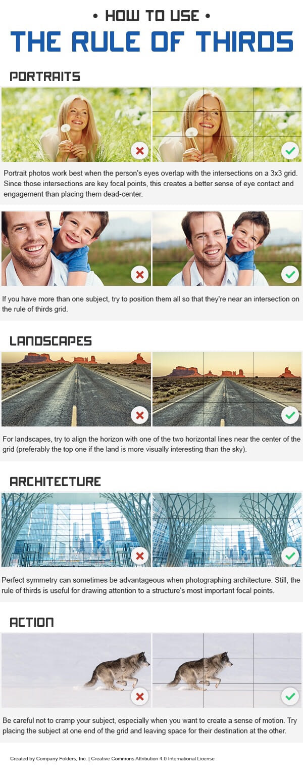 An example of how the rule of thirds actually works. If centrality has greater pictorial weight, the outskirts of the image are the outskirts of our perception as well. Arguably, a general rectangular image can only represent one’s field of vision (a simulacrum of sorts); both in terms of its two-dimensionality and the viewing angle of the eyes, which covers a 60-degre angle. As the eye moves from the focal points of the image (and points of inherent interest of the reader) to the marginal elements, this consequently also affects their respective importance. However, this also allows the artist to skillfully “hide” specific visual elements in the outskirts, if s/he so chooses. In comics, this can be quite prevalent, because the reader is generally accustomed to fast-pace absorption of pictorial material. Think of it this way: it’s like speed reading, where you get the gist of the information fast, but the details can readily remain in the shadows of comprehension. In connection to the principle of attraction, we should differentiate between the fixation on a particular element and a composition that pulls the eyes into the picture and guides them around it, in a sense creating a pattern that consists of natural framing and entry and exit points. This theory may be more prevalent in paintings and great works of visual art per se; however, in comics it can be (and is) equally applied, in the process creating a better and more connecting visual narration. Thus, by guiding the reader through the panels more indirectly, the reading becomes more natural and the reader becomes more immersed into the story. For example even the balloons and tails can act as framing devices in themselves, thus guiding, connecting, enclosing or separating the pictorial base from the text. 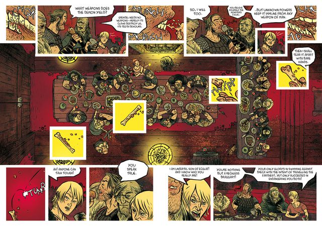 A double-page spread from Beowulf (2016, Image Comics) by Santiago Garcia and David Rubin. It exemplifies the use of balloons and inserted small panels as framing devices and using them to guide the reader's eye in the unmistakably clear Z-path. Arguably, framing is primarily pictorial, so it is harder to attain in a medium that depends on the interaction of pictures and words. Words can in this case hinder the natural flow of the picture, since for the most part they are visual add-ons, which by their symbolic nature that requires detailed decipherment demand greater involvement from the reader. In other words, they are natural elements of attraction. Attraction as such is actually twofold: while the picture creates the visual base and attracts the reader by its immediately recognizable presence, we have learned to attribute greater importance to words, since they can reflect (more) complex subject matter through an equally complex translation of its symbolic nature. Consequently, we are drawn to words because they take longer to digest amidst the pictorial backdrop, which, nevertheless, lingers in the background, gaining “subliminal” transference through even mere glances towards it. NEXT: PROXIMITY
0 Comments
Leave a Reply. |
Author
For reasons of extreme prejudice, the author of this blog wishes to remain anonymous … Archives
November 2017
Categories |
 RSS Feed
