
|
COMPOSITION: CONTRAST (Part 5) Contrast is a fundamentally crucial principle that may like the gutter in comics paradoxically go unnoticed. The reason for this is that contrast in art is so prevalent that it is far too often taken for granted. However or rather consequently, it actually works on a deeper level. I can full-heatedly say that contrast is the essence of art and creation in general. Even human perception of the world relies heavily on contrast. We perceive motion for example only after it has already occurred; therefore motion becomes intrinsically linked to its diametrically opposed stillness as a way of distinguishing changes in the perceived world.  Contrast of desert/sea (death/life) … or complementary concepts of stasis and growth. Just as these words on (digital) paper are viewed only because of contrast, so we distinguish characters by their traits and elements by their specifics. The clearest example of contrast can be seen in notan, a Japanese term meaning dark-light principle … or even the yang/yin principle of interaction between the negative (dark) and positive (light) space. To carry the philosophically ubiquitous dualism of yang/yin even further, the opposites complement each other rather than conflict … hence the perfection, fluidity and unity of the symbol [. This means that while contrasting elements allow for differentiation and notoriety, their greatest advantage lies in their mutability, since they inherently affect one-another. The perception of one directly depends on the position, size, color, etc. of the other. 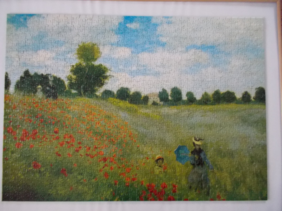 Contrast in Monet’s Les Coquelicots is achieved horizontally though the separation of sky and grass, where the dark green trees in the background serve as “boundary markers”. We can see strong interplay between the red blooming poppies and the lush green meadow, not to mention the taller damsel in the bottom right who clearly stands out with her darker blueish tones. In such a way, the most obvious and natural function of contrast (and paradoxically the least noticeable since it has already been internalized), is that it actually enables us to see. Bearing this in mind, it would not be a bold statement in the least to claim that contrast is all we see … or do not see. Further, the more rapid the change, the (ideologically) stronger it is perceived: “Many visual perceptions, such as luminance, color, motion, and depth, exhibit greater sensitivity to abrupt than to gradual change.” (Margaret Livingstone: Vision and Art: The Biology of Seeing (2002); pg. 58) The starker the contrast, the greater shape and color value differences, the more noticeable it thus is, since the eyes are drawn to it. Even psychologically, we are shocked more by unexpected, unforeseen changes (whether temporal, material, etc.), while the gradual differentiations remain “concealed”, as they do not peak our responses in either extreme and we readily internalize them. We become accustomed to our everyday surroundings, so we easily take things for granted. In such a way, greater “contrast” is achieved when we partake of newer experiences. I’m well aware that this is an extension of the artistry/composition I’m discussing in these posts; however, the universality of contrast is one of those rare and precious things that extends to every facet of being, comics nonexcluded. Consequently, Hellboy in Picture 1 creates a stronger pictorial contrast based on his color and half-demonic species, while the dark, blue tones of the other three (human) characters have a stronger tonal connection to the woods all of them are traversing. Additionally, contrast is greater also because it’s a newer setting for both the reader as well as Hellboy as the protagonist of the story. 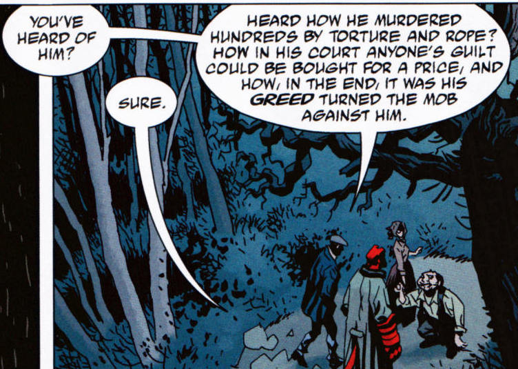 Picture 1: Mike Mignola et al. Hellboy Library Edition, Volume 5 (2012); pg. 37 We can carry the analogy of contrast further by extending it to all of our senses and the concept of life itself; the reason why one can distinguish jazz from heavy metal is contrast (speed and method of playing, instruments used, etc.), space observation and consequent equations are dependent on imagery scientists have to contrast to make sense of. Good and evil are equally prone to differentiation; not only observable through what is not part of one and central in the other, but in the essence(s) definable through one-another. Contrastingly paraphrasing, contrast as such is natural, since the comprehension between music and noise, speech and buzzing, or visual literacy and mere observance of visual stimuli is for the most part “only” a matter of distinctions, which in turn range from the most mundanely banal to the intellectually sublime. If contrast is “normal”, line drawings – essentially the accentuating work of inkers in comics – are on the other hand actually “abnormal”, since reality seldom offers strong, clear-cut (out)lines separating one element in nature from the other. Instead, we speak of borders between regions of different color or lightness known as contours. (Comics) artists thus enhance the contrast by adding a stronger division between the layers of contrast (even through penciling alone or inking). This enhances the reader’s ability for distinction, which consequently results in faster reading, more distinct although less “realistic” imagery. Without these contrasting distinctions, we would be in the presence of absolutism, either the absence/negation of everything (chaos) or the everlasting omnipresence (God), both extremes that extend beyond human physical conception, which is in turn but a liminal transference from one state (of being) to the other. Since I always tend to stray away from the artistry proper, I have another reason for it this time, even beyond the seeming universality of the subject matter. The conception of contrast was actually an aha moment for me. Not really a revelation, more of an eye-opening experience, since it connected various things for me to the point where everything just clicked (from my linguistics education to my research about perception and mythology). Once I truly realized that what we see, hear, taste, etc. is rooted in contrast, the worldly concepts took on a larger role … or a more nuanced one, if you care to look at it that way. Realizing, how authors for example subtly play with contrast and negative space alone adds an important layer towards greater comprehension and appreciation of art … and in this case life as well. NEXT: BALANCE
0 Comments
Leave a Reply. |
Author
For reasons of extreme prejudice, the author of this blog wishes to remain anonymous … Archives
November 2017
Categories |
 RSS Feed
