|
COMPOSITION: BALANCE (Part 6) I have already touched on the notions of symmetry and asymmetry, since they are connected to contrast. However, I’ll touch on them in this context as well; namely, as referring to balance. While for the most part we discuss it more within the frame of art proper rather than comics, balance is an artistic property of things, whose importance cannot be understressed: “Art is an experience of balance, of the relationship of its parts to the whole. Perceiving it as anything else is missing its most fundamental component […], organized and gracefully balanced around a hidden sense of proportion.” (Priya Hemenway: The Secret Code: The Mysterious Formula That Rules Art, Nature, and Science (2008); pg. 91) While this quote is related to the aspect of golden ratio that will be discussed in the next part, its essence applies to balance as well. Balance seems to be a key proponent in all art that stems from the basic human nature and can be connected to the formalistic arrangement and understanding of every aspect of said human nature. If our ancestors had somewhat similar traits as we do, we can say that we have always wanted to make sense of both ourselves and the world we inhabit. Balance is a measuring stick of our coconsciousness that can be actually traced from the seeming chaos and randomness of the universe on one hand and order within galaxies and solar systems on the other (again, part of the golden ratio). Balance is an arrangement of elements within a picture that carries pictorial weight. Like gravity, every element within a picture carries “weight” and affects one-another, regardless of how insignificant one detail can be … and remoteness, isolation or smallness often gets stressed or contrasted by its very nature. Consequently, every element attracts the eye. In such a way, a snowflake displays a similar symmetrical balance as a vortex or even a black hole, everything stemming outward from a point or a singularity (obviously taking two and tree-dimensionality into account). 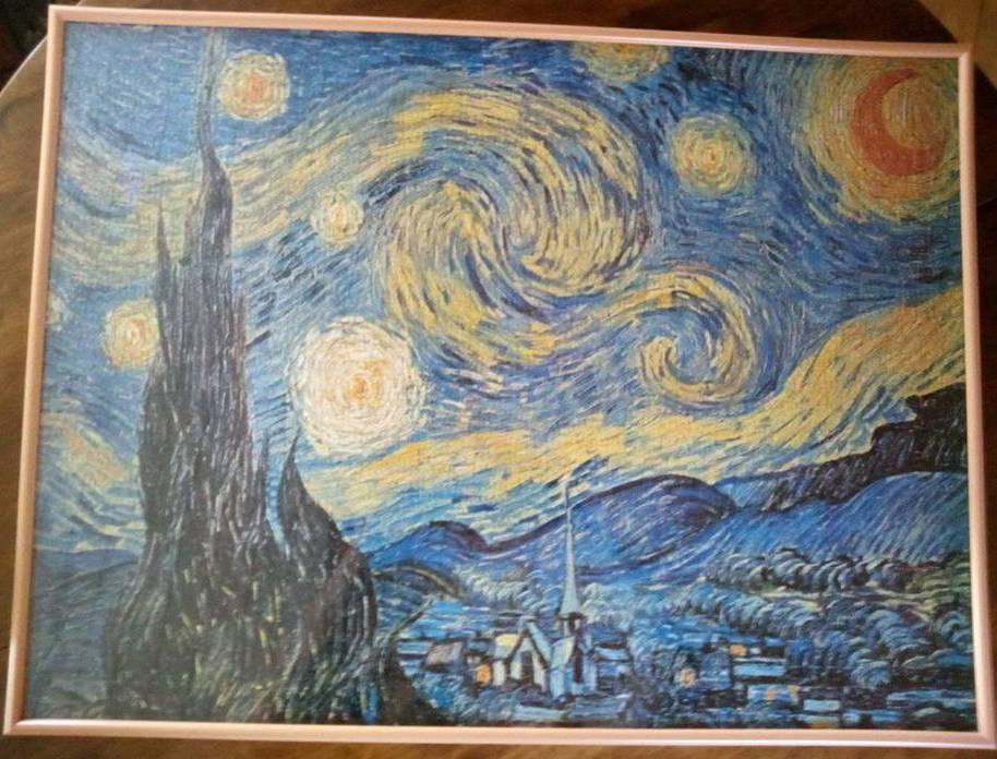 Balance in van Gogh’s Starry Night is evident becomes of the interplay of the “erupting” black cypress tree on the left, the subdued bottom scenery and the playfully stars in the sky. The “weight” of the picture gets distributed between these three features of the scenery and creates balance that may not be obvious at first glance. Pictorially, symmetry is more eye-pleasing and functions more precise when we want to make things as clear as possible. Such instances can be found in the digital world, where icons, symbols for apps and avatars are for example placed in a central position of a given background. From such a perspective, aesthetic clarity is key and there is no room for complex, abstract artistic expression (of let’s say a Kandinsky), when wider acceptance is the goal. 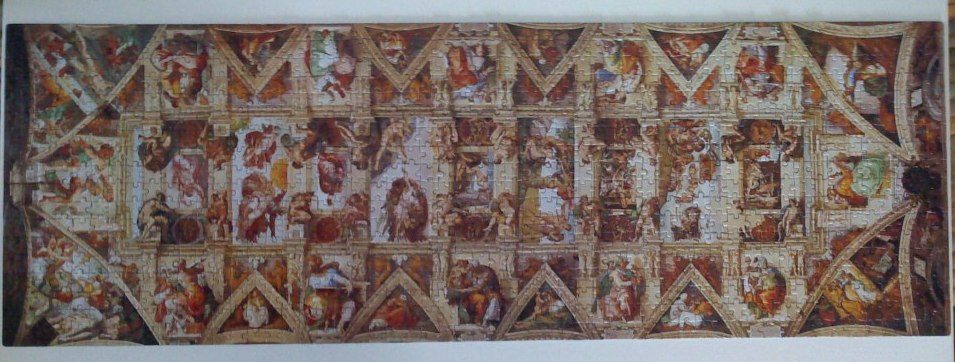 Symmetry in Michelangelo’s frescoes on the Sistine Chapel ceiling. The grid creates the backdrop on which and through which the biblical events and rendered. The amalgamation of the various scenes is in balance as are the stories part of the “symmetry” of the mythic/religious scripture. We have different types of balances for different compositional takes. The easiest way to imagine (a type of) balance for me is through so called steelyard balance, which functions like a counterweight. If there are many close objects in the lower part of the picture, this can be balanced by a smaller, distant object in the upper part. If we go back to the Starry Night, the distant moon in the upper right corner of the picture displays steelyard balance in relation to the large cypress trees that looms in the bottom left side of the foreground of the picture. Essentially, a larger element on one side of the picture is balanced by a smaller isolated one on the other side. On the other hand, just as much as art in general is subject to symmetry, it depends heavily on asymmetry as well. The human body itself is a physical example of bilateral symmetry, while we express what we see in ourselves and the world around us. Asymmetrical balance may be less easily understood and observed, but it adds vibrancy, freedom and feels more “real”. 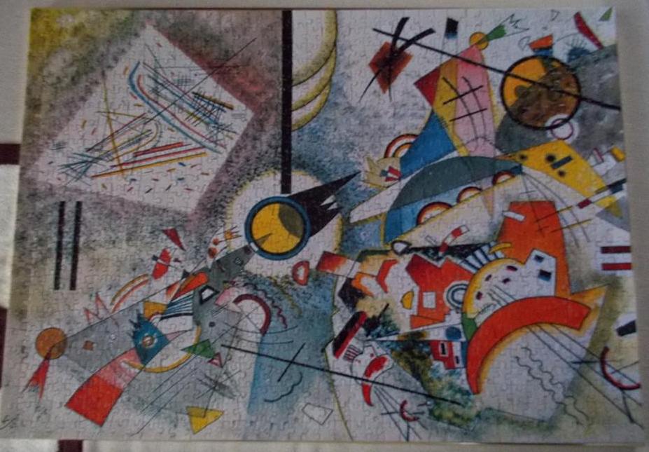 Asymmetry in Kandinsky’s Bustling Aquarelle. The central circle is flanked by the four corners/parts of the picture that are thematically different and yet relatively equal in terms of the picture as a whole. There definitely is balance and beauty within the seeming madness of lines and color here. What symmetry does for the concepts of aesthetic appeal and mathematical unity, asymmetry extends towards differentiations and even biological mutations. In other words, both concepts are equally important, keeping structural and ideological balance in a yang-yin-type interplay. Even the seemingly least balanced, random or abstract works of Kandinsky, Rothko, Mondrian and Pollock inherently follow their own respective art fields. It can be claimed that it is much harder (if even possible) to create a random, disorganized work than a realistic, balancing and pleasing one. This can be applied further. Even random thoughts are anything but random in the sense that they are governed either by the interplay of our subconscious and predisposition (aka. the personal) and the world that allows us to function as such (aka. the social). That’s why this can be consequently applied to all fields of human expression … meditation to boot, where suppression of random thoughts is akin to creating a disorganized canvas. Some more examples. The first panel in Picture 1 creates partial balance. Hellboy occupies the bottom part of the panel, while the hanging rope counterbalances his position. It needs to be stressed once again that such principles that are central to great works of art are displayed differently or at least for the most part on a smaller scale in comics, because the focus is more on the interplay of verbal and pictorial elements. The verbal elements in a panel, sequentiality, economy of space and strict deadlines all play a major factor, whether each and every panel can be a small masterpiece in itself, or the panel arrangement on a given page can display balance, symmetry, etc. Superb artistry of Picture 1 captures both the balance of the while comic page as well the cyclical/clockwise storytelling technique. All in all, understanding the basic principles of art in general and especially their consequent mastery and use within comics themselves, adds volumes to the admiration of the much underappreciated comics artists.  Picture 1: Mike Mignola et al. Hellboy Library Edition, Volume 2 (2008); pg. 38 Comprehension of centrality and the fringes of a picture may be conflicting, but I would argue that this functions more on a theoretical level. While Molly Bang (in Picture This: How Pictures Work) argues that central position means centrality of attention and the outskirts its fringe, Henry Rankin Poore (in Composition in Art) stresses the opposite by claiming that an element near the edge of a picture has more attraction. They are in fact both right; however, their point of reference is different. Bang’s position stems from the natural fact that elements at the edges function less important in a similar way like audience in a theater, where the actor on center stage is the one in the (quite literal) limelight. Further, since human peripheral vision is of relatively low resolution, we see clearly only what is directly “stressed” in front of us. In terms of “clarity”, the use of blurring and motion lines in comics is for example not merely a neat pictorial device, but resembles the natural human visual (in)ability. Rankin Poore’s position is that of balance and contrast (in paintings), where an element at the edge gains attention by proxy, since it is in sharp contrast to its counterparts. Also, centrality loses its power, since the greatest works of art tend to imply movement, have balance and lead the eyes away from the center of gaze towards the equally important elements on the outskirts, essentially visually completing the image. Movement is of course one of the staples of comics … i.e. the cyclical nature of the first five panels in Picture 1. Again, this seeming paradox of two equally valid theoretical points of view is in fact not confusing at all when viewing any work in question from a particular position (echoing the previous statement of multiple types of balances). And we do that all the time and in any endeavor. References, general comprehension and background information play a vital role both in understanding different positions in art as well as understanding myths that offer a multitude of meanings (with paradoxes galore to boot). Of course, there are just two general examples of theoretical divergence that is essentially a matter of perspective. Through a similar approach, different art styles and techniques offer both distinction as well as interplay of artistic traditions within cultural evolution. I hope it’s clear by now that all these principles of composition may have a powerful individual role, but for the most part appear united and thus affect one-another. This interplay can lead towards strengthening of a particular element and can provide a new, unique experience, or can lead to conflicting situations (either intentional or unintentional). Strengthening can be observed in Picture 2, where the darker tones, sharper lines, higher position of the creature and its attack from behind all strengthen the notion of danger, despite the fact that the protagonist is Lucifer … a splendid little ironic leitmotif in the whole Lucifer series. 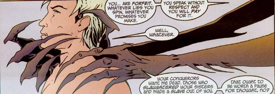 Picture 2: Mike Carey, Peter Gross et al. Lucifer: Book Two (2013); pg. 203 On the other hand, Picture 3 exhibits a unique experience, where the visually-enclosed position of Hellboy creates an uneasy atmosphere, yet his nonchalant answer reassures the reader that he has had numerous experiences of danger, creating a dichotomy of meanings. Plus, not the balance of the balloons in relation to the weight of the characters.  Picture 3: Mike Mignola et al. Hellboy Library Edition, Volume 5 (2012); pg. 37 Again, I know it’s visually more appealing to give fresher examples, but I just love reusing these examples over and over again, because you can clearly see the genius in their creation and just how much theory and application can work hand in hand. And I will always argue that comics is the best medium for linear visual expression. Honestly, I’ve seen too many examples of comics (meta)greatness that it’s hard to argue otherwise. Gotta love it! NEXT: GOLDEN RATIO
0 Comments
COMPOSITION: CONTRAST (Part 5) Contrast is a fundamentally crucial principle that may like the gutter in comics paradoxically go unnoticed. The reason for this is that contrast in art is so prevalent that it is far too often taken for granted. However or rather consequently, it actually works on a deeper level. I can full-heatedly say that contrast is the essence of art and creation in general. Even human perception of the world relies heavily on contrast. We perceive motion for example only after it has already occurred; therefore motion becomes intrinsically linked to its diametrically opposed stillness as a way of distinguishing changes in the perceived world.  Contrast of desert/sea (death/life) … or complementary concepts of stasis and growth. Just as these words on (digital) paper are viewed only because of contrast, so we distinguish characters by their traits and elements by their specifics. The clearest example of contrast can be seen in notan, a Japanese term meaning dark-light principle … or even the yang/yin principle of interaction between the negative (dark) and positive (light) space. To carry the philosophically ubiquitous dualism of yang/yin even further, the opposites complement each other rather than conflict … hence the perfection, fluidity and unity of the symbol [. This means that while contrasting elements allow for differentiation and notoriety, their greatest advantage lies in their mutability, since they inherently affect one-another. The perception of one directly depends on the position, size, color, etc. of the other.  Contrast in Monet’s Les Coquelicots is achieved horizontally though the separation of sky and grass, where the dark green trees in the background serve as “boundary markers”. We can see strong interplay between the red blooming poppies and the lush green meadow, not to mention the taller damsel in the bottom right who clearly stands out with her darker blueish tones. In such a way, the most obvious and natural function of contrast (and paradoxically the least noticeable since it has already been internalized), is that it actually enables us to see. Bearing this in mind, it would not be a bold statement in the least to claim that contrast is all we see … or do not see. Further, the more rapid the change, the (ideologically) stronger it is perceived: “Many visual perceptions, such as luminance, color, motion, and depth, exhibit greater sensitivity to abrupt than to gradual change.” (Margaret Livingstone: Vision and Art: The Biology of Seeing (2002); pg. 58) The starker the contrast, the greater shape and color value differences, the more noticeable it thus is, since the eyes are drawn to it. Even psychologically, we are shocked more by unexpected, unforeseen changes (whether temporal, material, etc.), while the gradual differentiations remain “concealed”, as they do not peak our responses in either extreme and we readily internalize them. We become accustomed to our everyday surroundings, so we easily take things for granted. In such a way, greater “contrast” is achieved when we partake of newer experiences. I’m well aware that this is an extension of the artistry/composition I’m discussing in these posts; however, the universality of contrast is one of those rare and precious things that extends to every facet of being, comics nonexcluded. Consequently, Hellboy in Picture 1 creates a stronger pictorial contrast based on his color and half-demonic species, while the dark, blue tones of the other three (human) characters have a stronger tonal connection to the woods all of them are traversing. Additionally, contrast is greater also because it’s a newer setting for both the reader as well as Hellboy as the protagonist of the story.  Picture 1: Mike Mignola et al. Hellboy Library Edition, Volume 5 (2012); pg. 37 We can carry the analogy of contrast further by extending it to all of our senses and the concept of life itself; the reason why one can distinguish jazz from heavy metal is contrast (speed and method of playing, instruments used, etc.), space observation and consequent equations are dependent on imagery scientists have to contrast to make sense of. Good and evil are equally prone to differentiation; not only observable through what is not part of one and central in the other, but in the essence(s) definable through one-another. Contrastingly paraphrasing, contrast as such is natural, since the comprehension between music and noise, speech and buzzing, or visual literacy and mere observance of visual stimuli is for the most part “only” a matter of distinctions, which in turn range from the most mundanely banal to the intellectually sublime. If contrast is “normal”, line drawings – essentially the accentuating work of inkers in comics – are on the other hand actually “abnormal”, since reality seldom offers strong, clear-cut (out)lines separating one element in nature from the other. Instead, we speak of borders between regions of different color or lightness known as contours. (Comics) artists thus enhance the contrast by adding a stronger division between the layers of contrast (even through penciling alone or inking). This enhances the reader’s ability for distinction, which consequently results in faster reading, more distinct although less “realistic” imagery. Without these contrasting distinctions, we would be in the presence of absolutism, either the absence/negation of everything (chaos) or the everlasting omnipresence (God), both extremes that extend beyond human physical conception, which is in turn but a liminal transference from one state (of being) to the other. Since I always tend to stray away from the artistry proper, I have another reason for it this time, even beyond the seeming universality of the subject matter. The conception of contrast was actually an aha moment for me. Not really a revelation, more of an eye-opening experience, since it connected various things for me to the point where everything just clicked (from my linguistics education to my research about perception and mythology). Once I truly realized that what we see, hear, taste, etc. is rooted in contrast, the worldly concepts took on a larger role … or a more nuanced one, if you care to look at it that way. Realizing, how authors for example subtly play with contrast and negative space alone adds an important layer towards greater comprehension and appreciation of art … and in this case life as well. NEXT: BALANCE COMPOSITION: TRANSFER (Part 4) The more abstract notion of closure is that of transfer, where connecting of dots occurs on a more symbolic level. To a large extent, abstraction itself is based on generalization and indirection, which means that we generalize the elements of the world around us and transfer them to similar ones in order to make sense of our surroundings. Just as much as all great paintings are basically just color on canvas, for the most part we perceive them not as abstract lines but as complete wholes. This applies to Monet just as much as Kandinsky, although their styles are a tad different. Just a tad. (Having had many hours of pleasure and pain in assembling art puzzles, this can also be a teaching tool for comprehension of both the basic composition of a particular art piece as well as realizing how transfer and unity work within the picture you’re assembling.) 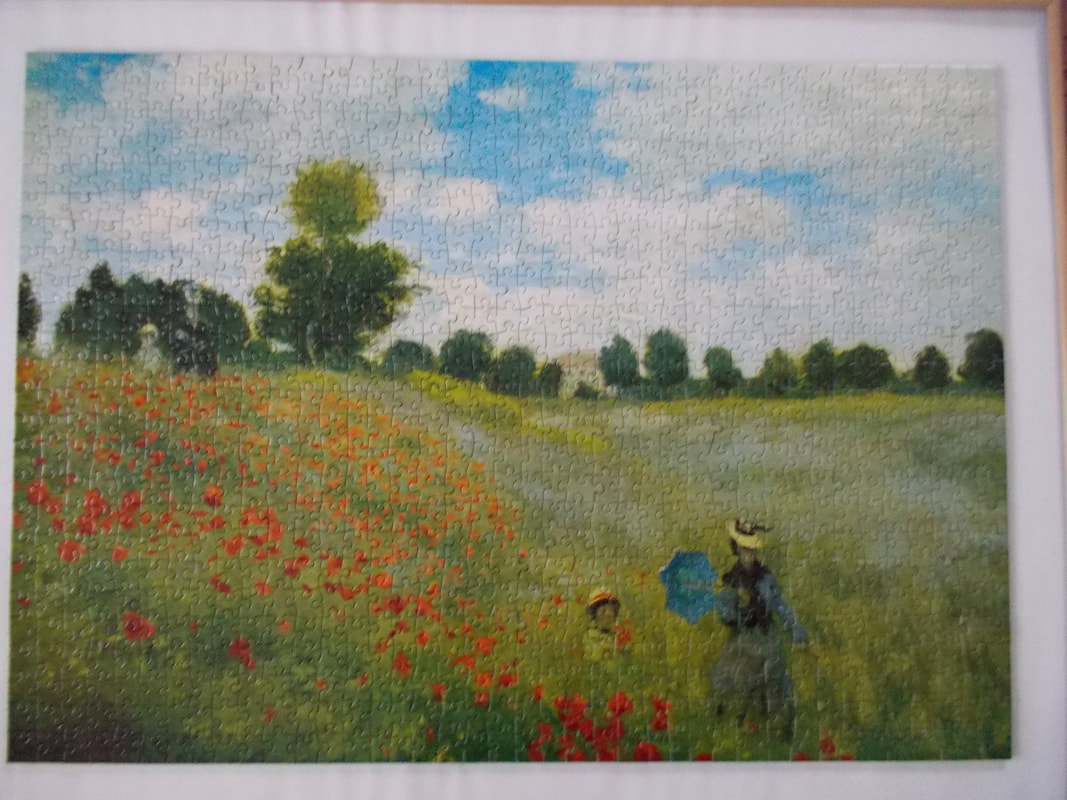 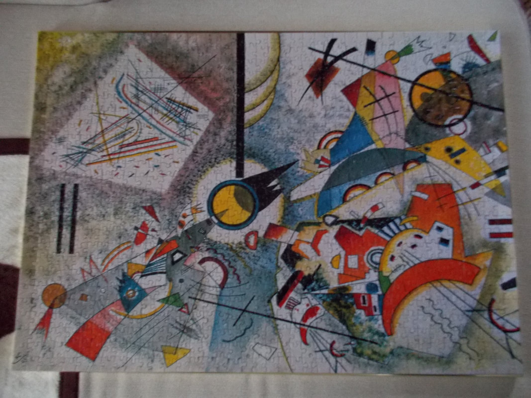 Comparison of the style in Monet’s Les Coquelicots and Kandinsky’s Bustling Aquarelle. In puzzle incarnation to boot. Further, the visual information we actually comprehend is heavily filtered by numerous factors, from biological to environmental ones, so for the most part we are essentially living in “tunnel vision”, where the majority of visual stimuli is necessarily relegated to the peripheral. Similarly, mathematical equations are just as indirect, abstract and arbitrary, as is our knowledge of the universe based on them … which of course does not mean that it is necessarily incorrect. Transference then allows us to see common, easily understandable shapes in those that would otherwise make less sense, not to mention enabling us to see pattern within larger, more complex frames of thinking and reasoning. This is partly due to a deeply personalizing and personifying nature of humanity, but it is a fundamental feature of art in general. Think of the smiley face and how easy it is to see it anywhere and everywhere. We see ourselves as objects in nature; a tree can be seen as a standing person with outstretched arms and a keychain can look like a smiley face. Poetic personifications may not be far removed from this observation. Plus, probably my favorite idiom of not seeing the forest for the trees can be (mis)understood within this frame as well. Cognition plays a crucial factor here, since the perception of elements and imagery in the mind must not be limited to what you see in a particular moment, but you sequentially connect all the singular visual moments that unfold in front of your retinas into an integral part of a larger whole, the world around you. Just as we are able to reason that two circles and a line underneath function as a face, we can observe that the characters in Picture 1 are arranged in a circle (or at least are grouped together) which implies equality. This is further stressed by them facing each other in a conversation, which strengthens the notion that Hellboy is part of humanity despite his devilish origins. And despite the fact that his red color still makes him stand out as paradoxically as his plight to fit in (which further foreshadows short-term storytelling for this particular comic and functions prominently in the long-term Hellboy canon as well). Another reading based on the principle of transference indicates that the group is equally in danger in the dark forest (yet, Hellboy’s color scheme again indirectly distances him and his abilities beyond those of his companions or the world he finds himself in in that situation). 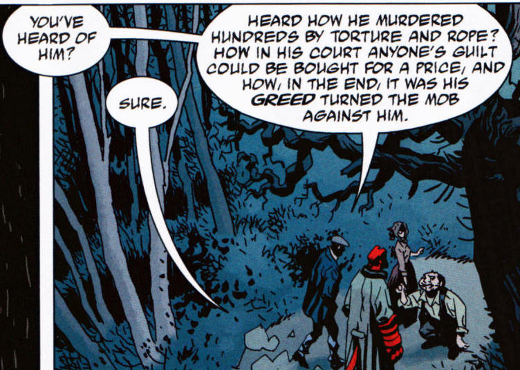 Picture 1: Mike Mignola et al. Hellboy Library Edition, Volume 5 (2012); pg. 37 Whether transference is direct or rather theoretical, it still adds volumes to the understanding of art. We can thus apply it also to allusion, allegory, metaphor and non-literary elements that make readings of any work as complex as its creation, yet through amazingly different personal layers. NEXT: CONTRAST COMPOSITION: CLOSURE (Part 3) “Perception is heuristic in nature – in order to speed up the translation of sensory data to conscious processes, our cognitive processes take short cuts and use generally applicable and broadly accurate rules of thumb to process the raw information and compensate for flaws in the incoming data stream.” (Levy, J. (2013). Freudian Slips: all the Psychology You Need to Know; pg. 121) I have already touched upon the notion of closure as an intrinsic element that allows readers of sequential art to bridge the gaps between the images and the gutter, experiencing a “continuous” narrative flow. I will elaborate it a bit further in light of current subject matter, since closure functions as a prism of visual experience. (Plus, as it is with “reuse” of pictures for different purposes, it’s always a positive when you can expand a concept into different venues.) For the most part we can say that we live in the present moment. Now, we do have to suspend our disbelief of how we process this present moment and how much we are hindered by the shadow of the past events and the looming echo of the future to come. Our present moment extends to the future events which we are continually entering into; yet, our past experiences allow us to anticipate them better, thus removing the shocks that would befall us otherwise. In comics terms, by “connecting the dots”, we are required to make sense of our daily lives just as much as we make sense of the story by connecting the panels. Technically speaking, we are using closure at every moment. We are connecting the dots repeatedly through blinking itself; however, we do not experience it as obstruction, since its rapid nature functions like film: a continuous series of images, creating the illusion of motion. Another simple, yet obvious example of closure occurs on a daily basis when we go to sleep. There is an obvious difference between the image we see when we wake up from the one before we closed our eyes. The difference may be merely temporal or spatial (if we wake up facing in a different direction), but the fact remains that our brain needs to make sense of the change in the surroundings, allowing us to visually assess the situation we are in. And as with comics where all the magic happens between the panels, life happens between all the sensory and empirical information we are privy to (if not faced with) at every single moment. I’ll reuse the double-page spread from Beowulf (2016, Image Comics) by Santiago Garcia and David Rubin as an example. Not only are the inserted small panels on a diagonal used to subtly guide the eye through the composition, but they add to the vibrant celebration at the dinner table (although it can be seen as the last supper as well). The focus on bones implies voraciousness of the feast and refers to the inexplicably hard times in the old Norse era, where food was often scarce. Indulging your primal animalistic urges comes to mind. The small panels are highlighted through the fiery yellow (contrasting) background and through their extreme close-ups. Artistically they serve as balancing forces for the whole scene, while also stressing the continuous flow of the meal, which marvelously embodies the concept of connecting the dots and captures the illusion of motion. 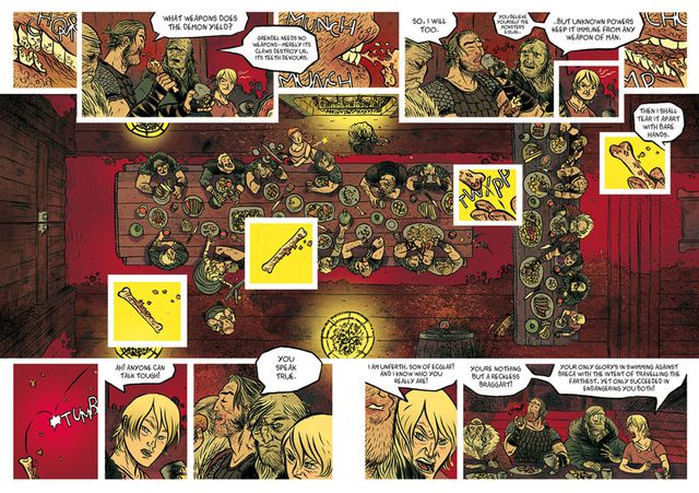 NEXT: TRANSFER The notion of proximity is in close connection to that of position. Elements placed together have for example greater weight and are generally viewed as more important, since there is visually more mass in their vicinity. This is further stressed when elements of similar size, shape and especially color are thus grouped. Proximity thus implies connection … On the other hand, however, it can lead to a loss of individuation. Consequently, elements in isolation can actually get stressed because they have a greater autonomy in this respect. While a detailed picture becomes weightier, the components that become excluded from the general accumulation of such mass feature prominently, because they break the pattern even despite their smaller size for example. For example: a comics panel depicting a large crowd is heavy in detail, but if you want to stress a particular person without “sacrificing” color and shape at that particular moment you can do so by merely positioning him or her slightly away from the main pack. Technically and practically speaking, this is a marvelous dualism. Picture 1 is very distinct in this respect, since the characters visually and metaphorically function as a group within the larger frame of the woods, yet within this proximity principle there is differentiation predominantly though color, since Hellboy clearly stands out. This is achieved through his (hot) redness, which is in contrast with (cold) blue and dark tones of other characters, visually linking them with the background – a clear example of interaction of principles.  Picture 1: Mike Mignola et al. Hellboy Library Edition, Volume 5 (2012); pg. 37 Panel 8 in Picture 2, on the other hand, exemplifies how a figure in the background, half immersed in darkness can stand out from a group of four characters, despite (or rather because of) being visually separated from them and thus occupying less physical space. While color is again resolutely the main reason for distinction, balloons further create an additional barrier of separation, while Hellboy and the rest of the characters exemplify pictorial balance. 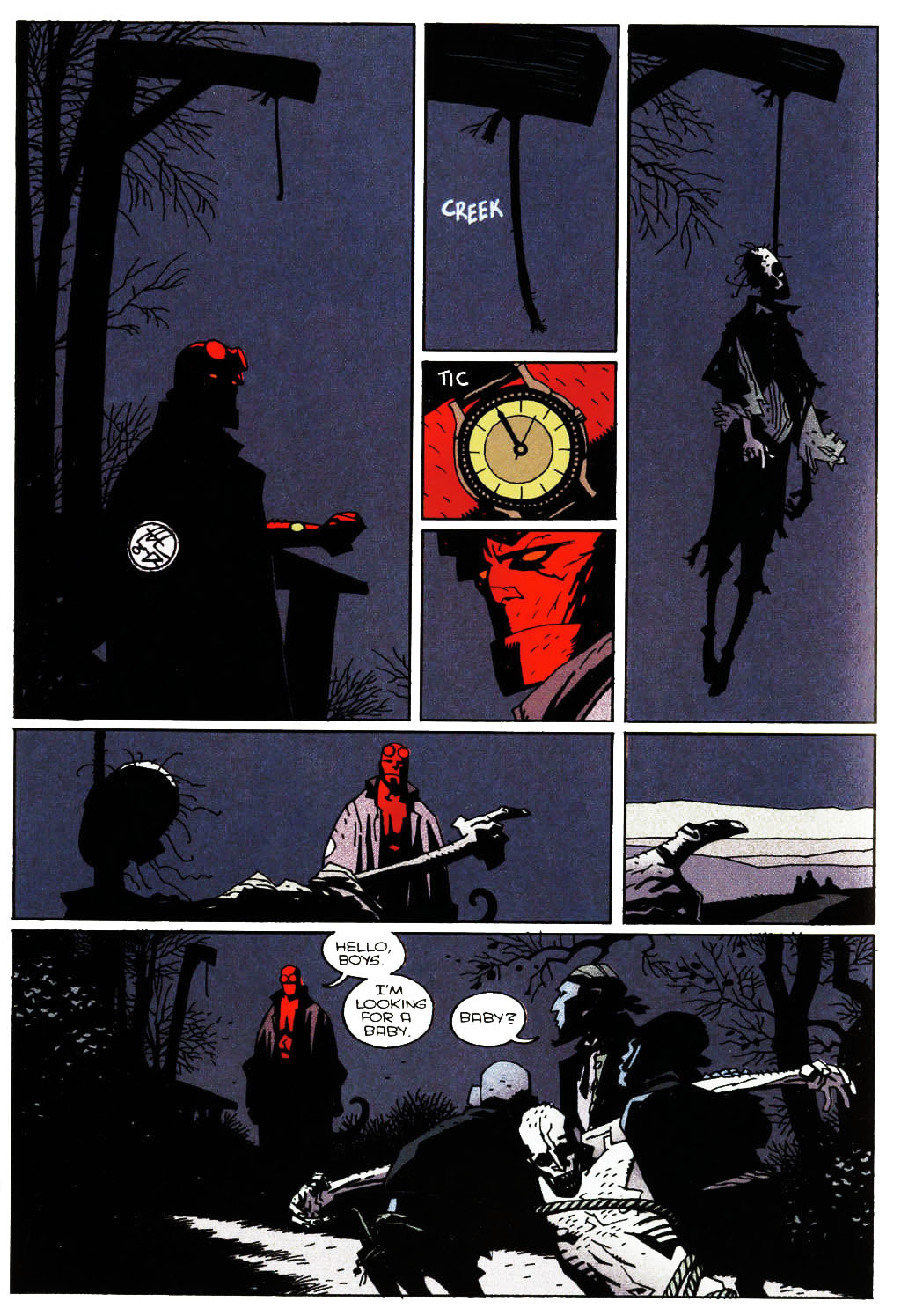 Picture 2: Mike Mignola et al. Hellboy Library Edition, Volume 2 (2008); pg. 38 I know I used these two pictures before and there’s a ton of other example to be used, but the beauty of a particular example is in its reuse, because the more you get immersed into the theory of comicana and storytelling, the more any given depiction can serve multiple purposes. Also, the reader of a comic can often take panel shapes and positions, character or balloon placements and shot selections for granted, because the story just flows extremely well. Behind all of this functional ease lies laborious work and (for the most part) years of experience from the authors, so the final product is quite literally polished to even seemingly insignificant details. It helps to be interested in shop talk, reading the scripts at the back of some of the works and observing authors’ sketches and character study. All of this inevitably helps you better understand the often wacky world of comics that always offers far more than meets the eye. NEXT: CLOSURE |
Author
For reasons of extreme prejudice, the author of this blog wishes to remain anonymous … Archives
November 2017
Categories |
 RSS Feed
