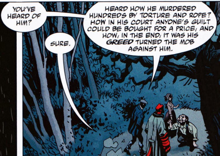
 Picture 3 (Mignola et al. 2008: 25) Picture 3 (Mignola et al. 2008: 25) SPEECH/THOUGH BALLOON If the panel is the most basic unit in a comic, the balloons, bubbles or carriers (of linguistic meaning) are the most striking cartoonish elements, somewhat reflecting the original nature of comics as funny, easygoing stories. This statement especially holds true for the thought balloons, since their gentle cloud-like child-friendly shape itself can carry different meanings. The gradually smaller and smaller circles that make up the tail of a thought balloons can as puffs of cloud be either serene or even quite comical. They can visually disrupt the perception of a comic or downplay the severity of a particular scene, especially if the work addresses a serious topic or reflects emotional states that are anything but cartoonish (i.e. in Maus). The balloons represent direct and indirect speech, respectively. “[Their] function is to allow the reader direct access to a character’s speech and thoughts and, therefore, [become] an extension of the people within the panel. By reading the words, the reader can ‘hear’.” (Talon 2007: 135) Balloons are the most obvious link between pictorial and linguistic elements in comics, encapsulating words in their pictorial surroundings. In most comics the words in the balloons are not mechanical typefaces, but resemble handwriting (as in Picture 3), making lettering more natural, indicative of a more personal voice of the character in question. (The lettering process nowadays is much easier, especially since the author’s own handwriting can be made into a font and inserted digitally (cf. McCloud 2006: 145), taking away the painstaking work of having to meticulously add every letter with a brush for example.) The balloon tail has an indexical function: it directly points to the character whose words/thoughts the balloon represents. While this fact might be quite obvious, awkward placement of either balloons or tails can cause confusion in the reading process that can unnecessarily hinder the narration. Such a hindrance can be seen as a visual mistake. Channel or semantic noise can for example attribute to a confusing reading or an unwanted, different interpretation of what was intended by the authors. Let us take a closer look at Picture 3. Although the tails of both balloons visually point to the same figure, the reading reveals that there are two speakers in the panel. In this case, narration is not hindered to the readers of Hellboy, since the stoic one-liners are typical of this eponymous character. The other clue is the separation of the larger balloon through the so-called “umbilical cord”. Further, the balloons with their tails visually engulf the characters, adding to the danger already implied by the dark woods (sharing the color scheme with the other three characters), and the unseen path. (As it pertains to the balloon “umbilical cords”, Eisner notably strongly opposed such separation of word balloons, specifically because he was a proponent of panels depicting individual moments in time, while the long cords can be visually unappealing and distracting. On the other hand, an objection can be made for a long monologue/dialogue to be broken up for easier comprehension. I generally prefer single panel, single balloon, singe action depictions, because it makes the storytelling more fluent, to the point and less likely to succumb to the pesky trap of unavoidable visual oddities, if not mistakes.) CAPTION The “narrative box” that is caption is commonly a structure that features the initial linguistic elements in a given panel. Predominantly rectangular, thus reflecting a more serious narrative voice or a voice of a character (not present) in the panel, caption is another means of depicting words and phrases within a panel. It is connected to the thought balloon, for the reasons stressed above, while sometimes even replacing it (as in Hellboy). As a comics page can commonly begin with an establishing shot panel, a caption can also serve a similar purpose; it can merely state the time or place, establishing the scene and creating a starting point for the reader. The range of use for captions can vary according to comics genres or just particular works, where the traditional balloons or even borders are replaced with a more embedded text, or the caption can become a visual gutter-like separator. In Picture 1 (from the previous post about panels), the captions serve as visually balancing elements and create an eerie melodic backdrop for the ruthless slaughter on the battlefield. After the emphatic war cry, the further three captions are small and concise, since the stress is on the pictorial action, yet at the same time the words slow down the action and make the reader linger on the big panel of Leonidas amongst the blackening sea of arrows and impending death. Further, the horizontal position naturally guides the eyes across the page and thus makes the overlay of captions less noticeable, despite the fact that their rectangular shape clashes with the diagonals of danger and dynamism within the panels. In linguistic terms, a caption has a wider range, since it could among other things be seen either as a (sub)title or a phrase. Interestingly, even when the caption serves as the narrator’s voice, it is generally still (visually) separate from the voices of the other characters, making reading less intrusive or impeding than in some literary works, where it is not uncommon for the narrator’s voice to fuse with the character’s voice. Or at least the storytelling is more constrained there and can require more ingenuity, because writers are “relegated” to the use of only verbal elements. The authors of comics, however, do not want to create too much confusion for the readers, especially when the pacing is faster or action-packed, so you ideally do not stay too long on a given page or panel. Ideally … excluding any form of analysis and that pure satisfaction of dwelling on the visual artistry before your eyes. References: Brownstein, C., & Schutz, D. (Eds.). (2005). Eisner/Miller. Milwaukie, Oregon: Dark Horse Books. McCloud, S. (2006). Making Comics. New York: Harper Perennial. Mignola, M., Byrne, J., Hollingsworth, M., & Stewart, D. (2008). Hellboy Library Edition, Volume 1: Seed of Destruction and Wake the Devil. Milwaukie: Dark Horse Books. Miller, F., & Varley, L. (1999). 300. Milwaukee: Dark Horse Comics. Morrison, G. (2012). Supergods: What Masked Vigilantes, Miraculous Mutants, and a Sun God from Smallville Can Teach Us About Being Human. New York: Spiegel & Grau. Talon, D. S. (2007). Panel Discussions: Design In Sequential Art Storytelling. Raleigh, North Carolina: TwoMorrows Publishing.
0 Comments
Leave a Reply. |
Author
For reasons of extreme prejudice, the author of this blog wishes to remain anonymous … Archives
November 2017
Categories |
 RSS Feed
