|
The notion of proximity is in close connection to that of position. Elements placed together have for example greater weight and are generally viewed as more important, since there is visually more mass in their vicinity. This is further stressed when elements of similar size, shape and especially color are thus grouped. Proximity thus implies connection … On the other hand, however, it can lead to a loss of individuation. Consequently, elements in isolation can actually get stressed because they have a greater autonomy in this respect. While a detailed picture becomes weightier, the components that become excluded from the general accumulation of such mass feature prominently, because they break the pattern even despite their smaller size for example. For example: a comics panel depicting a large crowd is heavy in detail, but if you want to stress a particular person without “sacrificing” color and shape at that particular moment you can do so by merely positioning him or her slightly away from the main pack. Technically and practically speaking, this is a marvelous dualism. Picture 1 is very distinct in this respect, since the characters visually and metaphorically function as a group within the larger frame of the woods, yet within this proximity principle there is differentiation predominantly though color, since Hellboy clearly stands out. This is achieved through his (hot) redness, which is in contrast with (cold) blue and dark tones of other characters, visually linking them with the background – a clear example of interaction of principles. 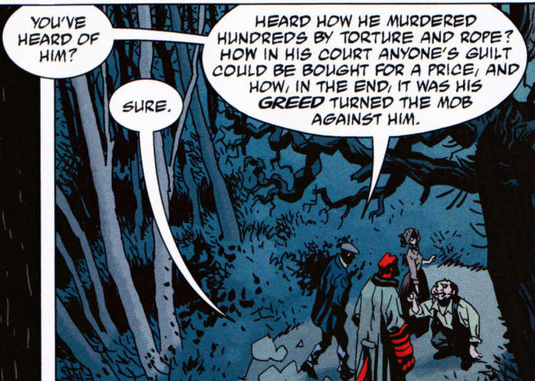 Picture 1: Mike Mignola et al. Hellboy Library Edition, Volume 5 (2012); pg. 37 Panel 8 in Picture 2, on the other hand, exemplifies how a figure in the background, half immersed in darkness can stand out from a group of four characters, despite (or rather because of) being visually separated from them and thus occupying less physical space. While color is again resolutely the main reason for distinction, balloons further create an additional barrier of separation, while Hellboy and the rest of the characters exemplify pictorial balance. 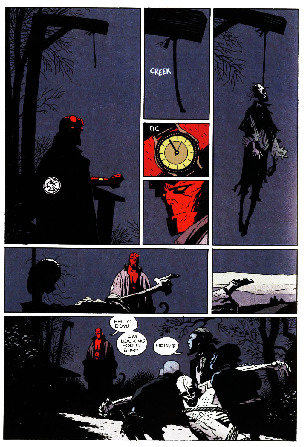 Picture 2: Mike Mignola et al. Hellboy Library Edition, Volume 2 (2008); pg. 38 I know I used these two pictures before and there’s a ton of other example to be used, but the beauty of a particular example is in its reuse, because the more you get immersed into the theory of comicana and storytelling, the more any given depiction can serve multiple purposes. Also, the reader of a comic can often take panel shapes and positions, character or balloon placements and shot selections for granted, because the story just flows extremely well. Behind all of this functional ease lies laborious work and (for the most part) years of experience from the authors, so the final product is quite literally polished to even seemingly insignificant details. It helps to be interested in shop talk, reading the scripts at the back of some of the works and observing authors’ sketches and character study. All of this inevitably helps you better understand the often wacky world of comics that always offers far more than meets the eye. NEXT: CLOSURE
0 Comments
Leave a Reply. |
Author
For reasons of extreme prejudice, the author of this blog wishes to remain anonymous … Archives
November 2017
Categories |
 RSS Feed
