|
It’s nice to get shocked every once in a while. A good horror story can do just that: give you a jolt of energy that makes you happy to be alive … paradoxically apart from at least some of the characters of the story you are immersed in. The fun of reception lays in the interplay between the author and the reader though the text … and when said text is psychologically or emotionally charged as in the case of a horror story, its believability is contingent on the author’s guiding the flow of the story and the reader’s ability to suspend his/her disbelief. If both crucial points are achieved, every turn of a page becomes a cliffhanger and every depiction in and out of the panel is lovingly devoured by the voraciousness of both the story’s progression as well as the reader’s craving to see what horror looms at the top left corner of the next page. (Sight divergence between a digital copy and an old-school comic may apply.) These are some of the broader elements that you can find in Rowans Ruin, a comic about blogging, ghost-hunting, house-swapping and mystery-solving (not necessarily in that order). It tells the story of Katie, an American blogger who changes homes over the summer with Emily, the owner of the Rowans Rise estate in England, both young ladies seemingly in dire need for some change of scenery. The trick is that what seemed to be a deal of a lifetime for Katie, who got a big-ol’ house all for herself while Emily got stuck in a much smaller apartment with Emily’s parents, turns into a creepy haunted place with ghosts and bodies, all the while the protagonist’s ideological fight-or-flight struggle unfolds in front of our eyes. What differs from the Scooby-Doo-type of mystery story is that in this case Katie has an innate ability to sense the supernatural, which in turn obviously makes the ghosts real, because what use is a power if not exploited in some shape or form (which is a lovely misnomer that also on the law of attraction). Consequently, the blood is real and the whole whodunit ordeal carries the flow of the story between the mystery solving and the jump scares. Before I reveal who actually dang dun it, let’s take a closer look at the nuts and bolts of Rowans Ruin, of what visually works and how, because just blabbering on about a comic in verbal form alone is another misnomer that hardly stays appetizing for long. All good works begin in medias res, right? Rowans Ruin starts with Katie’s distress call and her crashing through the window of the Rowans Rise house in an attempt to flee a seemingly ominous figure that we see in the shadowy background of the last panel on the first page. By referring to IT, we are immediately led to believe that we are dealing with something that could be supernatural. The large BARAKOOOM sound effect adds to the visually maddening scene of P1 (as Katie is trying to find her bearings), while functionally and symbolically bleeding into the gutter (of the unknown), which makes the very first page as enticing creepy. 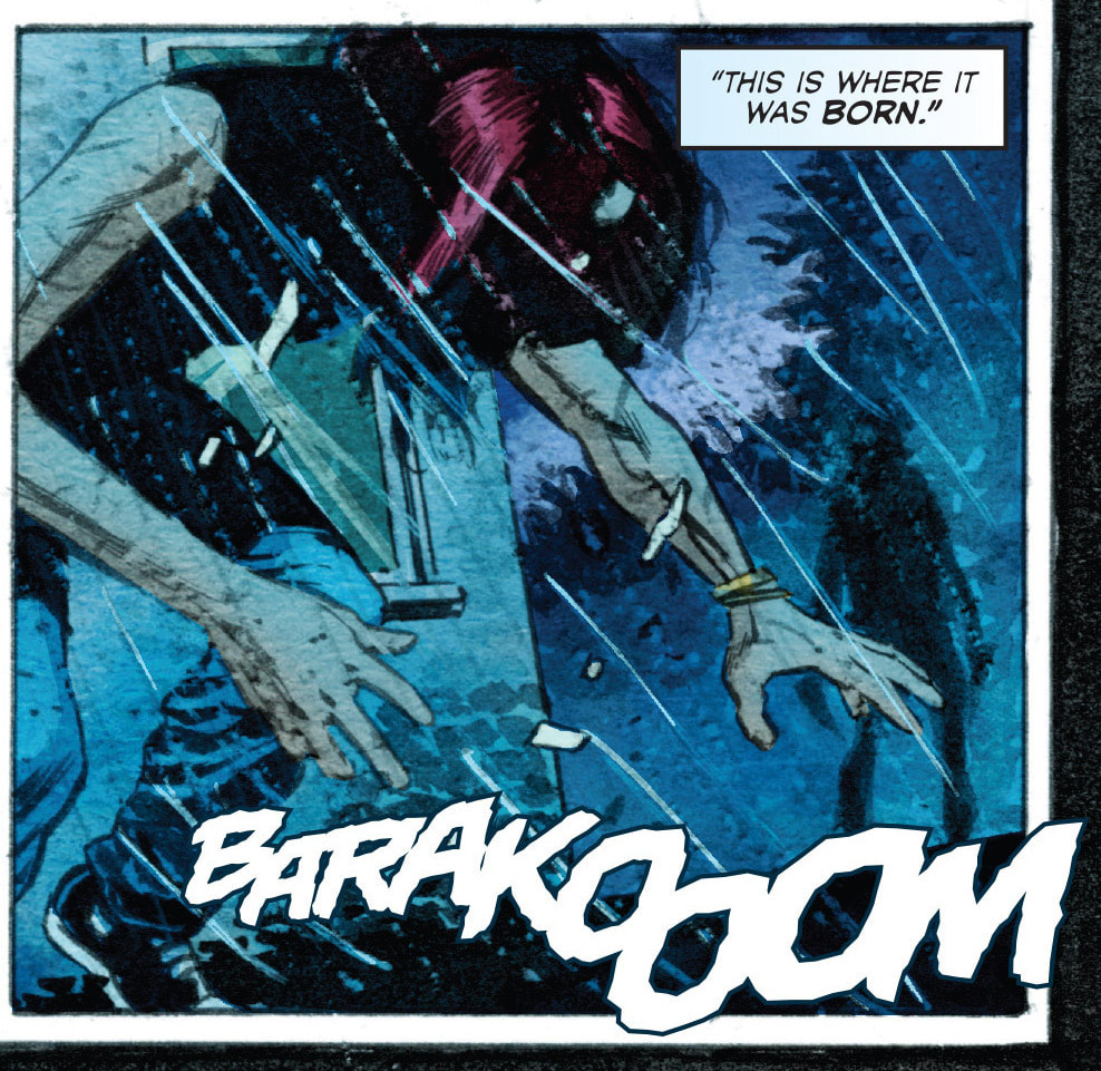 P1 The sound effect is repeated two pages later (P2), this time adding to its own visual and sound value as it is accompanied by the dark androgynous figure, literally jumping both at Katie and the reader. The third page in this perfectly short, strong, cryptic and on-point prologue makes an abrupt change from the blue-and-black background color of the previous two pages. The more striking red-and-black splash page only leaves the reader in suspense and visual shock as the mysterious nature of events does not allow you to think logically, since you are (through Katie) symbolically hunted and in fear of your life. The sparse explanation given to us in the captions on these three pages creates just enough confusion and unease that the pace of reading and the pictorial flow of the story remain balanced. This could in fact be extended to Katie’s balance of fear and determination to shed light on the goings-on. Interestingly, the creature and Katie share the blueish tones, which could be an indication of their possible connection. This is of course heavily overshadowed by the direness of the scene, the creature’s unnatural red eyes, imposing presence and even somewhat freakish, monsterly depiction of the right hand, where the index and middle finger come off more as claws than fingers. (This could of course be only a matter of perspective, but when danger looms, the mind can visualize all sorts of accompanying nastiness.)  P2 The emphasis on these introductory pages cannot be understressed, because they set the tone of the story, where the reader becomes conditioned to expect such extreme situations in the future. A stark contrast is made in the following pages, where we learn the background of the story six months earlier, where Katie wants to move for the summer for some needed change of scenery. Danger, urgency and the black gutter are replaced by lighter tones and a safer family environment … or rather an innocent one, since we learn that Katie’s parents are opposed to even the more gentle of profanities. This stark contrast can serve as the calm before the storm. When Katie finds Emily’s estate in Rowans Rise and the two young ladies chat online, the horizontal page division in P3 is a typical and particularly useful comics technique of both visually separating the characters (of events) and grouping them together. The left (leading) side belongs to Katie in her sterile (white) apartment, while the right (supporting) side is Emily’s in her more color-rich environment. Some potential unease can be felt by the thick red drapes in the background and Emily’s dark shadow, perhaps both sly reminders of the events from the beginning, while her facial dissatisfaction and loss for words further the mystery of her state and surroundings at Rowans Rise.  P3 While we may be led to believe that the shadow in the last panel of the P3 sequence is Emily’s, its slightly more prominent brow ridge and the angle of the shadow in relation to the lighting of the room may in fact be a red herring, indicating the presence of something mysterious. (Something similar can be observed in P4 as well, however, referring to Katie.) 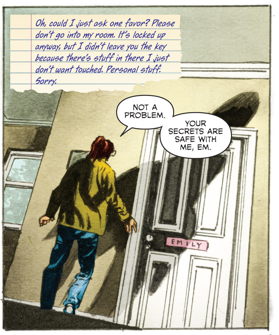 P4 As Katie arrives in England, her “American” forwardness and exuberance over her exciting new experience cannot be overshadowed … apart from her entering Emily’s room (P4) which her British house-swapper has specifically forbidden to enter. This is a clear red flag of mythic proportions, because the mere mention of a secret not only further adds to its mystique but viciously entices the reader as well. As already mentioned, there is another pictorial red flag in the form of another looming shadow spreading diagonally across Emily’s room. The depiction can already be a sign of (either Katie’s or) Emily’s impending dark experience, but it may also point that the dark, shadowy presence (or the IT) from the beginning is connected to the mansion and not her. While the diagonal position of the shadow can be objectively just the product of lighting, it adds vigorousness and vibrancy not just to this particular panel, but the rest of the page. Further, since the angle is slightly tilted, the panel itself acts as both a balancing force of the page as well as the oddity that will inevitably become the norm at the Rowans estate. Katie as a blogger/vlogger naturally has to keep her fanbase up to speed on a daily basis, so the following sequence of panels (P5, P6) provides a more raw, uncut and personal account of her new surroundings. A couple of things to point out here: the panel’s shape resembling a smart phone and the jagged (radio) balloons mark a very distinct and genuine depiction of our current lifestyle, where everything has to be (immediately) shared online. Stylistically, these two pages not only invite you into Katie’s own little (big digital) world, but also mark the passage of time through the battery indicator. While the relative fast battery consumption is a daily nuisance for most of us, in the comic this is attributed to some unknown force with a taste for electrical nourishment (not as tongue-in-cheek as it turns out). This elegantly ties the weird event of the story to real life, while the last (appropriately tilted) panel showcases the real “horror” of our current generation: the dreaded black phone screen. The reading pattern on these two pages is the normal Z-type; however, there is a missed opportunity in making a double-page spread where the third panel that ends with the words “to the right” would actually continue to the right, so the first panel on the second page would be the fourth one in this sequence. The slight confusion is more obvious in the printed version than the digital one, since the latter (as shown here) depicts a clear separation between the two pages, while the first retains at least the potential for blockage in the reading process and consequently the flow of the story. 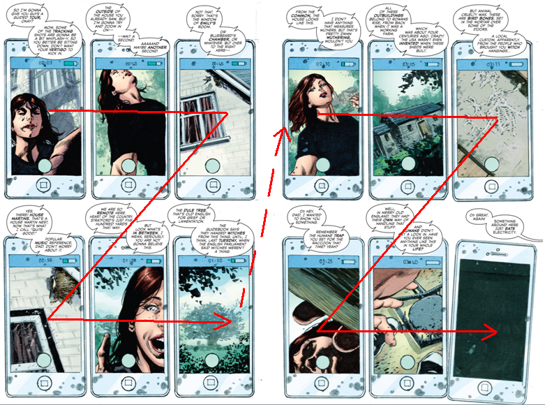 P5 (Normal reading path.) 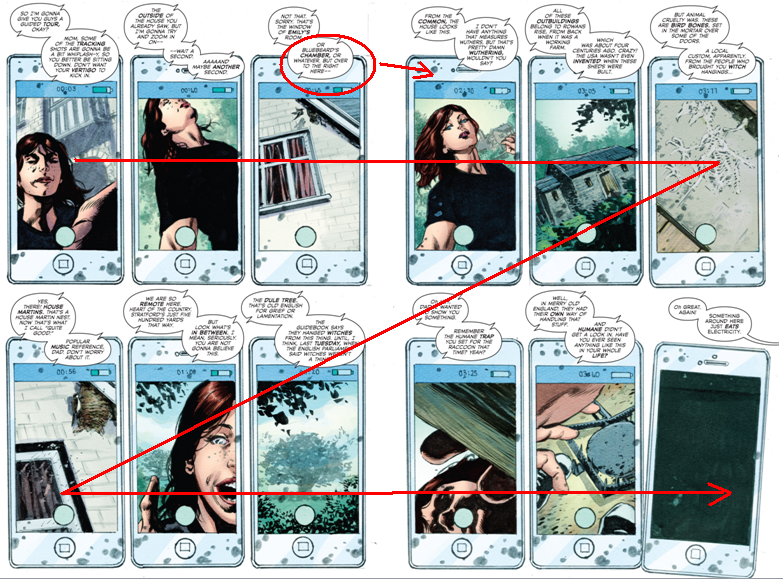 P6 (Proposed reading path.) In either case, this marks the beginning of Katie’s more and more intense research into the less than normal unfolding events. When her mother expresses her concern about Emily seeming haunted, all of it inevitably leads to Katie’s nightmare that acts as her premonition. As stranger things must inevitably ensue in an appropriately haunted environment, Katie finds Emily’s room unlocked. An innocent peek inside reveals a plethora of tools and techniques for supernatural-overtion and ghost-prevention: from horseshoes (warding off evil) dule tree branches (associated with hangings and witches), bells and home-made booby traps under the window to the mysterious white circle under the bed. Mysterious at least for Katie, since she obviously does not find the Winchester lads appealing enough to watch Supernatural. In true 1980s Miami Vice fashion where all drugs had to have been partaken of and where every pretty-boy detective knew every type of blow [wink wink], Katie assumes the role of the charismatic investigator and naturally has a taste of the white substance (P7). Shockingly, it is revealed to be that new fad all the crazy kids on the streets like to call NaCl … or salt. Amidst her newly rediscovered supernatural sensing ability it can be seen as strange that she would not be aware that the prominent white spice has been the salty anti-demonic instrument in folklore and popular culture. Nonetheless, the overall creepiness of her situation can indeed become overwhelming fast, even to the point of inattentional blindness and saccadic suppression … or at least their mental/emotional counterparts. 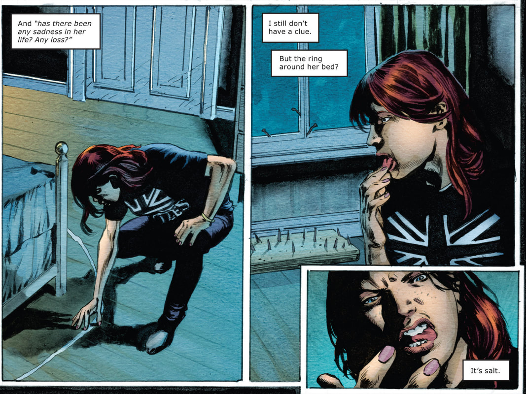 P7 As Katie goes out to the pub to find some renewed vigor and seeks safety in the social environment, she culturally, dialectically and visually stands out. Generally, such a distinction can be either extremely positive or overtly negative – especially in a smaller tightly-knit environment, where conformity and conservatism take precedence over differentiation and intrusion. In this case, we have a wonderful series of panels that appropriately culminate at the turn of the page, where Katie strikes the fancy of a local lad who visually dominates over her. The contrast in their pictorial appearance adds to the conflict, where the man leans in towards her in the first panel of the P8 sequence, fingers pointing at her, while hers are in a defensive state, as she occupies less and less space in the panel(s). The middle panels depict her verbal indifference to the man’s approach and pictorial entrapment in the two vertical panels. Further, the man(’s torso) pictorially entraps her in this series of four panels. In the last one, even the balloon placement can be viewed as a nod to Katie’s gradual ensnarement, since her balloon is also getting pictorially squeezed in by the more centrally placed double speech balloon of the man. The only sign of comfort (seemingly for the reader rather than Katie) is the strange hand reaching for the man … and even that is an indicator of further conflict. Overall, a simple, yet powerful use of basic shapes and color to indicate intrusion, defensive position, overlapping and dynamic posture, which all effortlessly carry the story forward. 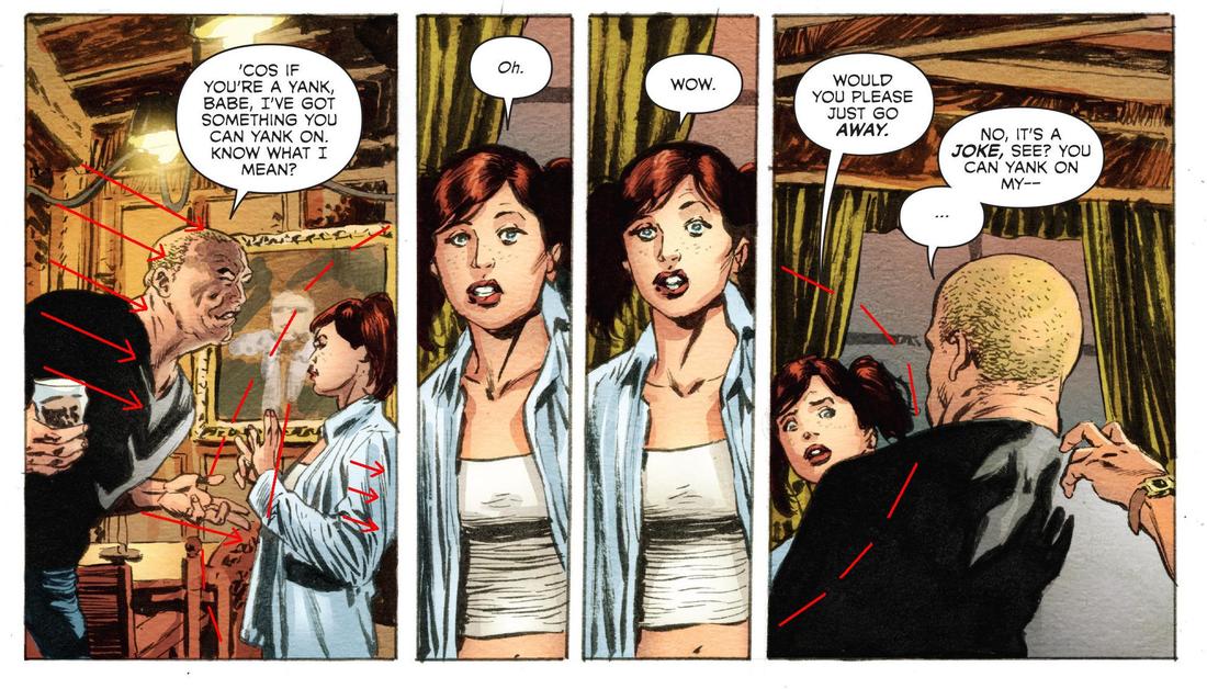 P8 The hand in question belongs to the constable James who proves to be the knight in shining armor … in more ways than one. In a rapid jump forward, we get a very abrupt change of pace and scenery that find Katie and the policeman on a somewhat romantic boat trip. As she finally trusts him enough to show him Emily’s room, we see that their love bond is somewhat contrasted. James’ skepticism about the oddities in the house, vigilant rationale and safe line of reasoning clashes with Katie’s more head-on approach and belief in the quite literally metaphysical events (or at least struggling to come to terms with what is real and what is beyond real). Katie stubbornly refuses to let James spend the night with her and takes her brave stance. As the use of shadows continues, they resemble more and more the creature that was chasing her at the beginning. The eeriness is reinforced by the Psycho scene of P9. At least that is what the stereotype of the hot woman in the shower (with foam or in this case the medium shot covering all her naughty parts) seems to have become. The use of the refrain from Sia's song Chandelier can be at first glance viewed as Katie letting her guard down and enjoying the rubbing and scrubbing … however, as the song actually seems to be about depression, alcohol, drug abuse and the struggle to deal with these pains, the protagonist actually lets us into her state of mind where she tries to cover her frightfulness with bravery and boldness. When the figure appears outside her shower in the decaying-green color, Katie’s suddenly outstretched fingers and eyes wide open perfectly capture the response you get when you either get scared or feel that tingling sensation, those pesky shivers down the spine. The silence in the panel is here used for greater dramatic purpose, to provide the pictorial shock that extends (and to a degree echoes) beyond words. One of the best uses of pictures in comics is when they either indirectly or overtly depict elements that the author does not want literally expressed. The value of seeing the lurking figure thus cannot be equally voiced with words, because words would be too descriptive and would hinder the shock-value of the third panel in P9. The first panel does indeed have one caption placed directly under the dark shadow, so there is almost no way for the reader to miss it. This creates the desired element of danger, where you know someone or rather something is lurking at Katie, so you expect even greater unease, as she climbs the stairs, getting even closer to her hazard. The “reading” of the third silent (and up close and personal) panel therefore stresses the reader’s unease and expectations even further. 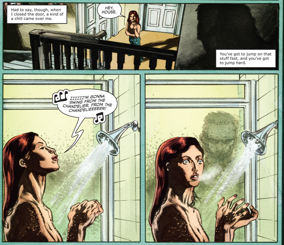 P9 The final page of the first issue appropriately ends on a massive cliffhanger, as we finally get the full-size view of the lurking creature. The tilted panel adds to the dynamic, contrasting figure of the symbolically vulnerable Katie clad only in a towel, unaware of anyone behind her, and the menacing (undead) creature (coming forth from the shadow), who is already pictorially upon her. The motion lines further add to the pressing situation. Since the level of narration and awareness appropriately caters to the readers rather than Katie, we feel sympathetic towards her and fearful for her well-being. 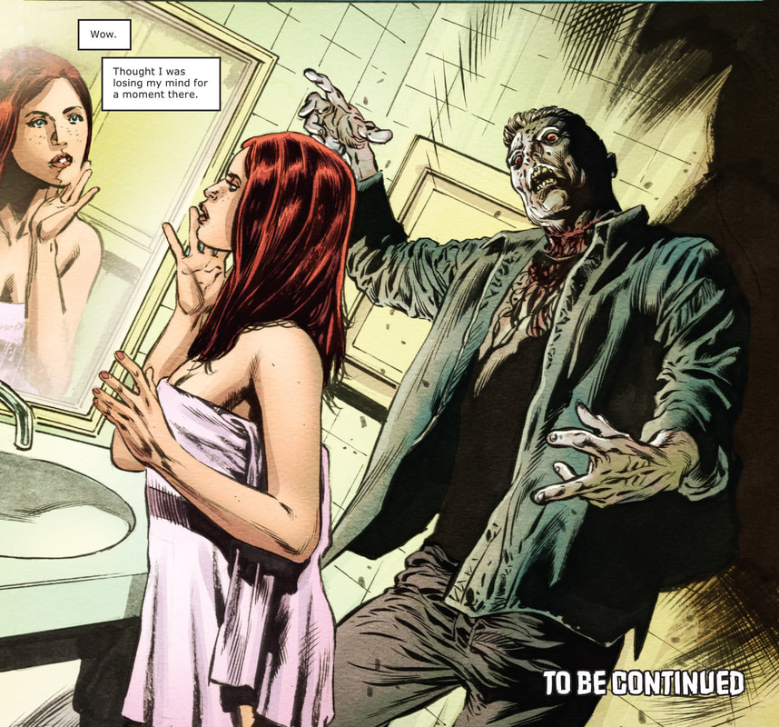 P10 Katie blacks out when she finally experiences the creature in full force at the beginning to the second issue. A short interlude into her childhood reveals that her apparent ability to sense the supernatural has been dormant, so the head-on collision here was a bit overwhelming for her. Since the police have found no wrongdoing, she has to resort to her own investigation of the Rowans estate in the supernatural domain of the … library. There, she finds an article about a gruesome attack by an unknown attacker on Emily and her sister Maggie, the latter being in a coma in the local hospital for 10 years since then. As Katie tries to indirectly get some information out of Emily about any potential goings-on at the house, Emily’s blatant denial of any kind of (spooky) activity is almost alarming. (Especially now, since Katie and the reader are aware of supernatural shenanigans) When the second panel is understood in the context of the P11 sequence, it displays what I like to call intentional conflict, a technique where pictorial and verbal elements in a given panel/picture are deliberately at odds with one-another. Emily’s verbal denial is thus negated by her expression of anger/defiance/indignation, which can only mean she is hiding something. And since the premise of the story along with the recently uncovered article point to sinister, life-threatening matters, such a panel is beyond revealing for both character-building and the plot of the story. 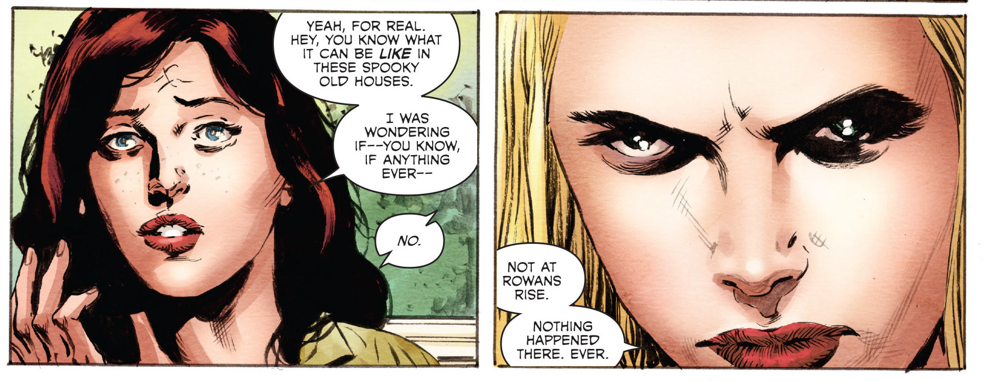 P11 Since the girls are skyping, the reader in this case is not the only one who is privy to Emily’s expression. A crucial element, since the (detective) Katie can see right through her and goes to visit her sister. By holding her hand, Katie unintentionally gets a shocking response from her in the form of another vision – of the attacker’s hands bludgeoning Emily into unconsciousness. This time Katie finds herself on the other side of the law, as the nurse calls the police. As James picks her up and begins to drive her somewhere, she begins to fear for her life. Fueled by the accumulation of the previous events, her feeling of being alone and misunderstood is used as a narrative plot twist … In this case a false one, because James’ intentions are pure, because he merely wanted to show her the accident site of Emily and Maggie’s parents. This scene of honesty and revelation gives Katie a chance to unburden herself and reveal (to us) that the dead man hunting her was in fact more interested in Emily. As Katie feels responsible to find out the truth and help anyone involved, the supernatural element of the story takes another twist, because the danger of the dead man is lessened in favor of the mystery of how he is connected to Emily and what she is hiding, not just what is happening at the house. 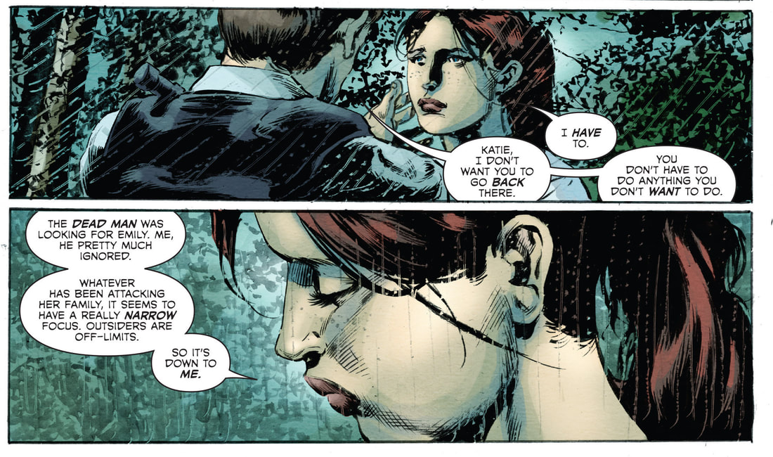 P12 As luck would have it, (and by that I mean the uncanny burden of knowing everyone in a small town) Katie and the librarian Theresa begin speculating that the dead man could be Emily’s former boyfriend Dylan. Katie finds renewed vigor and is determined to have another one-on-one session with him. As she falls asleep with Enid Blyton’s The Enchanted Wood in hand, we can perhaps view this as a modern shamanic ritual, where the otherworldly trance is a dream of climbing the magic tree towards the clouds of higher perception, the quite “real” perception of ghosts. This marks another slight change in the narration, as the underlying elements at end of the second issue are more humorous than horrifying. Visually and stylistically, fear is replaced by the fervor to comprehend, as Katie dreams up or rather summons up not just Dylan, but a whole gamut of ghosts, canine spirits to boot. While they still seem to be reaching towards her with red eyes and streaks of blood, they are nevertheless depicted as human not zombie-like. The light-blue color is also more indicative of the default spiritual realm rather than the evil nastiness and, last but not least, Katie’s tongue-in-cheek blog entry alone can be enough to see that she has gotten over the hump as her plan seems to be working. 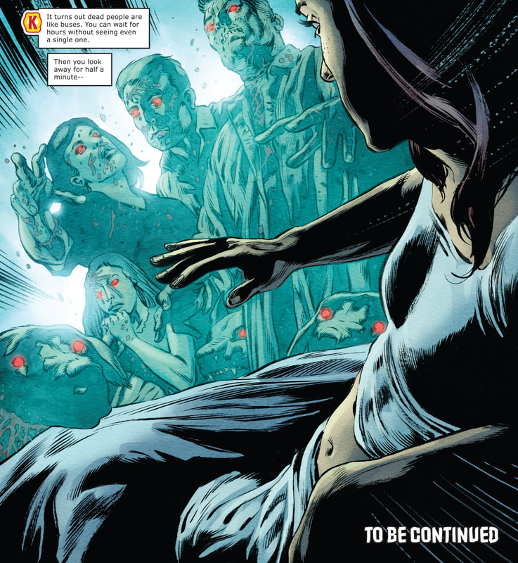 P13 The mood gets lighter still as Katie tries to have a conversation with the ghosts, which is all in vain … Until she touches Dylan and we get a flashback from his POV. While at first seemingly obsessed with her, his love is not accepted full-heartedly by her and we get another twist, as he becomes more of an overbearing boy-toy. 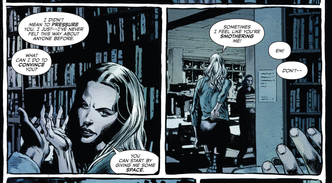 P14 What is more, his neck is cut before exiting the house, the pain spiritually felt by Katie as well. Stylistically, the black gutter is in the end replaced by the red one, creating a “bloody” outline. As we only get a glimpse of the reflection of the attacker, we are still literally and symbolically kept in the dark of the identity of the assailant, while his death is clearly linked to the Rowans estate. 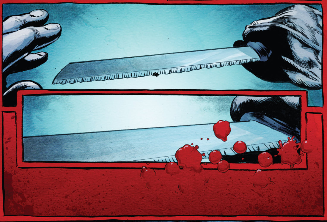 P15 As Katie discussed this mysterious matter with Theresa again, she thinks Emily’s seriousness and reservations are direct results of all the goings-on in the house (from the attack on her sister onwards), which made her susceptible to spiritual attack. As Therese in P16 remarks that Katie should be in fact talking to the house, not ghosts, this offbeat or even comical comment can have a much deeper meaning. If this reference points to The Epic of Gilgamesh, in which the god Ea indirectly warns Utnapishtim (the Babylonian Noah) how to survive the ensuing flood by telling the house of it. With such a mythological reading, the seemingly nonsensical comment suddenly not only makes a ton of sense, but it symbolically expands the meaning of Katie’s struggle to “survive”. Also, it is beyond fitting that this is pointed out by Theresa. As a librarian or a “guardian” of old, sacred knowledge, she preserves the connection to the Gilgamesh myth, the oldest and perhaps greatest of epic stories humanity has thus far retained. What is more, this kind of reading reinforces Theresa’s serious/stoic expression in the second panel, so the joke is that there is no joke and we can in fact take her words seriously. Further, since Mike Carey’s work is particularly flooded with (in)direct mythological references (pun intended) and he has incorporated the Gilgamesh epic in his Unwritten series as well, a reader of his cannot but help him or herself to partake of the mythological pie … with a cup of tea of course. 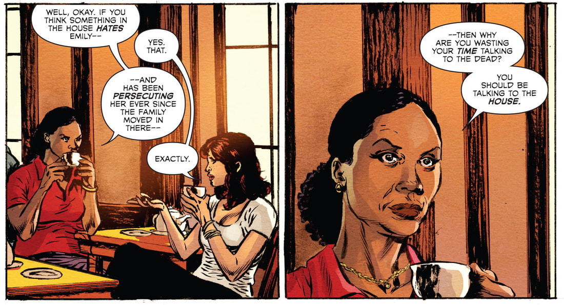 P16 After a brief interlude of appropriately Shakespearian proportions, as Katie and James attend the theater, her comment of seeing the performance of Hamlet is priceless, because it is beyond obvious and thought-provoking at the same time. Saying that Hamlet reflects the human condition, when we have been (at least in the West) brought up pondering about the meaning of “to be or not to be”, is pointing to dualisms of human experience. On the other hand, this can be just a throw-away comment from someone who knows just enough about Shakespeare to realize his work is really deep and really not worth further scratching your head about what it actually means … or if the meaning expressed in Hamlet’s words and actions is actually meant to be linearly and formalistically straightforward. In other words, is it not but dreadfully relative? 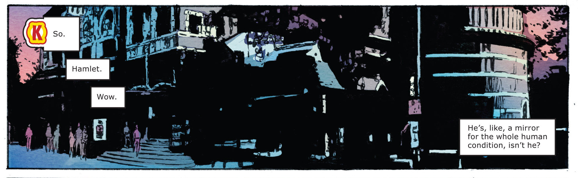 P17 From my own interlude to this Shakespearean interlude, Katie decides to get rid of the ghost traps and sleep in Emily’s room in hopes of getting to the bottom of things. While James wanted to stay with her, she would not let him. In true mythological fashion, the heroine has to face the real/final challenge of her quest alone (and what is more, she has to embrace it and not be forced into it), despite all the potential dangers (and often because of them). Her “power” and drive to combat the unknown circumstances is the central feature of cultural heroes around the world and has permeated from mythology proper into every artistic endeavor (this comic being a good example as well). As Katie writes Emily of her plan in hopes of helping her (P18), we are left with Emily’s blunt expression of disapproval and what seems to be either fear or anger. The yellow outline of the gutter is an interesting choice that in a sense negates the element of enhanced danger, since Katie is potentially more vulnerable without Emily’s safeguards in place. Also, the last darker close-up panel of Emily’s face is inserted into Katie’s narrative and tilted to indicate a change or disturbance of sorts. At first reading, we can understand this sequence of panels quite differently (as will become even clearer further on), especially since we generally do not pay that close attention to every detail in every panel, the angles, shots and even the meaning of hues in the given context, when we are immersed in a story. This is the paradox of immediate pictorial recognition and often blind reading of also often hidden pictorial clues. 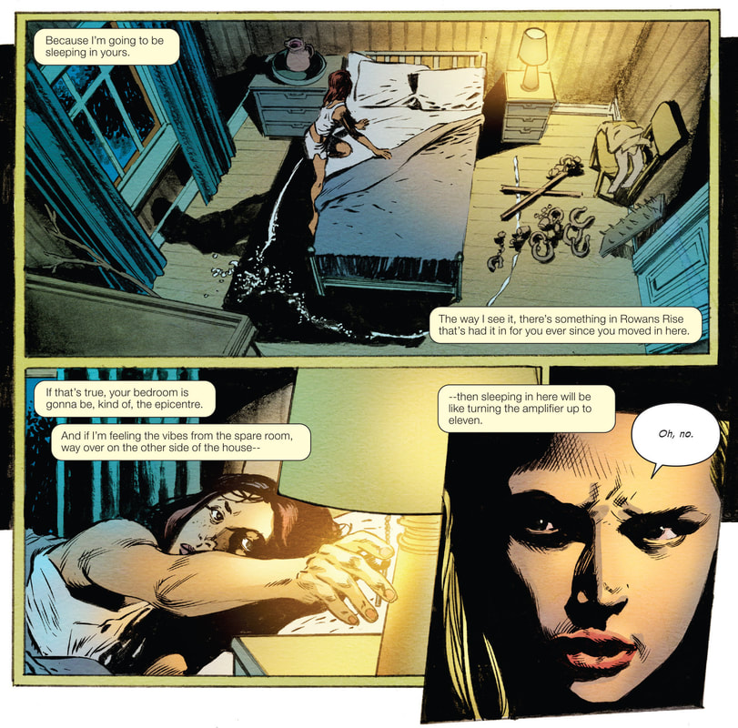 P18 The result of Katie’s ghostly test is another plot twist, as she sees a serene collage of imagery of Emily’s parents, sister and dogs. The image (P19) is thus “disturbing” more so because it is not disturbing. Katie’s powers of perception are getting more potent as her mythic journey continues, so she is able to feel love (in this case rather than hate) from everyone around Emily. However, since Emily still feels trapped to her, Katie takes one last mystery-solving effort … 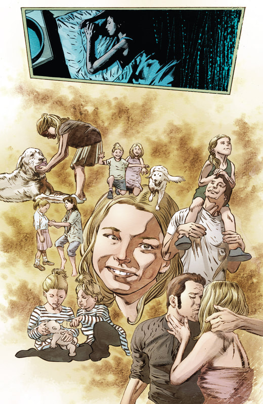 P19 By going to the former residence of Emily’s family, she is treated with disdain, which inevitably leads her back to the library. Theresa points to Emily always curiously escaping the danger, yet this is still at odds with her feelings of entrapment that Katie felt through her “séances”. Katie hurries back to the house to search for something and she does: the dog figurine with which Maggie was bludgeoned … still covered in blood. Katie’s affirmation of foul play is immediately reaffirmed with a swift blow to the back of the head in the concluding splash page. The culprit is Emily. The sequence of panels prior to that (P20, P21) exemplifies dynamic panel movement without oversaturation or overuse of different camera angles. A couple of tilts and overlapping is enough to show Katie hurrying up the stairs and searching for the object that is eventually focused on in the central panel on the next page. The establishing shot with the rain obviously adds to the drama and together with the final panel where Katie gets attacked frames these two panels between anticipation and danger. At this point, however, we have to let the suspension of disbelief play on and not dwell on the swiftness of Emily’s flight back to England or the fact that her blow with her home-made nailboard should have killed the heroine. 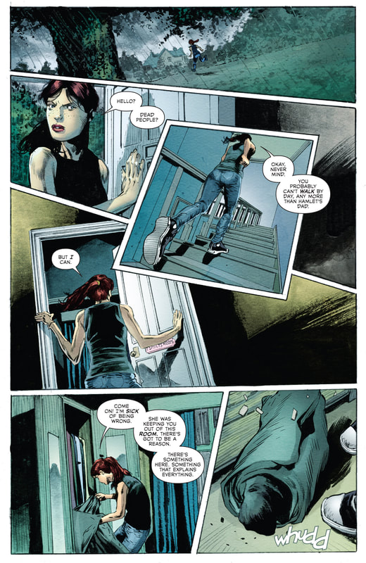 P20 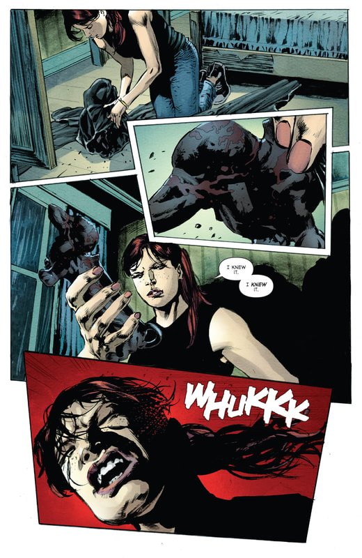 P21 As it turns out, Emily is a psychopath through and through. The start of the final issue is the start of finally putting things together and uncovering the truth behind the hauntings at Rowans Rise. Before Emily would indeed beat Katie to death despite her offering help and trying to understand her, Katie manages to touch her, which opens the flood gates of comprehension. Emily cannot stand affection of any kind and has often found solace in literally and gruesomely removing those closest to her from her life. The destructive irony in all of this is that the love of those near her was and still is so strong that they keep showing up as ghosts, in a sense perpetuating her (self-imposed) hell in this life. The flashback (P22, P23) reveals Emily’s antisocial reality as the panels swiftly build on her anger that culminates in killing her family and even the dogs. Even pictorially, the superimposed panels on the right of P22 physically and symbolically do not fit in with the loving agenda of Emily’s family, while P23 mashes and bashes the images even further as her fit of madness and her killing spree are held together by her outbursting scream in the upper left, where “seeing red” is pictorially extended to the red outlines of the boarder and the red tones in her beyond irritated expression. Her scream is the pictorial glue for her abusive memories and compulsive action, as she deals with her pain by projecting it towards others and through others that were merely showing her love and devotion. Symbolically, the pain of comprehension is even greater, since it directly engulfs those nearest to her. 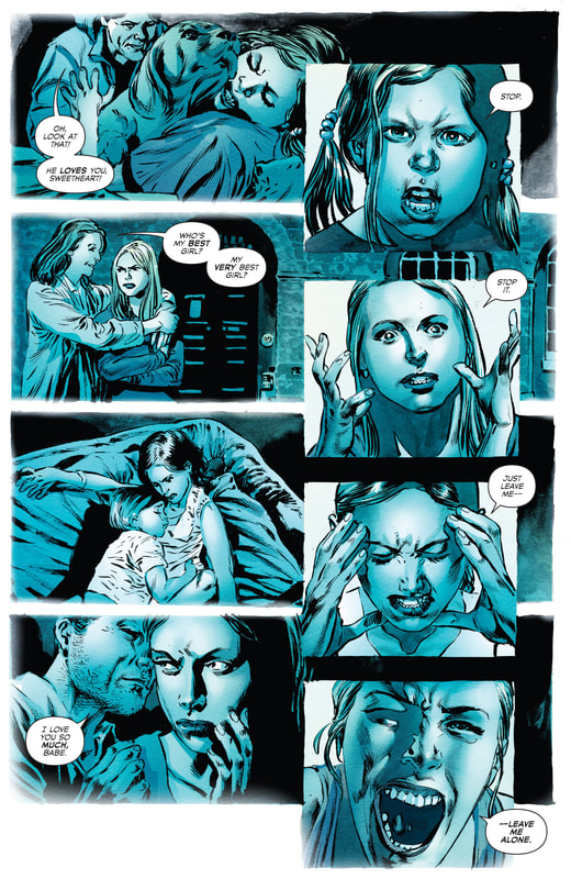 P22 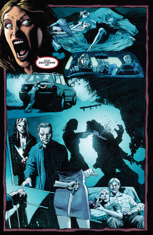 P23 As Katie realizes in horror that Emily has murdered her parents as well, Emily’s response is a cold-blooded reaction of anger and the projection of blame … both because she has been found out and because of the overbearing emotional discharge, an energy that engulfs her earthly worldview as well as the spiritual realm from which she seems not to be able to escape. Pictorially, P24 and P25 respectively capture the shock and defensiveness of Katie (through tears and hands) and grittiness and remorselessness of Emily (through a deathly gaze and teeth grinding). Since both panels are superimposed and Emily’s vicious look follows directly after Katie’s distress, the contrast is visually that much more striking, psychologically more emotional and quite simply effective. 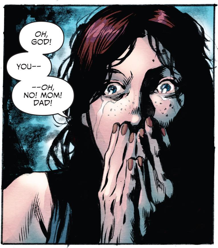 P24 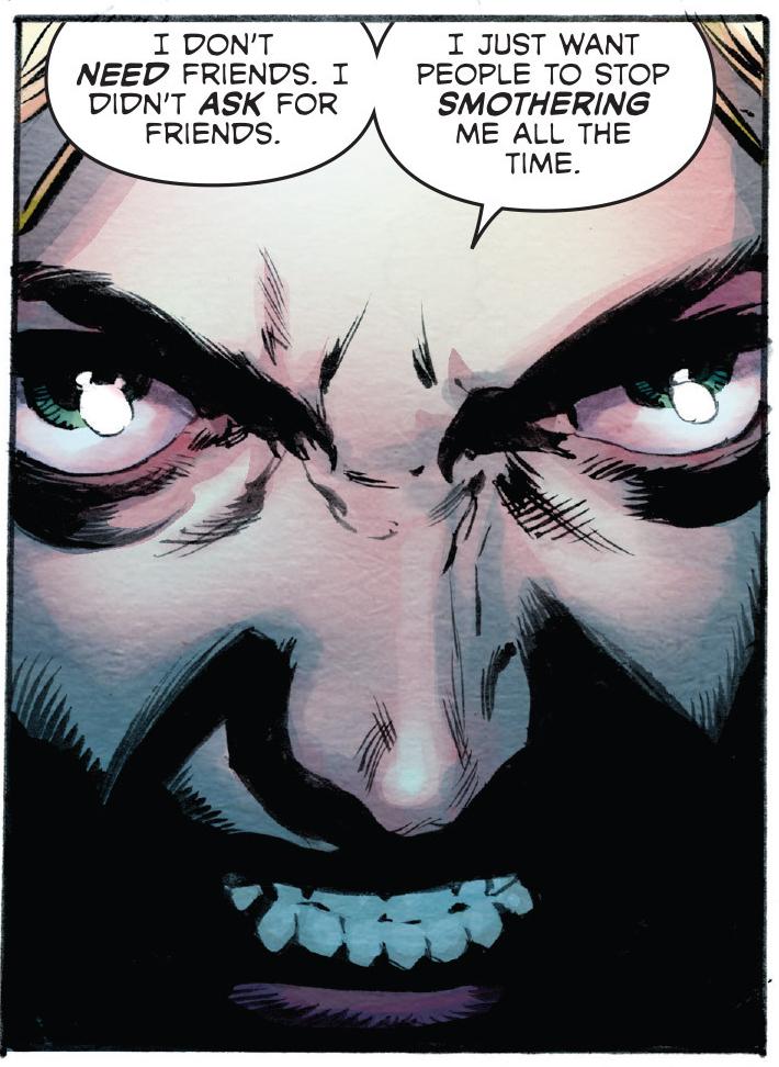 P25 Whether Katie makes use of Emily’s villainous exposé or displays the proverbial heroic fortitude, she manages to run from the room, her would-be-ripper in pursuit. In P26, Katie gets pictorially trapped by Emily’s dark figure, as her arm cuts off the panel and gives her only a narrow window of (visual) escape. While there could be some dark humor in Emily “seeing” her verbally as well as visually, since Emily is the one engulfed in shadow, the danger in this case is fixed on the protagonist, since Emily is facing away from the reader. 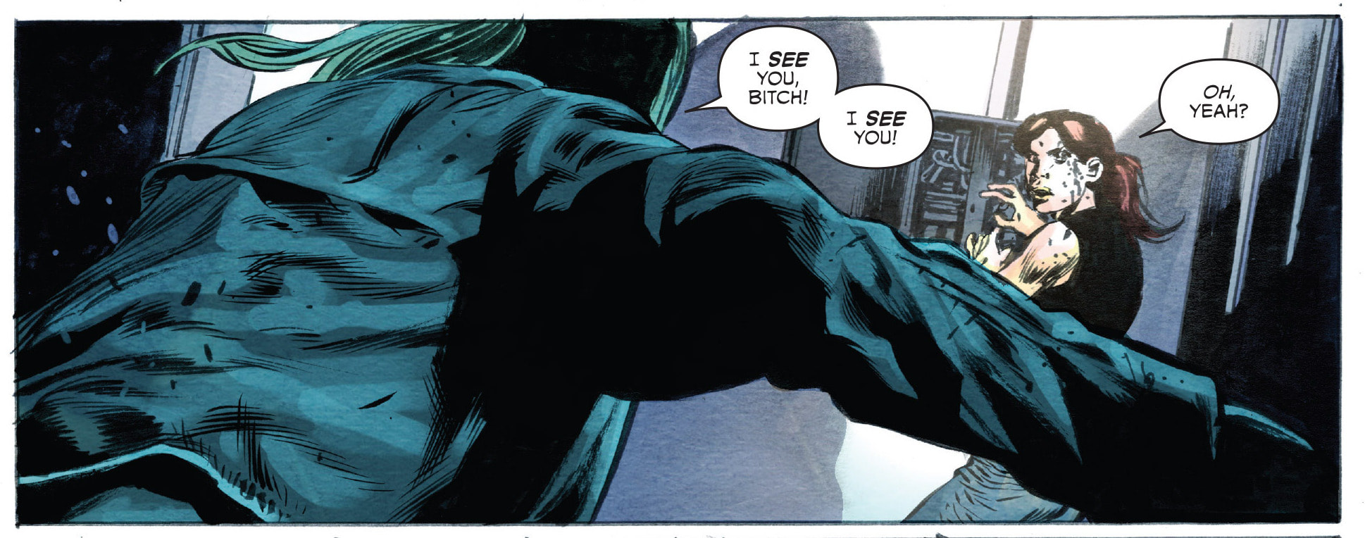 P26 To keep the tit-for-tat game going, Katie herself cuff off the electricity of the house, catching up to the events at the beginning of the comic. Pictorially, this gives the authors a chance to present the reader a different view of the action, this time with greater awareness of the narrative in progress, plus an opportunity to tie up all the loose ends … particularly referring to the instances of intentionally vague depictions which served as a plot device. Emily’s dark pursuit gets interrupted by James, who came back to check on Katie. Along with Katie’s distress call this interestingly stacks the deck against the villain, not just the protagonist who is caught between the ghosts and the murderer. After Emily swiftly kills James as well, she turns her attention back to Katie, who is beginning to realize that the ghosts are becoming more a nuisance than a threat. The real revelation comes when she realizes that the ghosts are not aware of their death and are essentially “living on” in ignorance, symbolically ignorant of their essential unwontedness (especially as it relates to Emily). If we compare P27 to P2, we see the change in Katie’s perception and POV, as both the reader and her become to a large extent immune to the large BARAKOOOM sound effect that echoed so boldly at the very beginning. While Dylan rushes after Katie, her expression in the two moment-to-moment panel transitions gives ample evidence of the heroine’s strength and growth in the story. The first panel (second in the P27 sequence) still displays shock, but the second one (fourth in the P27 sequence) is already defying. This is stylistically stressed by the oblique shape of the first panel (reflecting Katie being startled) and the (metaphorically) grounded rectangle that is the second panel. Note also the position of the word balloons in the latter. They visually continue right after the sound effect, making it as if Katie’s stoic response actually overshadows the large noise, but the balloons themselves also slightly cover the red tones in the last panel, not completely negating the level of danger, but downplaying it quite considerably. Arguably, the abrupt change in Katie’s expressions in these two panels can be more than enough to portray her steadfast approach, but the “hidden” pictorial details as described above add (subliminal) volumes towards immediate recognition of the intended narration and reading gratification itself. 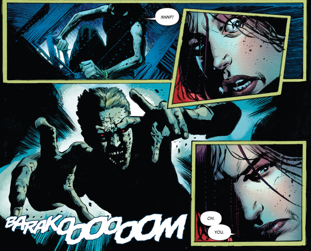 P27 We are inevitably led to the final faceoff between the protagonist and the antagonist … and a whole bunch of ghosts, of course. Katie’s realization of how ghosts seem to work and her power of perception make for a potent combination. Despite the fact that she is caught smack in the middle of her opposition’s home base, she realizes that the ghosts are a hindrance to Emily, not her, which leads to Emily slowly getting overpowered by them … or through her own subconscious, if we were to take the ghosts as metaphor of her own egomaniacal rage and perhaps even deeply rooted guilt. P28 and P29 pictorially capture the process of Emily getting engulfed by her “loving” ghosts. The first panel begins her downfall, as the two-tier narration makes her realize too late what is happening, while the reader can immediately see the ghosts closing around her. At this point, Emily is still on her feet and her balloons can symbolically be the last-ditch effort to pictorially separate her(self) from her surroundings, to remain relatively safe in her own mind and thoughts (expressed in the balloons). The ethereal nature of the ghosts, however, goes beyond the linguistic depictions (in other words the ghosts don’t speak) and since she is left without her charms and booby traps, she is about to implode. 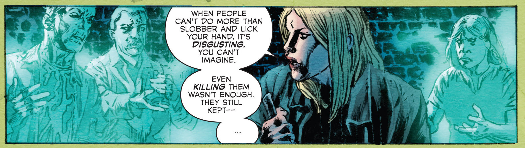 P28 The ghostly love is clearly overwhelming for the antisocial killer and even her weapon of choice cannot help her. Pictorially, her vortex of ethereal smothering is strengthened by the light blue color of the blade alone. Since the ghosts are of the same color, she cannot hurt them either way … Where’s the salt, when you need it … Last but not least, the non-threatening color of the panel boarders strengthens the fact that the element of danger (previously established by the red and black) has indeed shifted. 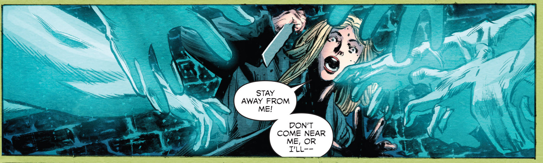 P29 Although Katie gets a hold of the knife, she lets Emily get consumed by the spirits. As she flees the house (assumingly) for the final time, she crumbles in the puddle outside, figuratively lying amidst the horrors of the events. The adrenaline dump after any kind of strenuous ordeal is reflected in the following swift conclusion to the story. (Plus, water is a long-standing symbol of change.) As Katie attends James’ funeral, the obligatory ceremony of the final rite of passage briefly touches on the issue of what lays beyond life (or death). Although Katie’s despondent expression in P30 can be expected as the coffin is being lowered, the message in this panel is actually more uplifting. The view from within the grave outwards reveals a U-shape that extends upwards, away from the dormancy of dirt and leads towards the sky (freedom, life), pictorially engulfing or leading Katie upwards as well, all the while the minister verbally expresses the Christian notion of afterlife. The potential for hope is clear. 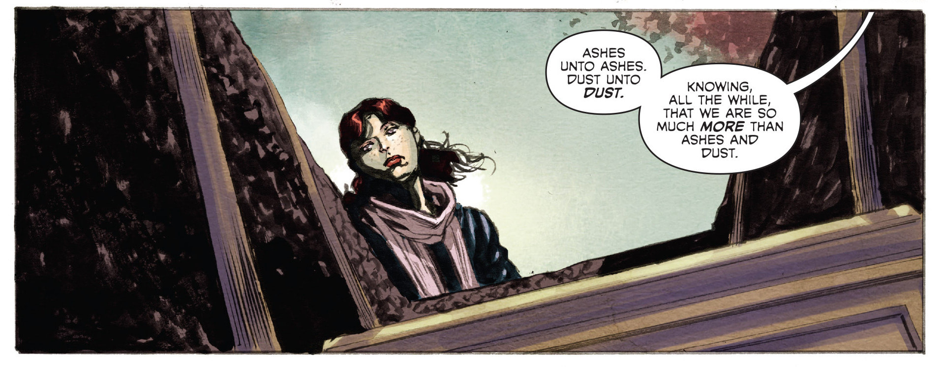 P30 As Katie prepares to leave back home to attend her parents’ funeral as well, the heroine’s state of mind remains in flux, as the motives of dread and hope continue to interlock until the very end of the comic. Arguably, her emotional agony of losing most of her loved ones is an instance is rather incomprehensible to most of us. We can imagine this as the interplay of her positive attitude as the protagonist in this story (the prototypical heroine who has overcome the physical demon) and her actual dark emotional reality as a person (the demon within her psyche still remains). This is visually evident in her farewell to Theresa (P31), as she takes responsibility (and blame) for the death of her loved ones, yet relates a strong message of telling the truth and facing the reality of what has happened at Rowans Rise. Trying to find reason in all of it as she walks away, the bars of the cemetery gate become the bars of her psychological prison … a symbolic extension of Emily’s own (spiritual) entrapment. One final question we can ask ourselves, however, is whose prison it actually is. Who is really behind bars: Katie or Theresa (with the rest of the community there)? 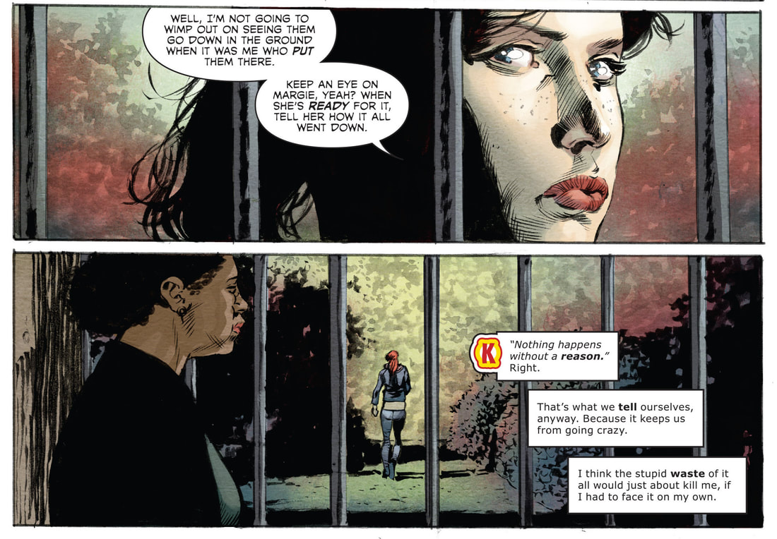 P31 Katie, nevertheless, standing tall in the end (P32) takes her final jump forward … in mythic fashion. As the heroes of old have always inevitable stood alone, because their journey was not for them alone, but for the larger social environment they find themselves in. Consequently, Katie may indeed be leaving, but she has served the community there by solving the mystery and hopefully bringing some semblance of peace to Rowans estate as well. While collateral damage (regardless of its psychological or ideological range) is a demanding necessity in the story (if not life as well), the personal progression that hopefully leads to social progress as well should always be a goal to strive towards. The concluding image of the comic is an appropriate splash page of Katie being flanked by the ghosts of what we can presume to be her parents and James. The concluding conundrum or rather a rhetorical question of Katie’s narrow path in life (as the mythic heroine) that is nevertheless accompanied by ghosts (as the heroine’s helpers) also gives us one final nod to Hamlet and surely answers the question of who is left behind bars as stated above; namely, no one (except perhaps Emily). 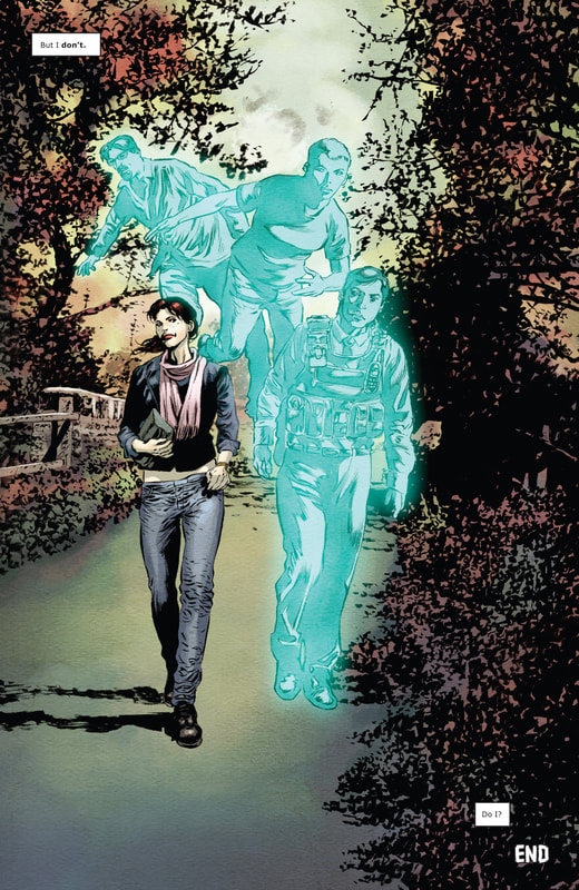 P32 The question of being and nonbeing, however, in this case takes on a different façade, because the supernatural reality of the narrative in this comic extends the fatherly ghostly motivation for Hamlet. While the prince’s execution of his predicament (tasteless pun intended) and its outcome may be quite different, Katie in the end leads the path of denouement with a paradoxically nifty turn of events. A happy ending to a ghost story? How ghastly, indeed!
If I try to sum things up, Rowans Ruin is a comic that captures some of the essence of good horror narrative: supernatural intrigue as plot device, psychological horror, interplay between the physical and the spiritual, humor, sex and (since this is indeed a comic) appropriate use of sly (if not subliminal) visualization and color. Having recently read Emily Carrol’s horrifically marvelous Through the Woods, Rowans Ruin creepily continued my current taste for the supernatural, although through different style, structure and technique. The biggest issue might be that the story (particularly the conclusion) feels rushed at times, especially considering that the authors are obviously no slouches when it comes to deep, epic storytelling. Mike Carey in particular excels in long narrative arks where his vast knowledge of mythological backbones of modern stories shines through the mastery of ideological interpretation of current, popular and political affairs. As the above examples show (without even mentioning the exceptional covers of all four issues), Mike Perkins’ artistry flows seamlessly, as he captures the eerily essentials of Carey’s verbal vigilance, while Andy Troy’s coloring unmistakably captures the emotional extremes (of darker red tones and gentler, ethereal blue hues for example), all to the point where the reader recognizes the narrative fluidity from the first page onwards. The shock value and mystery of the first pages lay down the foundations of this house of horror, but it is the twists and turns and continued rise of the stories of the house that is Rowans Ruin that make the reading experience beyond enjoyable. On a personal level, my initial idea was to do to a more general review, but as I began writing, it just felt more natural to engage in a bit more in-depth analysis, in the process indulging my own voracious appetite for comics reading, while applying scrutiny and expressing appreciation for the creators and their work. The game of interpretation is always fun to play, but the trick is in trying to find balance between structural analysis and pure fandom, where the first can lead to overinterpretation and the latter can succumb to subjective blindness. I admit I can go overboard with just such rhetoric when I get in the zone of visual analysis, however, I would like to think there is merit in trying to understand the basics of narration/storytelling and providing a (hopefully) meaningful account of the good, the bad and sometimes the ugly of the subject matter. Hence the title of this (again, hopefully) series of enhanced reviews that will explore the ins and outs of (predominantly) comics. Just like comics were said to be the bastard child of literature and art proper, yet proved to be the heir to the visual narrative throne, I hope that How it works series will bridge the gap between academic inquiry and popculture appreciation, because comics still seem to be for the most part parceled between the two often ideologically opposing approaches. Similarly, as the Buddha’s proverbial middle way is hard to achieve, let alone sustain, it is nevertheless a valiantly potent goal to have and to share the results with. All picture references taken from: Carey, M. and Perkins, M. (2016). Rowans Ruin. Los Angeles: BOOM! Studios.
0 Comments
VISUAL COMMENTARY: VESNA NICHEVSKA #1 Before I get back into the swing of writing, here’s another take on Vesna Nichevska’s art to satisfy my weird taste for visual analysis (or commentary, as dubbed in the more swagalicious title). The choice of the four pictures is more or less random, although perhaps I subconsciously chose some of those that immediately sparked my attention. When I analyze comics, pictures and art, I generally don’t want to dwell on them too much beforehand. It may sound weird, but when I’m writing about it, I want to go all in at that particular moment and just open my mind to it, so it comes off more pure, genuine, instinctual or whatever else you wanna call it. To me, it’s a toss-up between longwinded commentary and an on-the-spot analysis. At the end of the day, if you’re good at something or at least if you’re keen in a particular subject matter, you should be capable of both: explaining it in detail and giving the spark notes on it (if that’s still a thing). Hell, even if you shit the bed with your analysis once in a while, you’ll at least be nice and warm in the drizzle of your own rhetoric. So, without further ado and with much more beauty than Montezuma's revenge in mind, here we go! 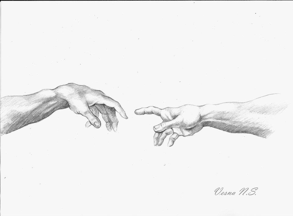 Untitled For all lovers of classic art, any rendering of Creation of Adam is a very notable and potent image. Over the years, this fresco has become Michelangelo’s most famous part of his world-famous painting of the Sistine Chapel ceiling. Creation of humanity and all that good (and bad) stuff that followed suit will forever be a topic of discussion … even beyond religious notions. You know you’re dealing with a potent symbol, if the whole of Michelangelo’s masterpiece work has become summoned up or stylized by this depiction of Adam’s and God’s hand (almost) touching. As it pertains to Vesna’s drawing, she managed to capture the forms of the original. A lot can be said about the whole image, especially as God’s cloaked menagerie has been linked to actually represent the brain, adding reason and intellect to the religious dimension of the fresco, but that’s not really the point here. As the touching goes, there is obvious passivity in the left hand (Adam’s left hand), as the fingers are sloped or at least in a more normal/non-strenuous position. The right’s hand (God’s right hand … not the right hand of doom, sorry, Hellboy) with the index finger stretched out towards the first created (hu)man is the active part to the passive recipient of life on the left. In the picture of just the hands, Adam’s hand seems more elevated because it’s resting almost nonchalantly on his knee, but his wrist is lowered. Since the respective torsos have been cut, Adam’s hand may seem more visually imposing as it actually is, plus the fact that God’s hand is reaching to the left or “backwards” perhaps adds to the delusion of grandeur. As it pertains to Vesna’s drawing, she managed to capture the forms of the original. A lot can be said about the whole image, especially as God’s cloaked menagerie has been linked to actually represent the brain, adding reason and intellect to the religious dimension of the fresco, but that’s not really the point here. As the touching goes, there is obvious passivity in the left hand (Adam’s left hand), as the fingers are sloped or at least in a more normal/non-strenuous position. The right’s hand (God’s right hand … not the right hand of doom, sorry, Hellboy) with the index finger stretched out towards the first created (hu)man is the active part to the passive recipient of life on the left. In the picture of just the hands, Adam’s hand seems more elevated because it’s resting almost nonchalantly on his knee, but his wrist is lowered. Since the respective torsos have been cut, Adam’s hand may seem more visually imposing as it actually is, plus the fact that God’s hand is reaching to the left or “backwards” perhaps adds to the delusion of grandeur.   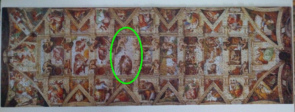 Vesna captured the essence of the hands as they were intended (note, this picture obviously wasn’t traced). The beauty of her depiction is in the purity of the white background and just the black/dark gray of the hands, so you get the point of the hands across even better than in the original, where either Adam’s knee or cracks of the fresco in the background actually hinder the symbolism of the hands a bit … as if to say that you know that you are only seeing a detail of a much larger whole, so you want to zoom out, but as you do so, this monumental hand gesture gets lost in the shuffle of the rest of Michelangelo’s majestic interpretation of the Genesis story. Less has proven to be more once again. 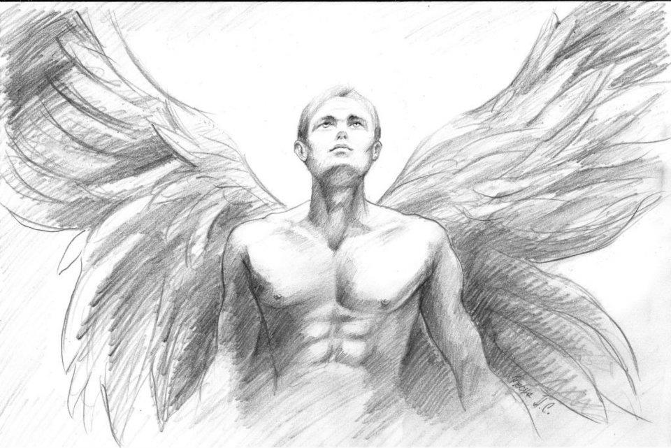 Untitled Continuing the divine theme, Vesna’s second drawing features an angel. (At least I’m calling him an angel.) The figure occupies the central position in this medium shot, with his extended wings in the X position, symbolically protecting his back and stressing his centrality in an X marks the spot type of thing. Or they might be extended to just fill out the picture and make it immediately clear they are in fact wings and the being is of the angelic kind … if his young, pure, angelic face wasn’t enough of a clue of course. His gaze is facing upwards, either towards God, the heavens or maybe to make him look a bit more exalted. Yet, while he may feel sublime, he doesn’t seem superior, which makes him more sympathetic. The shading is bottom-heavy and creates contrast with the upper part. The “angelic” whiteness above his head extends beyond his wings and his (and our) gaze, while his torso is “grounded” in his chiseled human form and lowered hands. Overall, a very clear, clean and uplifting picture. 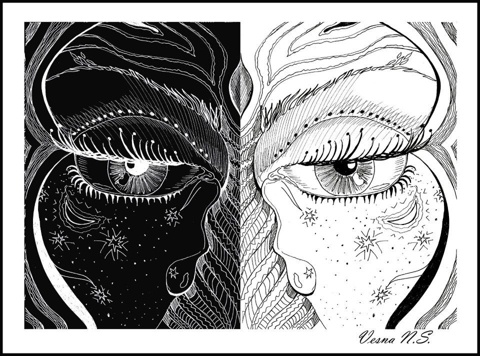 Untitled If I can make another segue, the contrast is even more apparent in the next picture, where the two black and white positive and negative halves form a close-up of (surely) a female face. Because of the stars and crescent moon on her respective cheeks, the first association here is with magic and the divine … which carries over the angelic theme from before. Although her eyes are half-opened, her look is a bit mysterious and strong, partly because of the contrast as well, since the focus in the darker left half is on the white pupil and white eyelashes, while the opposite can be said of the lighter right half. Since the eyes are half-opened, the eyelashes function more prominently, because they fill up the negative space directly above the eyelid and under the eye socket. The curved outlines of the face are also enhanced. These softer lines give the diametrically separated (and united) halves more balance and make the overall picture both stable as well as fluid. The fluidity is apparent in the tree-like structure stemming from her nose and like tree branches extending over the eyebrows (or rather forming them). The mythological context of the sacred tree functions as the central stabilizing force (axis mundi) of a culture … and yet can bend like branches in the wind or her gaze as she goes through the manifold stages and changes of life. The tears running down from the corners of her eyes also run down the trunk of her life-giving tree form, is a sense watering its hidden roots and providing fuel for life. The duality of her gaze thus continues metaphorically through the duality of her mournful tears. These tears function as the necessary energy that might enhance her third eye above on the forehead as the eyebrow branches split apart. This is another contrast between the stability, centrality and insight of the third eye and the tree branches that expand, separate and enhance the overall visual portrayal. Clearly, a picture that grips you with its gaze and captures your imagination. 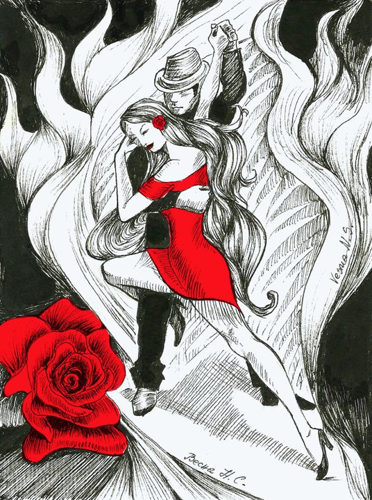 Untitled The last drawing analyzed in this post features a pair of dancers in emotional embrace. The dichotomy of black and white from the previous picture is contrasted here by the dance of the male and the female form, plus it adds the volume of color. If I go along the traditional definition of black and white as representing the respective absence and absolutism of color(s), red is the power that draws you in and connects you to the passion, heart and love portrayed in the picture. Both the large red rose and the woman’s dress (lady in red?) are what is immediately noticed, even more so than the form of the dancers engulfed in the flames of passion and movement. Given the woman’s dance move and the man’s outfit and the overall burning embrace, I’d say they are dancing tango, but that’s almost beside the point, because any form of dance can be passionate, especially if love is the main ingredient for the dancers in question.
The unity of red, black and white is the most potent contrast for my taste, because it connects the three most powerful and pervasive colors we have … plus, I’ve been a sucker for this combination since studying the expressionistic mastery of Hellboy. But back to the point: contrast of male and female, the yang-yin of passion, is enhanced through the male position in the background as the stabilizing, stoic force and the female embracing him with her leg, her more visibly expressive (“stretched”) position and a more romantic placement of her head on his shoulder. Also, her locks of hair embrace both of them and connect them to the white fiery locks of their background. A beautiful display of dance, love and art! Once again, thanks to Vesna for letting me use her art. You can find and follow her at: https://www.facebook.com/vesnaniche/ EMOTION “The aesthetic element is present in all visual accounts attempted by human beings […]. Perceptual and pictorial shapes are not only translations of thought products but the very flesh and blood of thinking itself and that an unbroken range of visual interpretation leads from the humble gestures of daily communication to the statements of great art.” Rudolf Arnheim: Visual Thinking (1997); pg. 134 We can observe that shapes in comics serve two general purposes: to show or reenvision the world through the eyes of the author (and consequently the reader) and in doing so express emotion, which I would say is by far the most obvious and important aspect of all art, even beyond the ideology … I dunno, maybe I’m a romantic at heart. You would be hard-pressed to find any type of art in any type of medium that is bereft of emotion … and what is more, does not capture emotion or imagination of the observer of said art. Arguably, evoking emotion and an emotional composition may be two different things altogether, but they still reside within the same frame of reference. Art pieces are envisioned by human creativity through their unique emotional capability to be experienced by their followers, instilling emotion in their own right. It becomes an emotional hermeneutic cycle (of the wheel of life) and with each turn of the wheel, potentially more potent emotional responses are given birth to. The pictorial principles in art may be more or less deliberate and intricately created. There is always interplay between the intended and the perceived. Nevertheless, we are aware of the emotional forces, even if they work beneath or beyond the conscious level. Just as our eyes can be deliberately “tricked” towards moving in a specific direction, tracing a path through a picture or over the panels on comic page, we are emotionally invested in doing so. If not, we see far far far less than we actually could … Hence the reason why some lunatics like mu are able to stare at a painting in a museum with a still gaze for many minutes. I mean, I’m not complaining, it’s exciting and eye-opening, but my advice is don’t go pic-gazing before the museum closes, because skimming through works of art is like eating soup with chopsticks … it gets (c)old very fast and you’ll go hungry. In any case, art of any kind has historically served many different purposes: from preserving the aristocratic image through numerous portraits, prolonging cultural/religious imagery to experimenting and extending the gaze of techniques and points of view … from the prehistoric cave paintings, through seemingly perfect classics towards postmodern reimaginings and multi-modal expressions. Nevertheless, the prevailing factors in and of art have always been the emotional responses and emotional investments from the observer. (Obviously, I’m referring predominantly to visual art proper, even though even this broad definition has always been rather flimsy.) Even the most pragmatically-oriented, science-based research yields to emotional factors. Knowing a particular structure or organization of a work or a discipline may foster further understanding and enriches the personal experience, yet we cannot escape the fact that even the most formalistic research was done because it was deemed important enough. In other words, there are levels of emotional investment present there as well. In a weird way, objectivity in scientific research goes hand in hand with emotional investment, which is based on pure subjectivity. And yes, even theoretical research has an emotional component hidden within its loins; quite simply, if the researcher is not invested in the subject matter, the result will be underwhelming. Apathy breeds blindness. Now, while too much zeal can make you prone to hyperbole, criticism for the sake of criticism also leads nowhere fast. There’s always a balancing act, the middle way if you will. The drive for expanding one’s knowledge is essentially subjective and ego-driven, objectivity as such is only partial; whether the goal is to prove or disprove a hypothesis, the investment becomes personal because it’s about personal creativity, which in turn has merit only in a larger social (critical) environment. Just as perception becomes emotional, interests are merely its outcome. Even the “guise” of an academic analysis is essentially subjective, since it reflects the researcher’s personal choice of the subject matter, but the goal can paradoxically only serve its function as an elaborate guide for readers and other researchers … in other words, hermeneutic cycle at its best. 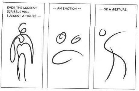 I like to use this McCloud’s example for various reasons, primarily because it’s self-explanatory and because he deliberately created it within his own theoretical research, so it fits rather nicely into this context as well. While the words in comics have been for the most part heavily stylized and more often than not tend to be excluded from expressionistic portrayal, pictures themselves thrive on expressiveness and become the main vessel of human potential. I’ll conclude with some emotionally impactful art by Vesna Nichevska. Since she has a large collection of drawings and paintings, I’ll use more of her art as examples or pure visual analysis in future posts. You can find her at: https://www.facebook.com/vesnaniche/ 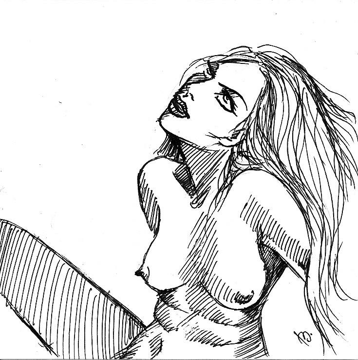 Anticipation The desire in the eyes, tilted head, slightly opened mouth, hair already slightly ruffled and looking up at her lover … all emotionally powerful and perfectly capture her anticipation. 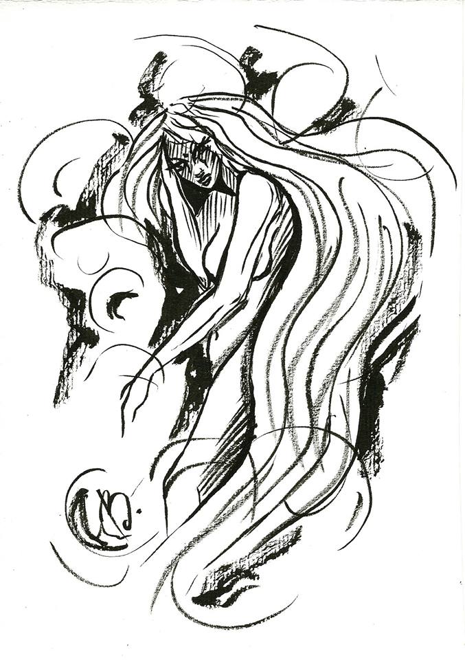 Desperation Gazing look, yet head lowered slightly and engulfed symbolically by her hair and the desperation of her emotional stress. Darker patches directly around her add to the contrast as well as her state of mind, perhaps some anger and despair mixed together as well. 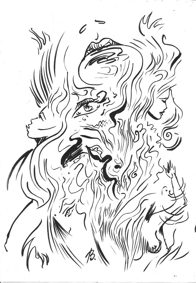 Fire The flames are engulfing the various female faces that could be symbolic of only one female or the artist herself. The impact of the image is enlarged through the focus on various eyes and lips, where curved lines extend upwards and like a flame burn brightly and ferociously, but only for a while … so you have to experience the fire at its peak. 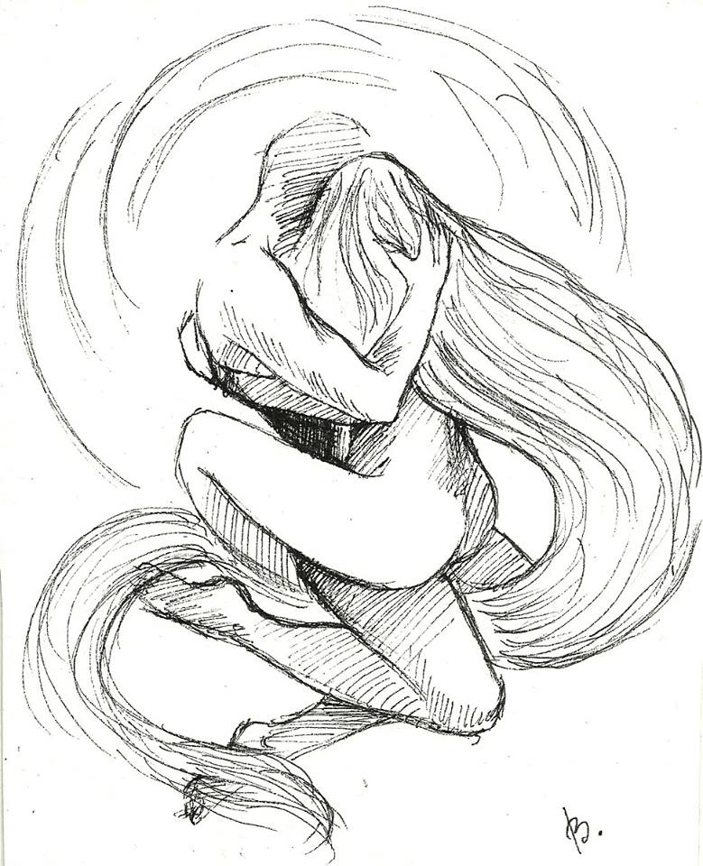 The dance of passion The embrace of lovers, of two becoming one, the yang-yin of passion, where both halves are appropriately stressed by the hair that symbolically encircles them. His hand on her hair and her embrace indicate love and passion, not merely emotionless sex. The faces get lost in the dance, just at time stands still when love is sublime.
And that is just a morsel of how powerfully emotions can almost effortlessly work their magic in visual imagery. Especially in Vesna’s art. COMPOSITION: GOLDEN RATIO (Part 7) While the application of balance and (a)symmetry is central to art, we can observe an interesting phenomenon, which may in fact transcend expressiveness per se and move from the “mere” artistic paradigm towards a universal property. I’m referring to the golden ratio or the so called divine proportion, mathematically (visually rather fittingly) represented as phi or φ. The golden ratio reflects how the whole is compared to a larger part exactly as the larger part is compared to the smaller one.  Essentially, this principle extends beyond the lineal presentation, so we can distinguish everything from the so called golden triangles, rectangles, to spirals, the Fibonacci sequence and more.  The spiral of the golden ratio that can be mathematically observed through the Fibonacci sequence and is reflected among other things in the architecture of the Parthenon (which would coincidentally surely be one of the Ancient Wonders, had it been built earlier). Bearing strong connection to ancient philosophies and religions, such as the Hindu tradition, the symbol of the golden spiral seems to extend beyond eternity, celestial power or even bodily energy, if some accounts about this philosophical and ethereal concept are right. Consequently, this principle becomes universal, as it is viewed not merely as an equation, a graph or a feature of design, but can be observed in nature itself; from snowflakes, shells, the pyramids to the great spirals galaxies.  Symbolic representation of natural forms from waves to plants that exhibit the principle of golden ratio. Also, bear in mind the divine presidency!  If all else fails, play the trump card! Unity and the dynamic variety of the golden section reflect its use (or rather appeal) in art, while socio-political readings, also through Aristotle’s golden mean (aka the middle way), offer connections to the interplay of the individual (personal) parts to the larger (social) whole. While this cosmic design may be so pervasive that we have paradoxically internalized it to such a degree that we are essentially blind to it, it's stressed here as a kind of universal archetype, the balancing act between the relationship of the whole and its respective parts. I if try to conclude this seven-part run on composition, I was brainstorming some principles that I’ve come across though various means, either directly in comics or merely theoretically. I’m sure I left some out, while there are more to be discovered or maybe I’ve given too much emphasis on the one’s I’ve written about … but they nevertheless feel interesting, consistent and impactful enough to merit at least a mention. And the word feel may capture the appropriate expression for all of it; namely, the underlying principle of emotion and the personal touch in any art you either devote your life’s pursuit as an artist or appreciate and cherish with your eyes and soul of a spectator. Essentially, we’ve seen that there are different types or aspects in a given compositional feature, so understanding specific parts of visual compositions, artistic intentions and the holy context is vital, if you want to know more about artistry in general. But the beauty of all of it is that you can appreciate any given piece of art without knowing anything about the subject matter or the artist, if said piece simply touches your emotions and imagination. However, if that happens, more often than not you will take the time and effort to learn more about it. A beautifully vicious cycle! And all in all, that’s the true beauty of art! COMPOSITION: BALANCE (Part 6) I have already touched on the notions of symmetry and asymmetry, since they are connected to contrast. However, I’ll touch on them in this context as well; namely, as referring to balance. While for the most part we discuss it more within the frame of art proper rather than comics, balance is an artistic property of things, whose importance cannot be understressed: “Art is an experience of balance, of the relationship of its parts to the whole. Perceiving it as anything else is missing its most fundamental component […], organized and gracefully balanced around a hidden sense of proportion.” (Priya Hemenway: The Secret Code: The Mysterious Formula That Rules Art, Nature, and Science (2008); pg. 91) While this quote is related to the aspect of golden ratio that will be discussed in the next part, its essence applies to balance as well. Balance seems to be a key proponent in all art that stems from the basic human nature and can be connected to the formalistic arrangement and understanding of every aspect of said human nature. If our ancestors had somewhat similar traits as we do, we can say that we have always wanted to make sense of both ourselves and the world we inhabit. Balance is a measuring stick of our coconsciousness that can be actually traced from the seeming chaos and randomness of the universe on one hand and order within galaxies and solar systems on the other (again, part of the golden ratio). Balance is an arrangement of elements within a picture that carries pictorial weight. Like gravity, every element within a picture carries “weight” and affects one-another, regardless of how insignificant one detail can be … and remoteness, isolation or smallness often gets stressed or contrasted by its very nature. Consequently, every element attracts the eye. In such a way, a snowflake displays a similar symmetrical balance as a vortex or even a black hole, everything stemming outward from a point or a singularity (obviously taking two and tree-dimensionality into account).  Balance in van Gogh’s Starry Night is evident becomes of the interplay of the “erupting” black cypress tree on the left, the subdued bottom scenery and the playfully stars in the sky. The “weight” of the picture gets distributed between these three features of the scenery and creates balance that may not be obvious at first glance. Pictorially, symmetry is more eye-pleasing and functions more precise when we want to make things as clear as possible. Such instances can be found in the digital world, where icons, symbols for apps and avatars are for example placed in a central position of a given background. From such a perspective, aesthetic clarity is key and there is no room for complex, abstract artistic expression (of let’s say a Kandinsky), when wider acceptance is the goal.  Symmetry in Michelangelo’s frescoes on the Sistine Chapel ceiling. The grid creates the backdrop on which and through which the biblical events and rendered. The amalgamation of the various scenes is in balance as are the stories part of the “symmetry” of the mythic/religious scripture. We have different types of balances for different compositional takes. The easiest way to imagine (a type of) balance for me is through so called steelyard balance, which functions like a counterweight. If there are many close objects in the lower part of the picture, this can be balanced by a smaller, distant object in the upper part. If we go back to the Starry Night, the distant moon in the upper right corner of the picture displays steelyard balance in relation to the large cypress trees that looms in the bottom left side of the foreground of the picture. Essentially, a larger element on one side of the picture is balanced by a smaller isolated one on the other side. On the other hand, just as much as art in general is subject to symmetry, it depends heavily on asymmetry as well. The human body itself is a physical example of bilateral symmetry, while we express what we see in ourselves and the world around us. Asymmetrical balance may be less easily understood and observed, but it adds vibrancy, freedom and feels more “real”.  Asymmetry in Kandinsky’s Bustling Aquarelle. The central circle is flanked by the four corners/parts of the picture that are thematically different and yet relatively equal in terms of the picture as a whole. There definitely is balance and beauty within the seeming madness of lines and color here. What symmetry does for the concepts of aesthetic appeal and mathematical unity, asymmetry extends towards differentiations and even biological mutations. In other words, both concepts are equally important, keeping structural and ideological balance in a yang-yin-type interplay. Even the seemingly least balanced, random or abstract works of Kandinsky, Rothko, Mondrian and Pollock inherently follow their own respective art fields. It can be claimed that it is much harder (if even possible) to create a random, disorganized work than a realistic, balancing and pleasing one. This can be applied further. Even random thoughts are anything but random in the sense that they are governed either by the interplay of our subconscious and predisposition (aka. the personal) and the world that allows us to function as such (aka. the social). That’s why this can be consequently applied to all fields of human expression … meditation to boot, where suppression of random thoughts is akin to creating a disorganized canvas. Some more examples. The first panel in Picture 1 creates partial balance. Hellboy occupies the bottom part of the panel, while the hanging rope counterbalances his position. It needs to be stressed once again that such principles that are central to great works of art are displayed differently or at least for the most part on a smaller scale in comics, because the focus is more on the interplay of verbal and pictorial elements. The verbal elements in a panel, sequentiality, economy of space and strict deadlines all play a major factor, whether each and every panel can be a small masterpiece in itself, or the panel arrangement on a given page can display balance, symmetry, etc. Superb artistry of Picture 1 captures both the balance of the while comic page as well the cyclical/clockwise storytelling technique. All in all, understanding the basic principles of art in general and especially their consequent mastery and use within comics themselves, adds volumes to the admiration of the much underappreciated comics artists.  Picture 1: Mike Mignola et al. Hellboy Library Edition, Volume 2 (2008); pg. 38 Comprehension of centrality and the fringes of a picture may be conflicting, but I would argue that this functions more on a theoretical level. While Molly Bang (in Picture This: How Pictures Work) argues that central position means centrality of attention and the outskirts its fringe, Henry Rankin Poore (in Composition in Art) stresses the opposite by claiming that an element near the edge of a picture has more attraction. They are in fact both right; however, their point of reference is different. Bang’s position stems from the natural fact that elements at the edges function less important in a similar way like audience in a theater, where the actor on center stage is the one in the (quite literal) limelight. Further, since human peripheral vision is of relatively low resolution, we see clearly only what is directly “stressed” in front of us. In terms of “clarity”, the use of blurring and motion lines in comics is for example not merely a neat pictorial device, but resembles the natural human visual (in)ability. Rankin Poore’s position is that of balance and contrast (in paintings), where an element at the edge gains attention by proxy, since it is in sharp contrast to its counterparts. Also, centrality loses its power, since the greatest works of art tend to imply movement, have balance and lead the eyes away from the center of gaze towards the equally important elements on the outskirts, essentially visually completing the image. Movement is of course one of the staples of comics … i.e. the cyclical nature of the first five panels in Picture 1. Again, this seeming paradox of two equally valid theoretical points of view is in fact not confusing at all when viewing any work in question from a particular position (echoing the previous statement of multiple types of balances). And we do that all the time and in any endeavor. References, general comprehension and background information play a vital role both in understanding different positions in art as well as understanding myths that offer a multitude of meanings (with paradoxes galore to boot). Of course, there are just two general examples of theoretical divergence that is essentially a matter of perspective. Through a similar approach, different art styles and techniques offer both distinction as well as interplay of artistic traditions within cultural evolution. I hope it’s clear by now that all these principles of composition may have a powerful individual role, but for the most part appear united and thus affect one-another. This interplay can lead towards strengthening of a particular element and can provide a new, unique experience, or can lead to conflicting situations (either intentional or unintentional). Strengthening can be observed in Picture 2, where the darker tones, sharper lines, higher position of the creature and its attack from behind all strengthen the notion of danger, despite the fact that the protagonist is Lucifer … a splendid little ironic leitmotif in the whole Lucifer series. 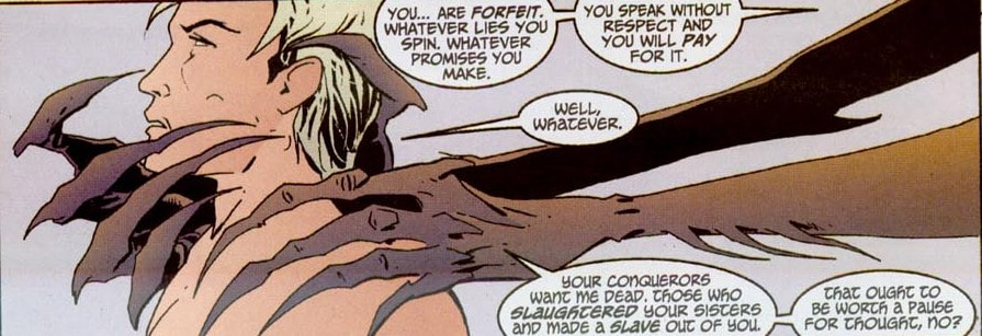 Picture 2: Mike Carey, Peter Gross et al. Lucifer: Book Two (2013); pg. 203 On the other hand, Picture 3 exhibits a unique experience, where the visually-enclosed position of Hellboy creates an uneasy atmosphere, yet his nonchalant answer reassures the reader that he has had numerous experiences of danger, creating a dichotomy of meanings. Plus, not the balance of the balloons in relation to the weight of the characters.  Picture 3: Mike Mignola et al. Hellboy Library Edition, Volume 5 (2012); pg. 37 Again, I know it’s visually more appealing to give fresher examples, but I just love reusing these examples over and over again, because you can clearly see the genius in their creation and just how much theory and application can work hand in hand. And I will always argue that comics is the best medium for linear visual expression. Honestly, I’ve seen too many examples of comics (meta)greatness that it’s hard to argue otherwise. Gotta love it! NEXT: GOLDEN RATIO COMPOSITION: CONTRAST (Part 5) Contrast is a fundamentally crucial principle that may like the gutter in comics paradoxically go unnoticed. The reason for this is that contrast in art is so prevalent that it is far too often taken for granted. However or rather consequently, it actually works on a deeper level. I can full-heatedly say that contrast is the essence of art and creation in general. Even human perception of the world relies heavily on contrast. We perceive motion for example only after it has already occurred; therefore motion becomes intrinsically linked to its diametrically opposed stillness as a way of distinguishing changes in the perceived world.  Contrast of desert/sea (death/life) … or complementary concepts of stasis and growth. Just as these words on (digital) paper are viewed only because of contrast, so we distinguish characters by their traits and elements by their specifics. The clearest example of contrast can be seen in notan, a Japanese term meaning dark-light principle … or even the yang/yin principle of interaction between the negative (dark) and positive (light) space. To carry the philosophically ubiquitous dualism of yang/yin even further, the opposites complement each other rather than conflict … hence the perfection, fluidity and unity of the symbol [. This means that while contrasting elements allow for differentiation and notoriety, their greatest advantage lies in their mutability, since they inherently affect one-another. The perception of one directly depends on the position, size, color, etc. of the other.  Contrast in Monet’s Les Coquelicots is achieved horizontally though the separation of sky and grass, where the dark green trees in the background serve as “boundary markers”. We can see strong interplay between the red blooming poppies and the lush green meadow, not to mention the taller damsel in the bottom right who clearly stands out with her darker blueish tones. In such a way, the most obvious and natural function of contrast (and paradoxically the least noticeable since it has already been internalized), is that it actually enables us to see. Bearing this in mind, it would not be a bold statement in the least to claim that contrast is all we see … or do not see. Further, the more rapid the change, the (ideologically) stronger it is perceived: “Many visual perceptions, such as luminance, color, motion, and depth, exhibit greater sensitivity to abrupt than to gradual change.” (Margaret Livingstone: Vision and Art: The Biology of Seeing (2002); pg. 58) The starker the contrast, the greater shape and color value differences, the more noticeable it thus is, since the eyes are drawn to it. Even psychologically, we are shocked more by unexpected, unforeseen changes (whether temporal, material, etc.), while the gradual differentiations remain “concealed”, as they do not peak our responses in either extreme and we readily internalize them. We become accustomed to our everyday surroundings, so we easily take things for granted. In such a way, greater “contrast” is achieved when we partake of newer experiences. I’m well aware that this is an extension of the artistry/composition I’m discussing in these posts; however, the universality of contrast is one of those rare and precious things that extends to every facet of being, comics nonexcluded. Consequently, Hellboy in Picture 1 creates a stronger pictorial contrast based on his color and half-demonic species, while the dark, blue tones of the other three (human) characters have a stronger tonal connection to the woods all of them are traversing. Additionally, contrast is greater also because it’s a newer setting for both the reader as well as Hellboy as the protagonist of the story.  Picture 1: Mike Mignola et al. Hellboy Library Edition, Volume 5 (2012); pg. 37 We can carry the analogy of contrast further by extending it to all of our senses and the concept of life itself; the reason why one can distinguish jazz from heavy metal is contrast (speed and method of playing, instruments used, etc.), space observation and consequent equations are dependent on imagery scientists have to contrast to make sense of. Good and evil are equally prone to differentiation; not only observable through what is not part of one and central in the other, but in the essence(s) definable through one-another. Contrastingly paraphrasing, contrast as such is natural, since the comprehension between music and noise, speech and buzzing, or visual literacy and mere observance of visual stimuli is for the most part “only” a matter of distinctions, which in turn range from the most mundanely banal to the intellectually sublime. If contrast is “normal”, line drawings – essentially the accentuating work of inkers in comics – are on the other hand actually “abnormal”, since reality seldom offers strong, clear-cut (out)lines separating one element in nature from the other. Instead, we speak of borders between regions of different color or lightness known as contours. (Comics) artists thus enhance the contrast by adding a stronger division between the layers of contrast (even through penciling alone or inking). This enhances the reader’s ability for distinction, which consequently results in faster reading, more distinct although less “realistic” imagery. Without these contrasting distinctions, we would be in the presence of absolutism, either the absence/negation of everything (chaos) or the everlasting omnipresence (God), both extremes that extend beyond human physical conception, which is in turn but a liminal transference from one state (of being) to the other. Since I always tend to stray away from the artistry proper, I have another reason for it this time, even beyond the seeming universality of the subject matter. The conception of contrast was actually an aha moment for me. Not really a revelation, more of an eye-opening experience, since it connected various things for me to the point where everything just clicked (from my linguistics education to my research about perception and mythology). Once I truly realized that what we see, hear, taste, etc. is rooted in contrast, the worldly concepts took on a larger role … or a more nuanced one, if you care to look at it that way. Realizing, how authors for example subtly play with contrast and negative space alone adds an important layer towards greater comprehension and appreciation of art … and in this case life as well. NEXT: BALANCE COMPOSITION: TRANSFER (Part 4) The more abstract notion of closure is that of transfer, where connecting of dots occurs on a more symbolic level. To a large extent, abstraction itself is based on generalization and indirection, which means that we generalize the elements of the world around us and transfer them to similar ones in order to make sense of our surroundings. Just as much as all great paintings are basically just color on canvas, for the most part we perceive them not as abstract lines but as complete wholes. This applies to Monet just as much as Kandinsky, although their styles are a tad different. Just a tad. (Having had many hours of pleasure and pain in assembling art puzzles, this can also be a teaching tool for comprehension of both the basic composition of a particular art piece as well as realizing how transfer and unity work within the picture you’re assembling.)   Comparison of the style in Monet’s Les Coquelicots and Kandinsky’s Bustling Aquarelle. In puzzle incarnation to boot. Further, the visual information we actually comprehend is heavily filtered by numerous factors, from biological to environmental ones, so for the most part we are essentially living in “tunnel vision”, where the majority of visual stimuli is necessarily relegated to the peripheral. Similarly, mathematical equations are just as indirect, abstract and arbitrary, as is our knowledge of the universe based on them … which of course does not mean that it is necessarily incorrect. Transference then allows us to see common, easily understandable shapes in those that would otherwise make less sense, not to mention enabling us to see pattern within larger, more complex frames of thinking and reasoning. This is partly due to a deeply personalizing and personifying nature of humanity, but it is a fundamental feature of art in general. Think of the smiley face and how easy it is to see it anywhere and everywhere. We see ourselves as objects in nature; a tree can be seen as a standing person with outstretched arms and a keychain can look like a smiley face. Poetic personifications may not be far removed from this observation. Plus, probably my favorite idiom of not seeing the forest for the trees can be (mis)understood within this frame as well. Cognition plays a crucial factor here, since the perception of elements and imagery in the mind must not be limited to what you see in a particular moment, but you sequentially connect all the singular visual moments that unfold in front of your retinas into an integral part of a larger whole, the world around you. Just as we are able to reason that two circles and a line underneath function as a face, we can observe that the characters in Picture 1 are arranged in a circle (or at least are grouped together) which implies equality. This is further stressed by them facing each other in a conversation, which strengthens the notion that Hellboy is part of humanity despite his devilish origins. And despite the fact that his red color still makes him stand out as paradoxically as his plight to fit in (which further foreshadows short-term storytelling for this particular comic and functions prominently in the long-term Hellboy canon as well). Another reading based on the principle of transference indicates that the group is equally in danger in the dark forest (yet, Hellboy’s color scheme again indirectly distances him and his abilities beyond those of his companions or the world he finds himself in in that situation).  Picture 1: Mike Mignola et al. Hellboy Library Edition, Volume 5 (2012); pg. 37 Whether transference is direct or rather theoretical, it still adds volumes to the understanding of art. We can thus apply it also to allusion, allegory, metaphor and non-literary elements that make readings of any work as complex as its creation, yet through amazingly different personal layers. NEXT: CONTRAST COMPOSITION: CLOSURE (Part 3) “Perception is heuristic in nature – in order to speed up the translation of sensory data to conscious processes, our cognitive processes take short cuts and use generally applicable and broadly accurate rules of thumb to process the raw information and compensate for flaws in the incoming data stream.” (Levy, J. (2013). Freudian Slips: all the Psychology You Need to Know; pg. 121) I have already touched upon the notion of closure as an intrinsic element that allows readers of sequential art to bridge the gaps between the images and the gutter, experiencing a “continuous” narrative flow. I will elaborate it a bit further in light of current subject matter, since closure functions as a prism of visual experience. (Plus, as it is with “reuse” of pictures for different purposes, it’s always a positive when you can expand a concept into different venues.) For the most part we can say that we live in the present moment. Now, we do have to suspend our disbelief of how we process this present moment and how much we are hindered by the shadow of the past events and the looming echo of the future to come. Our present moment extends to the future events which we are continually entering into; yet, our past experiences allow us to anticipate them better, thus removing the shocks that would befall us otherwise. In comics terms, by “connecting the dots”, we are required to make sense of our daily lives just as much as we make sense of the story by connecting the panels. Technically speaking, we are using closure at every moment. We are connecting the dots repeatedly through blinking itself; however, we do not experience it as obstruction, since its rapid nature functions like film: a continuous series of images, creating the illusion of motion. Another simple, yet obvious example of closure occurs on a daily basis when we go to sleep. There is an obvious difference between the image we see when we wake up from the one before we closed our eyes. The difference may be merely temporal or spatial (if we wake up facing in a different direction), but the fact remains that our brain needs to make sense of the change in the surroundings, allowing us to visually assess the situation we are in. And as with comics where all the magic happens between the panels, life happens between all the sensory and empirical information we are privy to (if not faced with) at every single moment. I’ll reuse the double-page spread from Beowulf (2016, Image Comics) by Santiago Garcia and David Rubin as an example. Not only are the inserted small panels on a diagonal used to subtly guide the eye through the composition, but they add to the vibrant celebration at the dinner table (although it can be seen as the last supper as well). The focus on bones implies voraciousness of the feast and refers to the inexplicably hard times in the old Norse era, where food was often scarce. Indulging your primal animalistic urges comes to mind. The small panels are highlighted through the fiery yellow (contrasting) background and through their extreme close-ups. Artistically they serve as balancing forces for the whole scene, while also stressing the continuous flow of the meal, which marvelously embodies the concept of connecting the dots and captures the illusion of motion. 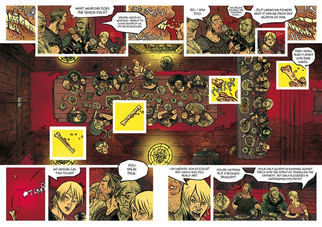 NEXT: TRANSFER The notion of proximity is in close connection to that of position. Elements placed together have for example greater weight and are generally viewed as more important, since there is visually more mass in their vicinity. This is further stressed when elements of similar size, shape and especially color are thus grouped. Proximity thus implies connection … On the other hand, however, it can lead to a loss of individuation. Consequently, elements in isolation can actually get stressed because they have a greater autonomy in this respect. While a detailed picture becomes weightier, the components that become excluded from the general accumulation of such mass feature prominently, because they break the pattern even despite their smaller size for example. For example: a comics panel depicting a large crowd is heavy in detail, but if you want to stress a particular person without “sacrificing” color and shape at that particular moment you can do so by merely positioning him or her slightly away from the main pack. Technically and practically speaking, this is a marvelous dualism. Picture 1 is very distinct in this respect, since the characters visually and metaphorically function as a group within the larger frame of the woods, yet within this proximity principle there is differentiation predominantly though color, since Hellboy clearly stands out. This is achieved through his (hot) redness, which is in contrast with (cold) blue and dark tones of other characters, visually linking them with the background – a clear example of interaction of principles.  Picture 1: Mike Mignola et al. Hellboy Library Edition, Volume 5 (2012); pg. 37 Panel 8 in Picture 2, on the other hand, exemplifies how a figure in the background, half immersed in darkness can stand out from a group of four characters, despite (or rather because of) being visually separated from them and thus occupying less physical space. While color is again resolutely the main reason for distinction, balloons further create an additional barrier of separation, while Hellboy and the rest of the characters exemplify pictorial balance.  Picture 2: Mike Mignola et al. Hellboy Library Edition, Volume 2 (2008); pg. 38 I know I used these two pictures before and there’s a ton of other example to be used, but the beauty of a particular example is in its reuse, because the more you get immersed into the theory of comicana and storytelling, the more any given depiction can serve multiple purposes. Also, the reader of a comic can often take panel shapes and positions, character or balloon placements and shot selections for granted, because the story just flows extremely well. Behind all of this functional ease lies laborious work and (for the most part) years of experience from the authors, so the final product is quite literally polished to even seemingly insignificant details. It helps to be interested in shop talk, reading the scripts at the back of some of the works and observing authors’ sketches and character study. All of this inevitably helps you better understand the often wacky world of comics that always offers far more than meets the eye. NEXT: CLOSURE “Perceptually, a mature work reflects a highly differentiated sense of form, capable of organizing the various components of the image in a comprehensive compositional order. But the intelligence of the artist is apparent not only in the structure of the formal pattern but equally in the depth of meaning conveyed by this pattern.” Arnheim, R. (1997). Visual Thinking. Berkeley: University of California Press; pg. 269 Along with basic shapes, there are other elemental principles in art that can add volumes to the expressionistic potential and perception of pictorial depiction. I label them under the term composition for the sake of emphasizing their cooperation and hermeneutic propensities. POSITION (Part 1) Position in a picture determines the state and importance of any given element in question. Thus, an object in the center of picture draws our attention the most, acting like a celestial star that has a gravitational pull on other elements, particularly when it is the largest. We get the central position through the application of symmetry (intersection of a dividing horizontal and vertical axis). The importance or at least validity of this central position may be in a manner of saying more a theoretical than a practical point. To clarify, I am referring to asymmetrical depiction, the so called rule of thirds (dividing both the horizontal and the vertical into thirds). By placing points of interest in the intersections of these lines, the artist creates a greater balance and enables a more natural depiction than the standard central shot. (Photographers use this technique in droves as well.) In other words, our eyes seem to be more adapt to viewing elements horizontally; stressing the peacefulness and stability of horizontals as opposed to verticals in general. (Frank Miller’s graphic novel 300 and especially his reasoning behind using this untypical horizontal position of panels and the book itself is the perfect example in this context.) The reason why we are even able to comprehend a single image from basically two distinct ones which each of our eyes generates is stereopsis or depth perception, accounting for the disparity between the two respective retina images.  An example of how the rule of thirds actually works. If centrality has greater pictorial weight, the outskirts of the image are the outskirts of our perception as well. Arguably, a general rectangular image can only represent one’s field of vision (a simulacrum of sorts); both in terms of its two-dimensionality and the viewing angle of the eyes, which covers a 60-degre angle. As the eye moves from the focal points of the image (and points of inherent interest of the reader) to the marginal elements, this consequently also affects their respective importance. However, this also allows the artist to skillfully “hide” specific visual elements in the outskirts, if s/he so chooses. In comics, this can be quite prevalent, because the reader is generally accustomed to fast-pace absorption of pictorial material. Think of it this way: it’s like speed reading, where you get the gist of the information fast, but the details can readily remain in the shadows of comprehension. In connection to the principle of attraction, we should differentiate between the fixation on a particular element and a composition that pulls the eyes into the picture and guides them around it, in a sense creating a pattern that consists of natural framing and entry and exit points. This theory may be more prevalent in paintings and great works of visual art per se; however, in comics it can be (and is) equally applied, in the process creating a better and more connecting visual narration. Thus, by guiding the reader through the panels more indirectly, the reading becomes more natural and the reader becomes more immersed into the story. For example even the balloons and tails can act as framing devices in themselves, thus guiding, connecting, enclosing or separating the pictorial base from the text.  A double-page spread from Beowulf (2016, Image Comics) by Santiago Garcia and David Rubin. It exemplifies the use of balloons and inserted small panels as framing devices and using them to guide the reader's eye in the unmistakably clear Z-path. Arguably, framing is primarily pictorial, so it is harder to attain in a medium that depends on the interaction of pictures and words. Words can in this case hinder the natural flow of the picture, since for the most part they are visual add-ons, which by their symbolic nature that requires detailed decipherment demand greater involvement from the reader. In other words, they are natural elements of attraction. Attraction as such is actually twofold: while the picture creates the visual base and attracts the reader by its immediately recognizable presence, we have learned to attribute greater importance to words, since they can reflect (more) complex subject matter through an equally complex translation of its symbolic nature. Consequently, we are drawn to words because they take longer to digest amidst the pictorial backdrop, which, nevertheless, lingers in the background, gaining “subliminal” transference through even mere glances towards it. NEXT: PROXIMITY |
Author
For reasons of extreme prejudice, the author of this blog wishes to remain anonymous … Archives
November 2017
Categories |
 RSS Feed
