
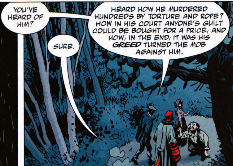
 P1 (Mignola et al. 2008b: 25) P1 (Mignola et al. 2008b: 25) Just as any art form prides itself on its particular rendering(s) and consequent reception, the understanding of comics also relies on the medium-specific elements. Randy Duncan and Matthew J. Smith propose a system of comprehension of images within the comics pages, which is essentially tripart: distinguishing between sensory and non-sensory diegetic images and hermeneutic images. Sensory diegetic imagery refers to aspects that can be perceived by the senses: pictures and words portraying characters, objects and the environment of the story (i.e. dialogue). Non-sensory diegetic imagery depicts aspects that would normally be unnoticeable, such as emotions and sensations of the characters, but the visual nature of the comics given the reader insight into the characters (i.e. thought balloons). Hermeneutic imagery, on the other hand, is placed outside the story world, yet influences the interpretation (i.e. psychological images, visual metaphors and intertextual references). All of these perceptual elements are, nevertheless, under the influence of personal and social stimuli that may result in inattentional blindness, hence inadvertently limiting the response to the work. Reception of comics depends heavily on the complexity of a given work. While various guiding traditions of narration, image-building and techniques exist, every comics panel is as unique as every written work is exclusive. Despite the fact that theoretically the vast majority of words used in a novel are for example available in dictionaries (unless you’re Shakespeare, of course), words are nevertheless used and described there in isolation. Equally, some of the charm of the imagery used in comics is its very appeal and recognition; yet, it is the newly created world where these pictures and words are given the platform to interact with where the ingenuity of authors comes into play. Together with the comprehension of the readers, the work is taken to the final level of recognition, where it is taken through a tailspin of interpretative grandeur by the numerous ways of readings, providing the ultimate interplay of the individual and the social. Before the reading process becomes too idealized, it must be stressed that there is always a degree of confusion (noise) and deviation in the interplay of author’s creation and reader’s reception (the interplay between intended and perceived meaning), varying from the beliefs and technical abilities of the author to the expectations and willingness of the reader to perceive the work as a whole. This, however, is true to all art products, since they are inherently an individualistic expressive design. Suspension of disbelief thus becomes a prerequisite for the enjoyment of not just every work, but is part of life’s perception as well, pertaining both to subjective views and objective representation. As we suspend disbelief to not see the drawings as merely colored lines on paper and to perceive images on a screen as anything but hyperrealistic binary code, we are doing so inherently. We do not perceive the world through its components; like general shapes or atoms to be even more precise. In the latter case we are physically unable to see at such peering close proximity, just as much as we can’t see radio waves because of the limitations of our perception of the visual field. Similarly as our brain transforms two images from each eye into a united whole, we take reality as a complete image as well – like a board with chess figures of life that require our undivided attention in order to play the game right. Pragmatically, the suspension of disbelief is the essence of our whole existence, since even growing and learning demand of us a certain degree of “blind acceptance”, either from what our parents teach us or what the texts we read try to point out. We can become critical and learn to evaluate things only after we have gained a certain amount of knowledge of ourselves, the world we live in and (crucially) their interaction ... And, to complicate things further, this doesn’t mean that all of a sudden everything becomes clear and you can comprehend life to the fullest. No. That’s an ongoing process. Call it a kind of hermeneutic cycle of life experience. The reading process requires us to understand spatial relations within every comics page and apply temporal notions, creating the illusion that the work is animated and comes to life. We do the same when watching film (connecting the frames to form continuous action – but in this case most of the work is already done by the creators) or reading a book (creating images in our mind from the symbols we read, making the subject-matter of the work come to life in a fascinatingly abstract fashion). Picture 1 (P1) reveals a spatial location with the characters walking along a path in the forest. The illusion of time is created by reading the words; namely, as you read, you imagine the characters walking along. The panel ends by capturing the moment in time as we walk off to the next panel. In such a way, as we begin reading, the position of the characters (were they not standing still) may have been more to the left. Therefore, what the picture reveals in the final frame is the animated process that occurs in the gutter between the panels and in the panels themselves. P1 (Mignola et al. 2008b: 25) 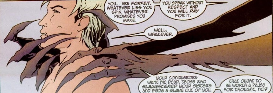 P2 (Carey et al. 2013: 203) P2 (Carey et al. 2013: 203) Arguably, panels can be static as well, especially when using a silent (wordless) panel as an establishing shot, where building a scene itself is more important than reflecting on its temporality. The reader, however, applies motion and time to the scene (in film this would be achieved with a zooming effect) because we know the world is not static but brimming with life and movement. Paradoxically, a complete comics image is immediately followed by the gutter and the following panel(s), further stressing the momentary aspect of reception and consequently emphasizing the astonishing ability of the human mind to comprehend complex meanings and depictions in a matter of moments. The final words in a panel generally reflect the final depiction of events. In this process every spatial and temporal element in the panel beforehand leads to that final moment when the complete image is perceived by the reader. If we look at P1 again, this means that when you read the text that ends with “against his”, that’s when the time freezes essentially and that is what the picture shows. The picture is just the final representation. I say just, because as you begin reading the text that begins with “you’ve heard of him”, time passes for the reader and as well as the perceived events in the panel, which means that at the beginning of the text, the characters should ideally have been on the left side of the panel. This creates the illusion of movement as much as it is the illusion of “turning back the visual elements”. Plus, the more back-and-forth dialogue you have between the characters, the greater the disparity and the potential for either confusion or just logical pictorial oddities. Coincidentally, this is why Eisner was such as big proponent of using one panel to show one scene, not prolonging action (even if it is just dialogue). This is why the dialogue in comics is often “relegated” to medium shots and close-ups to avoid (drawing) background noise, to place more emphasis on expressions and to create a sterile environment, where the reader is for example focusing only on character’s encapsulated timeless facial demeanor. When pictorial and verbal elements are at temporal odds, especially when the action depicted is more crucial for the development of the story, the reader’s suspension of disbelief can be shaken. P2 is clearly meant to be the final frame, since the creature’s hands are about to engulf the protagonist. We notice the picture right away; however, as we begin reading, we are actually taken back in time, forced to imagine the hands ever so slightly moving forward before reaching the apex of what is actually portrayed. Since visual experience is a process of space and time, this creates a spatio-temporal distortion that is common in many comics and can result in the “grip” of the narration to be loosened. P2 (Carey et al. 2013: 203) 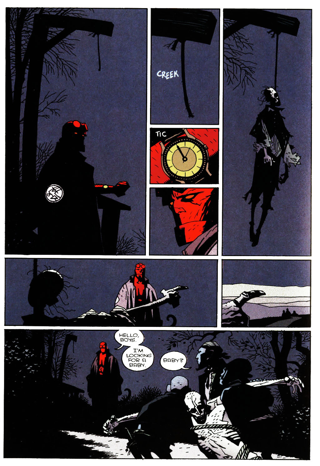 P3 (Mignola et al. 2008b: 38) P3 (Mignola et al. 2008b: 38) The reason for this “awkwardness” may be twofold: Lucifer was created in the mainstream comics environment, which means that individual issues of the comics ware for the most part “relegated” to 24 pages, in which case the authors were physically unable to divide the panel into two, with the first for example focusing on the dialogue and the second on the danger element to achieve a greater shock value of the scene. On the other hand, the panel may have been intended as such to create the lingering effect of impending danger even as you read the dialogue. The fact that the dialogue is spread on the right side of the panel and the hands appear on the (more immediately seen) left indicates that this might be the case. Although time per se in not a quality of vision, semblance of time is presented visually (cf. P2 and P3), while the interplay of space and time becomes a prominent factor both in comics as well as art, not to mention our constant daily struggle to fight off the proverbial hands of time.
If we consider the dual aspect of de Saussurian logic, reading comics is both immediate and gradual. The latter notion is probably the more obvious one. Reading comics for the most part follows a panel-to-panel progression, similar to a sentence-to-sentence stricture. Jumping from one panel to another, the reader is gradually revealing the overall picture that the comic is urging us to complete. The path of reading is directed by the author who constructed the design (like a successful chess player needs to calculate numerous moves ahead of time), but the response from the reader can be anything but linear and straightforward (as the other player uniquely responds to the position on the board). Immediate reading, on the other hand, refers to the fact that we notice pictures at a moment’s notice, since action precedes words, so the dialogue for example takes generally more time to devour. Every observed page in a comic is immediately scanned in a sort of top-down approach, moving from the most noticeable elements on the page as a whole (such as strong outlines, color, contrast and striking, unexpected shapes) towards individual panels where detailed (gradual) reading follows in greater detail. P3 (Mignola et al. 2008b: 38) Taking the above page for example (P3), the strong contrast is immediately achieved by the color red, which is noticed at once and especially because of the rest of dark, blue, melancholic tones. Upon gradual reading, you are drawn in further by the two smallest middle panels that act like the glue that keeps all but the last panel together both visually and thematically. Symbolically, the first six panels play off of the visual metaphor of the watch in the central panel by acting like a clock, moving from one element to the next. By striking midnight, the watch symbolically marks the end and a new beginning, reflecting on the dead body coming to life. The beauty of the layout is evident in the fact that we can actually read these panels in any way we want, since they all lead to the final long shot panel, where the hands of the corpse (through light contrast and position) lead the eye out of the panel into the next page. Since this design is pictorially dominant and the transitions are masterfully done, the reader can generally read through the page quite fast, but the “loop” of the two smaller red panels and the strong contrast makes you linger on these details (more and more through each rereading). Reception is obviously a complex principle that works on the most extreme subjective levels of any reader. To those for example not acquainted with Mignola’s Hellboy and distinctive expressionistic style, let alone not versed in reading comics, this page might seem merely a gritty, verbally-sparse product that you can go through quite fast. The crucial element why the page reads fast, however, is due to excellent pacing and mastery of Mignola’s craft. Misconception clearly breeds unappreciation. The followers of the Hellboy canon not only carry an unprecedentedly larger amount of emotional investment in the work as a whole, but can notice intertextual references. On a personal level, it is beyond rewarding to notice such grand elements of structure, composition and comics mastery in relation to what a newbie comics enthusiast can for example feel, but not quite understand. Rereadings, attention to detail and love of the subject matter can thus broaden one’s horizons beyond words … I would say beyond pictures as well, but it would seem counterproductive and too cheesy, so scratch that. Anyway, even art enthusiasts can for example more readily notice the spatial technicalities that are conveyed on the above panels of P3. In other words: for visually oriented readers, the art tends to dominate the initial attention, whereas prose readers not accustomed to the comic book form tend to move from one block of text […] to the next, and often miss important visual clues in the process. (Duncan and Smith 2009: 119) Perhaps the greatest attribute of reception is the fact that we can distinguish so many nuances and convey such a wide array of readings. The interplay between author and reader in comics is arguably subject even to interpretations that may or may not have been intended by the author. Over-reading can be always pesky, especially when you’re analyzing works and authors that are close to your heart and mind, but it goes without saying that when you do get it right it’s a jolt of positive energy that reaffirms your hard work was not in vain. Affective visualization allows authors to create elements that are less clearly observable (whether through subliminal elements or references to other works and the like). In such a way, the complexity of the narrative is further increased and the hermeneutic cycle propitiated. The reason for this is because pictorial portrayal varies (with author’s style the most). Mignola for example does not have a specific way to write SKELETON, or even of writing about or describing a skeleton (he does not have to), but he draws a distinct, unique skeleton that is immediately recognizable and unmistakably his. Reception of comics thus becomes an intimate process, uniting the two players like no other game. As every chess game can be played differently, more complexly forever again and again (as you adapt to the tactics used), so are comics a well of everlasting interpretive levels, since the spring of readership constantly renews and enriches its (mythic) potential. In closing this chapter of readership, the general assessment of comics as imagination-stirring objects, which has to a large extent carried over from its satirical, easy-going origins, refers back to comics as pure and simple being fun. It’s extremely pleasurable to allow your imagination to run wild with possibilities … when visualized in comics, that much better. Either through promise of an escape into more exciting, peaceful, fair, different worlds or enhancing the present world through factual means and insightful imagery, comics elucidate the human condition in a startlingly similar way as myths do. And that’s what you can call the eternal game of chess. References: Abel, J., & Madden, M. (2008). Drawing Words and Writing Pictures: Making Comics: Manga, Graphic Novels, and Beyond. New York: First Second. Abel, J., & Madden, M. (2012). Mastering Comics: Drawing Words & Writing Pictures Continued. New York: First Second. Arnheim, R. (1997a). Art and Visual Perception: A Psychology of the Creative Eye. Berkeley: University of California Press. Arnheim, R. (1997b). Visual Thinking. Berkeley: University of California Press. Dolinar, D. (1991). Hermenevtika in literarna veda. Ljubljana: ZRC SAZU - DZS. Duncan, R., & Smith, M. J. (2009). The Power of Comics: History, Form and Culture. New York: Continuum International Publishing Group Ltd. Eisner, W. (2008). Comics and Sequential Art. New York: W. W. Norton & Company. Gadamer, H.-G. (2001). Resnica in metoda. (T. Virk, Prev.) Ljubljana: Literarno-imetniško društvo Ljubljana. Garfield, J. (2011). Meaning of Life: Perspectives from the World's Great Intellectual Traditions. Chantilly, Virginia: The Great Courses. Heer, J., & Worcester, K. (Eds.). (2009). A Comics Studies Reader. Jackson: University Press of Mississippi. Jauss, H. R. (1998). Estetsko izkustvo in literarna hermenevtika. (T. Virk, Prev.) Ljubljana: Literarno-umetniško društvo Ljubljana. Komel, D. (2002). Uvod v filozofsko in kulturno hermenevtiko. Ljubljana: Filozofska fakulteta. Lopes, D. (1996). Understanding Pictures. Oxford: Oxford University Press. McCloud, S. (1993). Understanding Comics. New York: Harper Perennial. Moore, A., & Burrows, J. (2008). Alan Moore's writing for comics volume one. Rantoul: Avatar Press. Saraceni, M. (2003). The Language of Comics. New York: Routledge. Talon, D. S. (2007). Panel Discussions: Design In Sequential Art Storytelling. Raleigh, North Carolina: TwoMorrows Publishing. Virk, T. (1999). Moderne metode literarne vede in njihove filozofsko teoretske osnove: Metodologija 1. Ljubljana: Univerza v Ljubljani, Filozofksa fakulteta. Wolk, D. (2007). Reading Comics. Cambridge: Da Capo Press.
0 Comments
Leave a Reply. |
Author
For reasons of extreme prejudice, the author of this blog wishes to remain anonymous … Archives
November 2017
Categories |
 RSS Feed
