
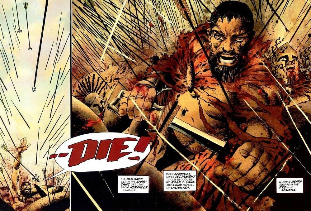
 Picture 1 (Miller and Varley 2006: 73) 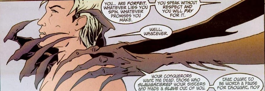 Picture 2 (Miller and Varley 2006: 73) Picture 2 (Miller and Varley 2006: 73) “The human mind generally uses any strategy it can to concatenate meaningful elements, and these strategies extend across domains.” (Cohn 2013: 34) Like any means of expression, like any art form and like any storytelling forum, comics consist of specific elements and techniques that represent the basis of any kind of comics analysis and therefore need to be addressed. Obviously, there are some shared elements with film and literature for example (either storyboards or other verbal narrative tools), the specific visual elements (such as the word balloon) make up the backbone of comics and have long been its most noticeable, obvious and (too) often underappreciated characteristics. PANEL The basic and visually most obvious unit in a given comic is the panel, which represents a specific area or a window through which the artists try to capture a(n extended) storytelling moment of time for the reader. It needs to be stressed that while this spatially captured moment of time is not necessarily just a snapshot, but it can imply movement. The progression of a panel can reveal elapsed time not just through the process of reading itself, but through the meaning of the dialogue and the overall pictorial arrangement within the panel. The above panel shows the hands of the creature engulfing the protagonist (Lucifer). Although the picture itself is static, the implication is that the creature is getting ever so nearer to grabbing the neck. An argument can be made that this panel is in fact a bit awkward, since the time needed to read the comparatively large amount of text in the balloons is conflicting with the momentary, immediate action portrayed. However, the disproportionately long, sharp hands and fingers/claws by their very presence intensify the scene and the expressed entrapment of the main character furthers the uneasiness. The spatio-temporal issue is further complicated by the relatively steadfast look of Lucifer, hinting at his acknowledgement (and consequent denial) of danger. On the other hand, the panel may reflect the final state of events occurring within it and the reader would perceive the creature’s hands moving closer to Lucifer while reading the last balloon or after the whole text had been read. The resulting panel may in fact be the product of spatial constrains, as the authors working in the 24-page monthly comic format have a fairly limited amount of time and space to tell (especially in the case of a series like Lucifer) a complex story. Either way, the panel clearly tries to create an eerie illusion of movement, bringing the visual elements to life from many different viewpoints. Panels are still predominantly rectangular, perhaps reflecting the shape of the page itself (and consequently the book form as well), so they can be arranged in a grid. This notion is directly connected with the reading process. The western tradition employs a left-to-right and top-to-bottom reading order, so for the most part reading of a comic page is linear similarly to the “regular” reading of writing. This so-called Z-path of reading is visually more obvious in comics, since in literature the height of the words and the text/font are for the most part arbitrary, while the shape and size of panels often play a vital role in the perception of a comic. The horizontal, rectangular shape of the panel in Picture 2 for example stresses Lucifer’s entrapment. The flat, grounded nature reflects his current state, as he is bereft of his powers, while his position on the left directly relates to the element of danger approaching from behind and physically occupying the most space in the panel. (Note that there can be a sharp distinction between reading good-ol’ book form comics and digital comics, in which the strings of panels can have a wider – or at least more applicable – range of “motion” so to say. A specific feature of many digital comics is their exclusive approach to reading, where the digital interface may immediately zoom in from the whole page to the first panel and guides the reader from one panel to the other, eliminating the issue of “spoilers” from other panels on a traditional page. This, however, creates a potential problem of being guided too much, making the reading pattern too passive and a bit forced and not experiencing the panel as a whole, while essentially eradicating gutters and with them the indirect power of transitions that traditional, book-form comics have in spades. Also, this kind of reading draws closer to a static film experience, which is at least for my taste detrimental in the context of comics,) While the Z-path reflects the natural way Westerners are accustomed to reading, the position of the panel on a page and the subject matter they portray can vary, so reading patters can be heavily manipulated by the authors (and consequently the reader, if the action portrayed grabs the eye beyond the intended reading pattern and one skims ahead). Taking Picture 1 for example, it is comprised of two panels, following an L-path; the first vertical panel shoots straight down (pun intended) and continues right, following the flow of the text. The reader, however, can easily get distracted by the huge medium shot of Leonidas in the heat of the battle, so the eye may inadvertently jump up to scan the battlefield before returning back down to the text. While we may immediately scan the whole page, we focus only on selected context, since “we have surprisingly low visual acuity (resolution) in parts of the visual field that are not at the center of where we are looking – the center of gaze. We are not aware of this, because we usually move our center of gaze to whatever we want to look at.” (Livingstone 2002: 68) This issue not only stresses the importance of understanding (appropriate) reading patterns and its possible blockages, but further research into reader perception and behavior of the eyes during extensive visual stimuli may in fact be helpful to the authors. This might among other things enhance story progression, create better panel divisions and make sure the last bottom panel on the right before the turn of the page does not lure the eyes to it before the entire two pages have been read. The final panel before the turn of the page functions as a mini cliffhanger, enticing the reader to turn the page and see either the resolution or the prolonging of action. This is more obvious in comics where the pictorial elements offer more “action” and pictorial diversity in panel shape, arrangement, etc., as opposed to a drawn-out two page dialogue with the back and forth exchange of head shots (btw, this sounds way dirtier than it should …). It should be noted that editorial and marketing changes and republishings (especially in larger, newer volumes) can sometimes result in different page and panel arrangements or remastered color. Thus, some odd pages in trade paperback editions of Lucifer and Sandman become even (or vice versa) in larger collector’s editions for example. This issue may be unnoticeable by most readers, since they may not care for more than one version of a given title. Literature does not fall into this category, since pictorial recognition is much faster and has a more immediate outcome than slow linguistic decoding. However, further research should be taken to determine the empirical effect of such pictorial nuances that might possibly have bigger collective consequence than anticipated. Finally, we can compare a panel to a sentence in linguistic terms, where both constructions represent a structure of smaller units, either pictorial elements or words, respectively. We can note that a single image generally contains vastly more information than an individual word, While this can always be debated in terms of analyzing Pictures 1 and 2 in isolation for example, they are far more nuanced and revealing when viewed within the larger framework of their respective comics as a whole. But in essence pragmatism still works, so the picture is (still) worth a thousand words. References: Cohn, N. (2013). The Visual Language of Comics: Introduction to the Structure and Cognition of Sequential Images. New York: Bloomsbury Publishing. Duncan, R., & Smith, M. J. (2009). The Power of Comics: History, Form and Culture. New York: Continuum International Publishing Group Ltd. Livingstone, M. (2002). Vision and Art: The Biology of Seeing. Michigan: Harry N. Abrams. Mateu-Mestre, M. (2010). Framed Ink: Drawing and Composition for Visual Storytellers. Culver City, California: Design Studio Press. Miller, F., & Varley, L. (1999). 300. Milwaukee: Dark Horse Comics. Talon, D. S. (2007). Panel Discussions: Design In Sequential Art Storytelling. Raleigh, North Carolina: TwoMorrows Publishing.
0 Comments
Leave a Reply. |
Author
For reasons of extreme prejudice, the author of this blog wishes to remain anonymous … Archives
November 2017
Categories |
 RSS Feed
