|
THE CURVED LINE The curved line is a more natural line. And coincidentally curves are sexy. As much as the Earth is literally nowhere near a perfect sphere, so are strict lines and ordered geometrical shapes predominantly of human invention. Again, this perhaps reflects the pleasure and vice of humanity’s intrinsic formalistic nature to label and organize the world around us amidst the seemingly beautiful kerfuffle of celestial chaos. While groupings of any king pragmatically make perfect sense to us, the universe extends beyond organization per se, since the notions of action/reaction and gravity are the principles in play. Arguably, Earth’s perceived shape is indeed spherical, which is a three-dimensional gravitationally-influenced expansion of a single point; however, Earth’s natural surface is predominantly comprised of curvatures (gravitational forces play a key role in their shape). This might be a natural reason why curved shapes feel more natural and endearing than straight lines. While perfect curvature can be technically and digitally reproduced million times over, in nature, however, it does not appear as such. Curved shapes appear unique every time, which everyone can experience for example just by trying to create two perfect circles with a pencil. And they say no two snowflakes are alike, equally as no two people are. As perfectly sustainable as nature seems (with or without us in it), perfect regularity nevertheless does not exist in nature. As part of either the straight or curved line, we can create convex and concave elements, those that expand outwards and those that turn inwards, respectively (Mathematically, the internal angle of a non-curved convex shape is less or equal to 180 degrees, while the internal angle of the concave shape is always more than 180 degrees.). A speech balloon in comics is thus for the most part convex. Its curved lines expand outwards, becoming more “airy” and cloud-lie. When the curves face inwards, they resemble a hole, facing inwards and become more restricted. Visually, the balloon shape has (apart from the pleasing appearance) also a pragmatic function of offering a greater use of the space within for the text … as coincidentally does the emptiness of a jar for example in Daoist terms. Convexity, though, tends to have precedence over concavity. In other words, expanding shapes have a bigger visual value because of their inherently bigger size. The differentiation is more or less arbitrary, since the same lines can depict opposite notions purely by their position and which direction they are facing (a similar notion can be observed in letter M and W for example). 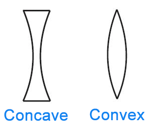 As with any basic notions, compound meanings – in this case structures – can be applied. Consequently, a vertical line can for example extend into an upright parallelogram, similarly compounding the original emotional meaning of the simple line; reflecting strength like a standing pillar or imply encapsulation or enclosement like in a coffin or the character’s own state of mind.
COMPOSITE LINES Composite lines represent numerous other possibilities of line rendering. Whether a zigzag line (expressing tension), a circle (unity), triangle (stability) or any other more or less geometrical and natural shape, the artist’s repository of knowledge is build from these very basic shapes. As much as the writer combines words into established phrases, (s)he incorporates, joins and creates unique expressions as well, instituting a unique repertoire and personal style of writing. Similarly, all pictorial art stems from the basic shapes and is given life through personal styles and techniques. The artists, who are influenced by the world, mimic it through their artistic approach, inspired and molded through their interests, enabling the perfect interplay of the personal and the social. These types of examples are even more context-dependent, so combinations of either intricate patterns or misleadingly simplistic basic shapes can work hand in hand to enhance the reading experience. But more specifically, a base-heavy triangle ▲ points upwards, its base line creates a stable structure, while its enclosed sides offer further stability (i.e. mountain, especially a pyramidal peak); especially if the triangle is equilateral, where its three equal angles enhance this notion. Turned upside-down ▼, however, the nature of the triangle changes drastically. Due to the one-point base, the stability is replaced by unease. The down-pointing shape resembles a sharp object that we associate with danger (i.e. blade, icicle or tooth). Our awareness of a knife or a dagger in real life is clearly and sublimely transferred into this visually-piercing object. The characteristics of a circle ● are quite different, since it does not have the same geometrical constraints (and advantages) as the triangle embodies. Its smooth curved surface is visually more pleasing and does not pose a threat (of course for the most part depending on size, mass, direction or movement). The uniform shape has been a long-standing standard for perfection, circularly reflecting both the Sun and the Moon, as the two most influential stellar bodies for the Earth. (Deemed so both because they are so easily observable and because of their geological, astronomical effects and reciprocity with our planet.). The natural simplicity of the circle, however, has an underlined depth which alludes to the notion of simplification for amplification and attribution of seemingly universal meaning to generally arbitrary depictions. Symbolically, the circle is the extension of the point, in other words the singularity of all complex visual expression being fundamentally in a more visibly palpable and beautiful circle … or the sphere, if we extended this notion through “dimensional magic”. We can relate these observations to comics as well. The caption has a traditional rectangular form ■ (which is even more sturdy and uniform than a triangle). The straight nature of its sides not only offers stability and an easier outlet for the text (which traditionally follows a straight, linear path), but can reflect either the more serious tones or formalistic, factual descriptions in captions. On the other hand, the bubbly thought balloon visually follows the lightness and smoothness of curved shapes and circles, reflecting the inner dialogue of a character. Not to imply that the stream of consciousness approach means that the characters are lightheaded, even though that can often be the case, especially when an extensive action scene, meant to be read fast, is accompanied with an elaborate longwinded inner monologue, where these linguistic elements balance the pictorially dominant portrayal, only to distract the narrative flow and break the suspension of disbelief. (In other words: there’s nothing wrong this “flying” through the pages of a comic, because not every scene has to be linguistically challenging. Sorry, Alan Moore.). Equally, the jagged shape of zigzag balloons, used to indicate mechanical voices or speech heard from television or radio for example, is visually more tense and tenuous; reflecting the electrical current necessary for the signals to be transferred to the satellites and back or to the transmitters directly. The visual tension becomes psychological as well, since this digital transference of talking on the phone and especially listening or watching a program (both passive approaches, where the communication is one-sided) is much more impersonal. Obviously, similar arguments can be made for every object we can find both in art or nature. Arguably, specific rules apply; as much as gravity is a force that shapes life in the universe, Abstract art and Cubism follow their own distinctive pattern. Nonetheless, the very shape and color used in the latter cases are still a reflection of the prevailing natural order imprinted in humanity (even if negating these standards). In such a way every “unorthodox” art form is both unique as well as unilaterally formalistic, just as every subculture is “special” and yet quite ordinary at that. De Saussurian duads are constantly in play. The world as we know it is our vary nature and we are but a product of it. Consequently, our “imprint” of it is both intrinsically and extrinsically based (mutability and immutability in full effect) on the natural shapes and colors. Nevertheless, distinction becomes the crucial factor which (like a trickster) stirs this pot of standards by implementing diversity of life. We can see this both in cultural distinctions of all kinds and the very evolution that brought about the complexity of life (while retaining its roots in nature). END of PART 2 (of 2)
0 Comments
“When no preconceived ideas keep us from looking and we take all the time we need to really ‘feel’ what we see […] the universe opens up and we catch our breath in awe at the incredible complexity of design in the humblest things It is only when this happens that we regain our sense of wonder.” (Bothwell, D., and Mayfield, M. (1991). Notan: The Dark-Light Principle of Design. New York: Dover Publications; pg. 75) As much as the world may seem to be a disorganized, random amalgamation of elements, especially since we are bombarded by visual stimuli at every corner on a daily basis, there is in fact a pattern to be observed. This may be obvious in language – where specific and fixed symbols are used – but that is also the case in the pictorial world, even though it may quite ironically be less obvious. Part of this may be because we generally take the visual world around us for granted. We have internalized the fixed images that we observe on a daily basis, so for the most part we know exactly what to expect when we step outside our house and even more so when we return home … but if someone asks you to describe the intricate pattern on your carpet or the design of your coffee table, most of us would be surprisingly “blind”. The shapes (and colors) make up the visual language of the world that we see around us and consequently immediately interpret, yet we don’t see it per se, because it’s either too obvious or we and our eyes deem the details too bothersome to invest all our precious attention to them, when it’s needed elsewhere. So, let’s clear the air. It’s try to describe the basic elements of visual composition that apply to both visual storytelling as well as plain visual awareness of ourselves and the world around us. We begin with rudimentary geometric elements (and their spatial relations) that like atoms through evolutionary process and arduous work make up the larger, greater and artistically awe-inspiring imagery. The four elements are the point, the straight line, the curved line and composite lines. THE POINT • The point is the one and only essential element from which every other shape is brought to life. Well, obviously. Like the atom (I know there are smaller elements still) or the pixel in the digital environment, the point is the building block of complexity and the starting point of this examination as well (let’s exclude negative space for the time being). While it can be said that every picture is an amalgamation of lines on paper, every line is constructed of points in a sequence. As such, the power of this singularity (like atoms creating higher units, morphemes creating words and further semantic sequences) is more evident in the general shapes that stem from this starting point. We can draw parallels to mythology, where the point symbolizes the center, which in turn is the source of life (the beginning and end). This is the axis mundi that connects the profane world (of basic shapes) with the sacred space (of artistic complexity). Further, this concept can be applied to the cosmos as well, because the Big Bang (whether theoretical or actual) is essentially just that singularity brought into complexity. Also, one other thing as far as mythology goes, there are more or less subtle connections between basic shapes and basic archetypes … of course referring not to their “basic” simplicity, but the foundation for though-provoking complexity. In such a way, were the devil archetype for example vied as negative space, both concepts carry a plethora of meanings and philosophical/transcended imagery. Not “bad”, but essential (in true Daoist sense, if not Jungian as well). Since I’m generally ad-libbing with most of these oblique analogies, it could be fun to imagine the prototypical archetypes as rudimentary shapes and imagery, but at this point I’m just gonna shoot straight to the next element on the list. THE STRAIGHT LINE The basic geometrical shape that reflects stability has to be straight, right? Depending on its position, length, thickness etc., the straight line creates a number of responses. Albeit, in mathematic terms, the length is irrelevant in the sense that a line is just a visual representation and it extends beyond its starting or end point into infinity, but for the most part that is just our required formalistic simplification. Either way, the straight lines are as followed: The horizontal line (–) expresses stability and exemplifies the horizon of the world that creates a down-to-earth effect and can be calming (like the horizon of a sunset) or overbearing and vast on the other hand. The vertical line (׀) stresses upward movement, rejection of (earthly) gravity through its symbolic rising (towards the heavens) and obviously all-ensuing phallic symbolism. Schwing! Excellent, indeed.  The diagonal line implies dynamic movement, either upward (/) or downward (\).Therefore, it implies motion and creates tension. As an extension of this fact, uneven and steep terrain is harder to traverse, while angles and triangles have a visually less calming effect. Similarly, knives are dangerous because their edges can quite easily pierce our skin (even though this “sharpness” is less obvious on a molecular level). Taking into account left-to-right reading pattern in the West, the diagonals “read” in this direction as well. In such a way, the peaks of diagonals /and \ are at the far right, stressing the aspects of progression and regression, respectively. Interestingly, such a left-to-right reading scheme is globally employing in graphs for example. Arguably, this usage can be a matter of worldwide agreement for the sake of comprehension – similarly as the English language has been forced … I mean adopted as the world language (taking into account global expansion and insemination of English-based culture, of course). Not that I’m complaining, but still, let’s call a spade a spade. END of PART 1 (of 2)  I’m not click-baiting, stereotypes really are essential in comics comprehension. This refers to (over)emphasis of specific character traits, which is to an extent quite evident in caricatures, where exaggeration is inherent, apparent and in for the most part instantaneously recognizable. This notion may seem in conflict with previous examples of visual art (staying true to human anatomy and keeping exceptional moments to a minimum); however, stereotypical depiction in comics equates neither cliché nor absurdity. There is an obvious distinction between a cliché used as an escape route, a mere narrative element, weak plotline or even an offensive characterization of a particular class, gender or belief for example. However, stereotypes as comprehensive storytelling devices are not used to offend neither the conservative nor liberal types. Stereotypes don’t hinder the work, but enhance it because of the strong, deliberate characterization. They pictorially stress specific features for them to be immediately recognizable. In such a way clarity is achieved through the use of recognizable character traits. We can correlate this even to pantomime, professional wrestling, drama, and film as well, where you often have to exaggerate and go over the top in order to get the desired effect (again, context matters). In comics, the artist for example has to stress the visuals of a character or a scene in general for that very matter, so the linguistic elements are free to carry their part of the narrative without having to describe the character’s features in great detail. Writing in comics is specific, since the writer is restrained by the amount of text that goes into each panel, so they have to be more precise, distinct, clear and resourceful in their phrasing. Speaking from many years of experience, this process can to a large extend be compared to translating … subtitling in particular. The translator like the comics writer “suffers” from the visual constraints of either the subtitle or the balloon, so their respective inventiveness, adaptability and creativity are constantly tested in order to be able to express an idea sometimes in more than one way (especially those writers in the limited 24-page comic books of the mainstream publications). The principle of stereotypical depictions per se is predominantly used (and abused) in cartoons, where the hero has for example been traditionally portrayed as handsome and broad-shouldered, while the villain’s visuals are sharper and s/he is typically clad in dark clothes. Eisner offers an excellent old-school take on this notion, which stays evergreen (still applied to wrestling as previously mentioned). Running can for further example be overemphasized to the degree where the character may have legs extended beyond the capabilities of even the best ballerinas, gymnasts or contortionists, while the expression of shock on the face can be drawn with mouth and eyes open to a realistically absurd degree. Comics have to adhere to similar principles, even if the approach is more “realistic” or the theme of the work more “mature”. An argument can be made that the most realistic portrays manage to step outside of the principle of stereotypes, since the material mimics the natural world to the extent that exaggerations are not possible. Especially with stylistic photorealism and with the xerographic technique for example, where actual photos are used and manipulated into creating a story. As the comic seems and feel more real, the stereotypical representation (if deemed necessary) transfers to either the ideological or the metaphoric level. So it helps to look at it as stressing the essentials and choosing the appropriate panel, in which the artist “stressed” a specific posture or scenery as opposed to another, because you want the reader to get your work and feel it without overthinking and overanalyzing every picture. Unless that’s the point of the comic … but that’s very rare. Suspension of disbelief is always the crucial element that enables the reader to for example take Spiegelman’s anthropomorphic animal creatures in MAUS as humans (which coincidentally creates even greater shock). The language of comicana is the perfect example of such “stereotypes”. The signs on paper or on the screen reflect senses (such as smell and hearing) that cannot be achieved otherwise. Stereotypes, referring to the previously discussed aspect of simplification, reflect the basic human nature of labeling and organizing elements into a more or less coherent whole; the discipline whose roots are surely the most entangled with this principle is history proper. The Hellenistic age and Renaissance are arbitrary labels that modern thinkers have placed on specific traditions that were realistically neither restricted to their respective time-spans nor can objectively be viewed only through what they imply. Consequently, this is as arbitrary as setting the birth of Jesus as the starting point for counting years. Hellenistic age semantically implies the rise of Greek – Hellenic – culture, yet it actually marked its final demise through the Macedonian (Greek) and later Roman dominance. Renaissance on the other hand literally means renewal, yet for rebirth to occur the tradition of Greco-Roman-inspired art would had to have been completely forgotten (an ideologically semantic dispute, I know), which was and still is hardly the case, since the whole model of Western civilization consistently remains the remnant of Ancient Greece. Last but not least, stereotypes in comics can be seen as mythological archetypes, images that reflect the basic human nature. In a medium suffering from economy of use and density of information they can thus be easily recognizable. Humanity has a tendency to understand and simplify matters so they can be easily understood, yet their true nature is far from straightforward (Jung be proud). Comics (and even more so myth) is an exemplar of this notion: while it is fairly easy to explain the medium, its complex nature and beauty reach far beyond the oversimplistically obvious word-picture interplay. Either way, this concludes the four-part series on the comics-related essentials of visual art. If another principle worth stressing pops up, I’ll include it in future posts, but for now I’ll continue slogging along with some more basics about shapes (and color) and probably a review or two, because there’s plenty of comics that beckon analytical attention. I know the last post about minimalism (and maybe this one as well) went a bit all over the place and away from artistry proper, but the fun and beauty of art in general is its pervasiveness in making itself the conduit of comprehension and perception of our very being. The thing is that I tend to see connections between let’s say certain philosophical notions and natural phenomena that are often not necessarily thought about together. When I try to make sense of this, I far too often connect them way better in my head than it ends up on (digital) paper. I dunno, it’s a gut feeling as much as it is research-based. I like to consider these allusions and connections of different subject matter (that I’m sure a lot of you find ridiculous or nonsensical … not because you wouldn’t be able to get it, but because I fail to convey them optimally) an attempt to understand my own mind and comprehend the larger reality that has invariably shaped this noggin of mine. If at least one person gets it, I’ll be more than happy, because that will mean I’m not just blowing smoke up your ass, but am in fact trying to put in perspective things I’ve come across in my research and life in general. Cheers! Of the four essential concepts in comics comprehension that I’m taking under a bit closer examination, minimalism is my favorite one, because when used correctly, it keeps one in check and prevents you from blowing your (artistic) load. Not to confuse it with the artistic style of minimalism, in this case it’s a bit more literal, although the connection to the artistry is meant to be obvious … I mean, this is about visual art, right? Minimalism refers to the concept of simplicity, simplification for amplification or my preferred down-to-earth equivalent of less is more. This principle means that the portrayal follows a specific narrative pattern, keeping in check overabundance and overcomplication of pictorial stimuli. Overemphasis on detail in a panel depicting action that is meant to be read fast can hinder the narrative flow in that particular instance just as much as it can hinder the artist further down the line. Thus, when following this simplification for amplification, when a particular element is stressed, it has more weight. This works with plenty of art forms, film as well. Action flicks generally end with a large action scene, like in the case of the 2012 The Avengers. I mean, this is about comics (in one form or another), right? The final large-scale battle obviously wasn’t the opening scene. Everything was built around it and the events of the film lead to a perfect crescendo (with heavy help from previous film instalments in the Marvel Cinematic Universe). There is obviously the possibility of different/non-standard narrative flows, but the point I’m trying to make is that through simplicity, The Avengers were able to gradually amplify not just the action scenes, but also lead the viewers towards a climax, where suspension of disbelief was flawlessly executed and the expectations of the viewers matched the on-screen performance. (Which consequently led to a box office record. Now always related, it in this case it definitely was.) But minimalism is not just about that. It’s about clever use of certain items, techniques and takes on a given story, so it seems constantly fresh and helps build suspense and intrigue. Minimalism is the haiku of storytelling of sorts, the art of making the most from the basic building blocks, because once you master the basics, everything else you add to that, will stand out. And in the comics medium that is primarily all about (visually) standing out, this point should not go understressed. Some more comics examples of minimalism: the use of certain colors in Sin City or the use of splash pages in the final chapter of Watchmen or The Death of Superman. In terms of these large (and in charge) panels, we can go one step further with a double-page spread that should be reserved for occasions that depict an over-the-top situation that literally jumps at the reader (even more so than a splash page, which only takes up one page, not two). The two following pictures are examples of how using color sporadically can spark visual interest, because the respective red and blue hues were otherwise not used in Sin City’s neo-noir black-and-white technique. Note that such example make far less of an impact in isolation (such as here), so you have to take the whole work as the norm. 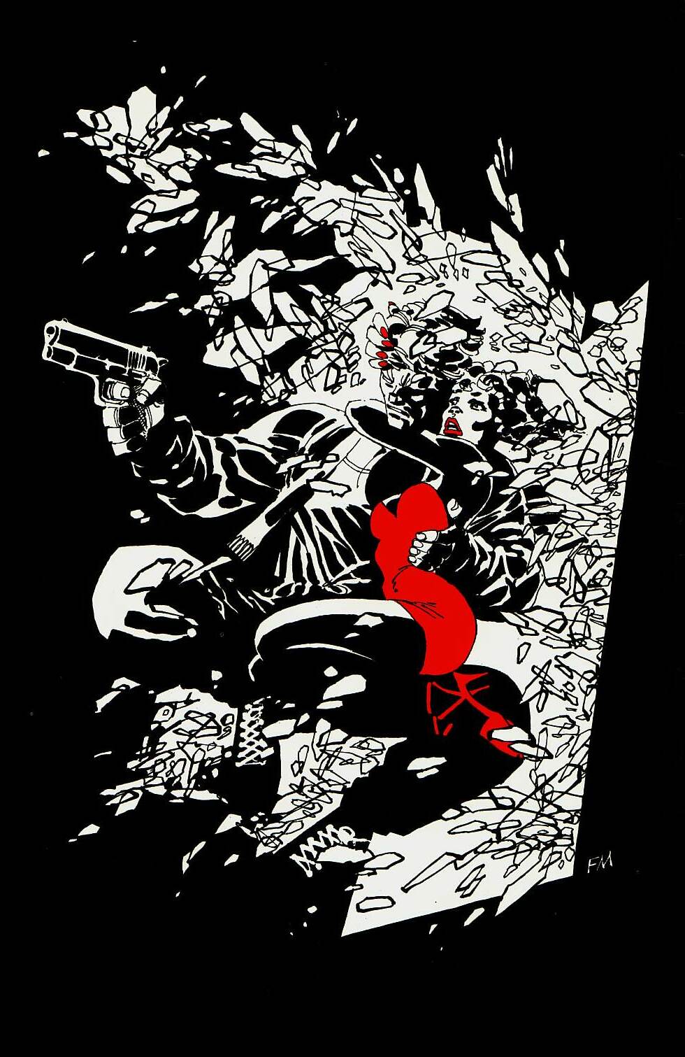 Frank Miller: Sin City: The Babe Wore Red.  Frank Miller: Sin City: Hell and Back. Simplification of sort can be observed not only in all walks of life, but seemingly in the Universe as well. We can apply this to the understanding of the history, arbitrary epochs of the world as seen from the viewpoint of humanity as well as our cognition. We simplify everything from languages (signs and sounds) to physics (basic equations) in order to understand its “essence” and consequently build on it and further expand it. In diagrams, we simplify the shapes of planets as spheres (or circles in a two-dimensional representation) and their orbits as cyclical, despite them being more or less elliptical – because of gravitational fields and their complex effects not just in our solar system, not just in our galaxy, but in the Universe as we know it. In other words, this minimalistic principle can be imagined to having an ace up one’s sleeve, or using selective means most effectively with restraint. Again, if the artist reveals all of his or her cards at the very outset of a comic, if will be harder to keep the reader’s attention span, since the story will already seem to peak during prologue. Arguably, there is a different “simplification” in work when we for example simplify a philosophical doctrine in order to give it clarity, as opposed to being wavy of overexposure and excessiveness of pictorial material, but comprehension can in both cases be enhanced by the very nature of stressing only particular elements. Thus, the focus is clearer and understanding is greater. The issue of less is more can be best assessed through the superhero genre, where the pictorial extravaganza bombards the reader, while the nature of these powerhouses among humans hinders the effectiveness of storytelling, as the stress is placed purely on the impressive visuals. And to stress the matter further, the superheroes as essentially gods become an ego-driven ideology in itself. Once you unearth God and the (hu)man made in his image, we may as well ask ourselves, where the line is between our self-imposed prominence as merely a selfish desire to be gods and the natural progression/evolution (with or without us). In any case, while the over-the-top heroic elements may pique the interest of (younger) readers, because they present a fantastic, other-worldly sphere brimming with imaginary potential, the author may in fact alienate some (adult) readers by relegating the present human condition to the excesses of some fantastic force. Once you propel the superhero towards hyperbole, it becomes a commonplace for creating more and more powerful figures still. The more celestial the planet-eaters and god-destroyers get, the less humanizing the layers of the story become, so the human reception echoes harder through them. This issue of is also strongly shared by the delusion of religion in the current era of myth-busting. I’ll move on, before this turns into paradox for the sake of paradox, akin to this relatively long-winded post about “less is more” … ahem. An interesting parallel can be drawn to the notion of wu-wei, present particularly in the Daoist (and Confucian) philosophy. Essentially meaning spontaneity and effortless action, wu-wei bears striking resemblance to the principle of minimalism (or rather the other way around). Following a natural flow, either the artist or the sage embarks on the path of least resistance, where all the other elements follow suit. Consequently, the background noise in music, the darkness/negative space in visual art, the conundrums and paradoxes in religion and philosophy take center stage and become not just more meaningful, but necessary for the subject matter. An empty picture with a person standing in the middle has a more striking effect than the one displaying a crowd. While the latter demanded more attention and work, it is the void of the first that adds depth and emptiness that the observer fills with their own perceptions and beliefs (again, context always matter). Akin to the notion of Dao, emptiness becomes a tabula-rasa-like possibility, the negative space that the reader fills with an array of choices limited only by one’s imagination. Further, these observations can share resonance with the gutter as the empty-yet-full comics component. Also, by not stressing a particular element, the artist is in fact stressing everything else about it. The empty picture becomes full and remains in strong (yet natural) contrast to the sole person inhabiting it. While in different surroundings the devil is indeed in the details, in this case less is definitely more. The final point about this varied category of minimalism may be a bit of a stretch, but feels suited here, especially in relation to the notion of less is more. Namely, I refer to masterpieces. So, what’s that about? A masterpiece is a work that transcends not only its specific genre or medium, but connects cultures through different eras by the mastery of its subject matter … This by definition is an irregular occurrence. A perfect world beaming with one masterpiece after another would not only devalue the individual worth of such a work, but raise the level of expectations, where the grandeur of a work of such depth must be contrasted by its place in society. Utopias aside, humanity seems to have always envisioned progressive lands, states, organizations and orthogenetic ideologies, but pragmatically, there has always been strife and conflict. To a large extent, advancement itself requires diversity, which means the dirty stuff as well. Many a masterful work was a direct response to the less than progressive events of its time (Guernica being a prime example). A masterpiece can only be a masterpiece in the true sense of the word when it directly reflects the human condition in full (the “good” and the “bad”), in the process differentiating itself from the rest in an attempt to artistically take the society towards a higher level (hand in hand with the “good” and the “bad”). And in a perfect world, this becomes a paradox akin to the ideal of liberal democracy in our present world. I mean, all in all this is about life, right? NEXT: STEREOTYPES Facial expressions can definitely be viewed within the first principle of physiognomy, but since this second category is so essential to visual storytelling, it needs to be stressed in its own right. The emphasis on what our face instinctively expresses and how these (mostly) natural reactions are perceived can actually be far greater at times, since human communication is the most intimate and revealing when observed or experienced face-to-face. We can view this in more or less every good comic that involves a comprehensive dialogue or two, where facial features and character reactions are of such importance that background is often left out, so the emphasis remains on the face … and there is less hassle for the artist to worry about pesky background details when those are of secondary, if not tertiary importance. (Two birds, one stone.) Pragmatically, this is established in large extent through many close-up and medium close-up shots. This is a feature of storyboarding that the comics medium shares with film. Storyboarding is the concept of sequential visual images telling the story and showing the shots the director will invariably choose, unless a myriad of changes occurs, of course. (Comics are essentially a storyboarding concept brought to life, albeit much more finalized and complete than in film, where storyboarding is the map that leads to filming the action/acting.) The stress on the character’s face and their facial features reflects our desire and ease of expressing both basic and complex emotions. The reader for example embraces subtle frowns or smirks very fast and consequently adds this emotional state to the overall depiction together with the text expressed in the balloons or captions. Easier said than done, of course, since mastery of comprehension of such features essentially pales in comparison to the artist actually being able to capture just the right emotion not to create unwanted confusion or guessing from the reader (again, unless intended). This means that the artist needs to laboriously study the whole human body, from the bones and muscles to the tiny, delicate changes on the face. Just one line too many in the neck and too dark an outline can make all the difference between unwontedly seeing that dark line as for example a vain that can make the character seem too angry/nervous/excited in that specific context. McCloud has a couple of very methodical/formalistic schemes that beautifully capture the richness of facial expressions and the prudence of the artist to capture them appropriately. 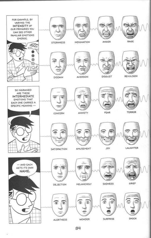 McCloud, S. (2006). Making Comics. New York: Harper Perennial. Pg. 84 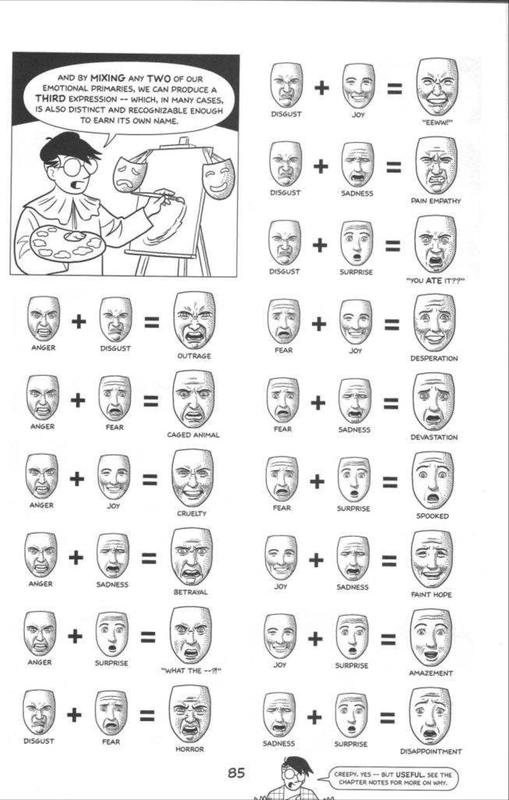 McCloud, S. (2006). Making Comics. New York: Harper Perennial. Pg. 85 Conversations over the phone are on the other hand much different than in person. While nowadays it has become to an extent easier to converse digitally (especially, if one seeks a less emotionally hectic experience), looking a person in the eyes offers direct connection, noticing even the smallest frowns and squirms … if your converser is observant enough or rather emotionally invested enough to care to notice. But that’s the case with essentially everything we do, especially nowadays when stimuli (over)consumption is almost inescapable. The parallel of what we experience in reality to the depictions in pictures is obvious. The visual rendering, however, becomes a far more hectic matter to everyone who has ever tried to draw a face conveying the appropriate expression. Lastly, perhaps the reason for such stress on facial features stems also from the fact that the body part with the most muscles is in fact the head. A relatively small body part can thus astonishingly create a whole plethora of emotional responses that guide and govern the observer’s own reaction. While the body as a whole is a visually more prominent factor that can convey general expressions (even from a distance), the head is responsible for more detailed expressions and emotional nuances that can be viewed only at close distance, in a fittingly more delicate setting. As they say, if you cut off the head (of the snake), the body will follow accordingly.
 The concept that I label physiognomy encompasses the larger framework of being knowledgeable about the human appearance and anatomy. While race and gender may differentiate, there are certain visual features that apply to any and all humans. This just means that generally speaking we for example have a pair of arms, regardless of the length of the forearm, color or veininess of the skin (or rather veininess viewed under the skin), etc. Flexibility, gestures, what we do with our hands and how we do it is another matter altogether, because various natural attributes and cultural dogmas quickly come into play. When drawing gymnasts for example, you can even go overboard with their flexibility, the same way as muscles and veininess of superheroes have become the obvious staple of their physical appearance (this relates to the notion of stereotypes that will be discussed in a future post). On the other have, the position of the limbs (body itself) can subtly reveal a lot about a character: whether they are in a defensive position (with arms crossed) or overtly stiff, which can be used for a specific purpose like showing the character as shocked or emotionless … or can indicate the artist’s slight lack of visual prowess in not being able to capture the appropriate appearance. (Generally speaking, when the comics creator is both the writer and the artist, such “abnormalities” are far less likes to be either allowed, let alone observed.) Gestures, on the other hand, can also be misused culturally or drawn in a dubious way, so ideally any sort of potentially confusing elements should be scrubbed out right away … unless of course confusion is intentional, as the best works can hold steadfast to. This means that if you’re reading a story about Nazis and you’re not sure if a raised hand is intended as a greeting, merely stretching or a controversial salute, in the best situation this misperception could be used by the artist to create further intrigue and plot twists, it can foreshadow or deliberately build the story in a way so you have to read it again. (Me thinks, the Nazi salute example is the effect of finally getting my hands on the first volume of B.P.R.D.: Plague of Frogs. Clearly, everything is connected, but I digress.) The human body therefore has specific features that need to be met without the work of the artist regressing to a farcical state of perception. Of course those delicious exceptions to the rule that I already mentioned, are not the only ones. Theoretically speaking, every rule of physiognomy can potentially be broken, if stressed sufficiently and maintaining its established subject matter. The same way as Disney has for example established its unique look based on loose rules of anatomy and spread them worldwide (for example influencing the manga work of Tezuka, who in turn influenced back the mainstream Anglo-American comics). As part of the comics canon, Smith’s Bone, is for my taste just about the perfect masterpiece of how to create an epic story with a unique look and deliberately cartoonish features … and most importantly making it all work. While artists have specific styles and the best of them can change them according to either the demands of the story or the publisher (cf. David Mazzucchelli and Scott McCloud), they decisively stress the importance of understanding basic human features. This knowledge, namely, extends beyond the mere appearance, since to understand a human is to understand a human in reaction to both internal and external stimuli, the personal and the social. Consequently, issues like depth perception, perspective, shading and motion become paramount to effectively conveying a story. (Unless the pictorial elements are for example extremely experimental or are confined to stick figures without background. In this case the linguistic elements have to carry the bulk of the narration for the comic to still be held in high regard.) I’ve become more alert to the technical side of things from the time I’ve read Eisner’s and McCloud’s work, but if you’re into the practical side of comics and art in general and would like to know how it all works, there are so many (mostly good, if not even superb) works out there, it’s almost impossible to go wrong. Whether it’s a book on writing, a manual on character building or video lectures on how to create the larger world from essentially the most of basic geometrical figures, it all comes down to interest, intent and perseverance (and even then there’s a difference in comprehension and rendering). While every tradition has the potential to enthrone its own visionary way (abstract or not), it seems that Picasso was definitely on to something when he observed the flexibility of knowing the joints … I mean rules before breaking them … or merely stretching them intensely. NEXT: FACIAL EXPRESSION From the outset, works of art have been embedded with aesthetic appeal. They carve their very essence through the artist’s craftsmanship and insight, reflecting the ideals of form, function and greater social inspiration. I would like to think that cave paintings, the Renaissance classics as well as the modern memes at least in some aspect still pertain to the overinflating grandeur of the first sentence. To know the human condition, it helps to know the human endeavors and creative force. And art serves a purpose that very few other modes of expression can follow suit. It is a humanizing force that at least tries to adhere to the divine as well, but it also means understanding the self, its surroundings and the tying force that binds the personal and the social together … if not nature/existence altogether. And visual art (proper or not) has been the stable of our imaginatively progenitive endeavors for as long as we have made an attempt to copy, preserve and comprehend our states of mind and being. It comes without saying that to understand a medium like comics, which centers on pictorial representation, one must become versed in various aspects of visual art. There is an obvious difference in the complexity of comics than specific art trends like surrealism or cubism for example; this, however, does not imply by any means that comics are a form of lesser artistic expression. They merely approach their subject matter differently and apply the basics or building blocks of the visual world in another way, specifically focusing and relating more to their sequential nature and narrative function. What are these building blocks? Language fields like phonetics, morphology and semantics teach us how linguistic expression is a complex amalgamation of sound, form and meaning. To eventually understand the most comprehensive literature and complex philosophical thought, we must first learn to read and distinguish the basic phonemes, morphemes, letters and sounds which create a larger whole. In order to understand anything, we have to attribute meaning to it and essentially create a contrast between what is known, what has meaning and what is unknown (in some way seemingly bereft of meaning). Pictorial representation follows alarmingly similar principles. To simplify things even further, you could say that understanding pictures requires knowledge of basic shapes and colors. But that’s obviously too vague a statement, so we’ll have explore it further. The area where pictorial and linguistic elements meet is semiotics. While the understanding of cultural meanings of signs and their progressive development offers vital clues into their application in a give work, there is still a measure of subjective implementation of sings both from the viewpoint of the author and the reader. To complicate matter further, there must always be a distinction between the meaning of a sign in isolation and in a particular setting. In such a way the sign + may be either a plus sign or a cross; however, in works brimming with religious imagery (such as Hellboy, Lucifer or Preacher that I’ve already touched on), cross itself conveys a much deeper meaning to different religions and cultures, not just the tradition out of which and through which the works gain strength. Arguably, we can find syncretic parallels to let’s say a Celtic cross … and that’s part of the fun, intrigue and frustration in trying to assign meaning of a specific symbol within a specific culture, specific era and consequently even specific way of reading it in that particular context. Now, there’s a lot of “relativity” here, but the point is that you have to have a feel for the subject matter and you need to understand the work you are reading or the painting you are observing (or the music you are listening, etc.), for it to make greater sense. This means that there is no absolute interpretation, because meaning gets easily transcended and often the intention of the artist can be swayed more towards popular opinion of their work, regardless if the mass got it right. Depiction of signs and imagery brimming with not just every possible cultural form but spirituality and human life has been a long-standing tradition in all art fields. We attribute meaning to the world around us in order to make sense of it. Without it, this very writing becomes fast obsolete. While theoretically speaking markings of any kind may be artificial constructions that cannot capture the essence of life they paradoxically try to convey, we are essentially part of this planet, so our reflection of the world around us should in one way or another try to point to truths within said world that are not just arbitrary. The circle for example has historically gained a very prolific pool of meanings. Referring to unity or nothingness, the sun or the night, the sign O may be a natural choice for its many meanings, since the spherical form reflects the shape of many objects in the Universe. Therefore, while even da Vinci’s The Vitruvian Man may concretely be nothing but scribbles on canvas, the meticulous draftsmanship, the form and the meaning of the picture nevertheless reflect a higher truth. For those very reasons and after half a millennium of its conception the work still permeates human imagination. 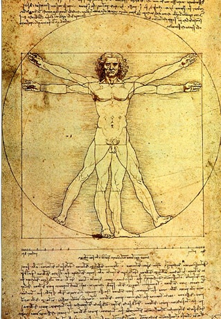 Da Vinci’s The Vitruvian Man My research essentially tries to follow the principles of Euclidian geometry, inherent gravitational principles, psychological means and cultural distinctions (particularly regarding color). This, however, is at best times only a smart-ass guessing game that can quickly fall prey to scrupulous overinterpretation or gets caught between the overtly subjective worlds of either the author or the reader.
In other words, since the world of comics reflects the natural world, there is neither a uniform code of expression nor definite rules that every single artist follows. As does all art. Even the works that go against the principles of nature and physical reality are nevertheless based IN this reality; namely, they are created by the author in this world observed and comprehended through the means and senses of people in the same plane of existence. Otherwise we would not be able to comprehend them, even if only on a very miniscule level. Higher spiritual and divine realities by their very nature extend beyond the physical existence in which this writing is presented as well. Thus, such “higher” comprehension by its very nature becomes pragmatically excluded from our mundane experience. Historically, we can observe certain visual conventions for artistic representation in any given art field. Different periods of time obviously reflect different social, cultural, ideological, technological times, but within this diversification there lays the ever-present humanizing force that seeks to show the then and future generations aspects of the visual world or of the interior world of dreams and imagination. Genre distinctions and specifics of a particular medium govern the “rules” of a particular filed of expression. I believe it was Picasso that was of the mind that once mastered, even those rules are to be broken for progression and complexity of life to be furthered (otherwise there would be no cubism for example, while within mythological framework the work of tricksters would be likewise in vain). The comics environment is just as specific as certain artists have a tendency towards a particular composition for example (i.e. Alan Moore’s complex multi-narratives and masterful verbal coinage or Mike Mignola’s expressionistic prowess of telling more with less). A wide variety of works and compendiums can be found on the nature of symbolism and the consequent attributed meanings to specific signs. As such, it is pointless to provide a long-winded narrative on the nature of every single possible symbolic representation, because it can vary considerably and it often becomes a deconstructive pain in the ass, because very few authors actually provide an in-depth etymological account … because to put it bluntly: there’s too much painstaking work and not enough appreciation. Look at it this way: there will always be cultural symbols and to really know them you have to study said culture. (And for the most part its neighbors as well, because no one evolves in isolation, so there’s influence galore!) Now, let’s say you have a broad understanding of how for example the circle has been represented religiously in Western Europe. Does that relate fully to the mathematical use of the circle within the Muslim scientific revolution or the “number” zero in ancient India? Does the circle divert in some way to the Daoist philosophical decree? The easy answer is that the circle does symbolizes unity, the sun, pervasiveness and fullness/emptiness cross-culturally, but the paradox is that it does so diversely in each era and within its specific playing field. So saying that something is universal is missing the point, because the formalistic hive-mind of humanity tends to oversimplify things for the sake of easier comprehension and consumption by the non-experts. (Plus, nothing is “universal” per se. It’s only on the level of “as far as we know it”.) Symbols like Pi Π or Phi Φ are used similarly. Both are either letters or essential numbers. But the number of Pi as 3.14(159…) is a simplified approximation (for obvious reasons that most people hate numbers), just as much as the golden ratio of Phi is rendered as 1.618(033…). How each is used, however, depends heavily where you stand. There’s a big different in jotting down Π just as a sign of some mathematical mumbo-jumbo, of using Φ as the spiral of life. And even that depends heavily, if you’re working the philosophical angle or are trying to disclose some would-be universal patterns … All in all, there are ample examples of use of signs of all kind. Relativity is a fickle thing, indeed. When you are dealing with a visual medium such as comics, the meaning of a single line, its depth, color, position, means of rendering, etc., creates plentiful conversational topics to consider, because for the most part the artists have indeed considered most of those and many more. What the reader sees and reads is the product of a work brimming with details that get for the most part only glanced over, because reading is relatively fast and our ability to scan pictorial elements faster still. Therefore it’s important to know how something might work for the most part. While specific industry and production demands always create their own ideology of artistic work, it, however, behooves me to stress some principles that I have found essential for a complex, meaningful pictorial representation in general. The focus in this context will be on physiognomy, facial expressions, minimalism and stereotypes. NEXT: PHYSIOGNOMY 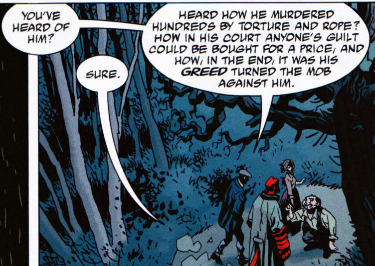 P1 (Mignola et al. 2008b: 25) P1 (Mignola et al. 2008b: 25) Just as any art form prides itself on its particular rendering(s) and consequent reception, the understanding of comics also relies on the medium-specific elements. Randy Duncan and Matthew J. Smith propose a system of comprehension of images within the comics pages, which is essentially tripart: distinguishing between sensory and non-sensory diegetic images and hermeneutic images. Sensory diegetic imagery refers to aspects that can be perceived by the senses: pictures and words portraying characters, objects and the environment of the story (i.e. dialogue). Non-sensory diegetic imagery depicts aspects that would normally be unnoticeable, such as emotions and sensations of the characters, but the visual nature of the comics given the reader insight into the characters (i.e. thought balloons). Hermeneutic imagery, on the other hand, is placed outside the story world, yet influences the interpretation (i.e. psychological images, visual metaphors and intertextual references). All of these perceptual elements are, nevertheless, under the influence of personal and social stimuli that may result in inattentional blindness, hence inadvertently limiting the response to the work. Reception of comics depends heavily on the complexity of a given work. While various guiding traditions of narration, image-building and techniques exist, every comics panel is as unique as every written work is exclusive. Despite the fact that theoretically the vast majority of words used in a novel are for example available in dictionaries (unless you’re Shakespeare, of course), words are nevertheless used and described there in isolation. Equally, some of the charm of the imagery used in comics is its very appeal and recognition; yet, it is the newly created world where these pictures and words are given the platform to interact with where the ingenuity of authors comes into play. Together with the comprehension of the readers, the work is taken to the final level of recognition, where it is taken through a tailspin of interpretative grandeur by the numerous ways of readings, providing the ultimate interplay of the individual and the social. Before the reading process becomes too idealized, it must be stressed that there is always a degree of confusion (noise) and deviation in the interplay of author’s creation and reader’s reception (the interplay between intended and perceived meaning), varying from the beliefs and technical abilities of the author to the expectations and willingness of the reader to perceive the work as a whole. This, however, is true to all art products, since they are inherently an individualistic expressive design. Suspension of disbelief thus becomes a prerequisite for the enjoyment of not just every work, but is part of life’s perception as well, pertaining both to subjective views and objective representation. As we suspend disbelief to not see the drawings as merely colored lines on paper and to perceive images on a screen as anything but hyperrealistic binary code, we are doing so inherently. We do not perceive the world through its components; like general shapes or atoms to be even more precise. In the latter case we are physically unable to see at such peering close proximity, just as much as we can’t see radio waves because of the limitations of our perception of the visual field. Similarly as our brain transforms two images from each eye into a united whole, we take reality as a complete image as well – like a board with chess figures of life that require our undivided attention in order to play the game right. Pragmatically, the suspension of disbelief is the essence of our whole existence, since even growing and learning demand of us a certain degree of “blind acceptance”, either from what our parents teach us or what the texts we read try to point out. We can become critical and learn to evaluate things only after we have gained a certain amount of knowledge of ourselves, the world we live in and (crucially) their interaction ... And, to complicate things further, this doesn’t mean that all of a sudden everything becomes clear and you can comprehend life to the fullest. No. That’s an ongoing process. Call it a kind of hermeneutic cycle of life experience. The reading process requires us to understand spatial relations within every comics page and apply temporal notions, creating the illusion that the work is animated and comes to life. We do the same when watching film (connecting the frames to form continuous action – but in this case most of the work is already done by the creators) or reading a book (creating images in our mind from the symbols we read, making the subject-matter of the work come to life in a fascinatingly abstract fashion). Picture 1 (P1) reveals a spatial location with the characters walking along a path in the forest. The illusion of time is created by reading the words; namely, as you read, you imagine the characters walking along. The panel ends by capturing the moment in time as we walk off to the next panel. In such a way, as we begin reading, the position of the characters (were they not standing still) may have been more to the left. Therefore, what the picture reveals in the final frame is the animated process that occurs in the gutter between the panels and in the panels themselves. P1 (Mignola et al. 2008b: 25) 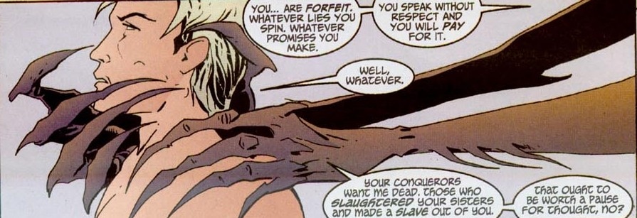 P2 (Carey et al. 2013: 203) P2 (Carey et al. 2013: 203) Arguably, panels can be static as well, especially when using a silent (wordless) panel as an establishing shot, where building a scene itself is more important than reflecting on its temporality. The reader, however, applies motion and time to the scene (in film this would be achieved with a zooming effect) because we know the world is not static but brimming with life and movement. Paradoxically, a complete comics image is immediately followed by the gutter and the following panel(s), further stressing the momentary aspect of reception and consequently emphasizing the astonishing ability of the human mind to comprehend complex meanings and depictions in a matter of moments. The final words in a panel generally reflect the final depiction of events. In this process every spatial and temporal element in the panel beforehand leads to that final moment when the complete image is perceived by the reader. If we look at P1 again, this means that when you read the text that ends with “against his”, that’s when the time freezes essentially and that is what the picture shows. The picture is just the final representation. I say just, because as you begin reading the text that begins with “you’ve heard of him”, time passes for the reader and as well as the perceived events in the panel, which means that at the beginning of the text, the characters should ideally have been on the left side of the panel. This creates the illusion of movement as much as it is the illusion of “turning back the visual elements”. Plus, the more back-and-forth dialogue you have between the characters, the greater the disparity and the potential for either confusion or just logical pictorial oddities. Coincidentally, this is why Eisner was such as big proponent of using one panel to show one scene, not prolonging action (even if it is just dialogue). This is why the dialogue in comics is often “relegated” to medium shots and close-ups to avoid (drawing) background noise, to place more emphasis on expressions and to create a sterile environment, where the reader is for example focusing only on character’s encapsulated timeless facial demeanor. When pictorial and verbal elements are at temporal odds, especially when the action depicted is more crucial for the development of the story, the reader’s suspension of disbelief can be shaken. P2 is clearly meant to be the final frame, since the creature’s hands are about to engulf the protagonist. We notice the picture right away; however, as we begin reading, we are actually taken back in time, forced to imagine the hands ever so slightly moving forward before reaching the apex of what is actually portrayed. Since visual experience is a process of space and time, this creates a spatio-temporal distortion that is common in many comics and can result in the “grip” of the narration to be loosened. P2 (Carey et al. 2013: 203) 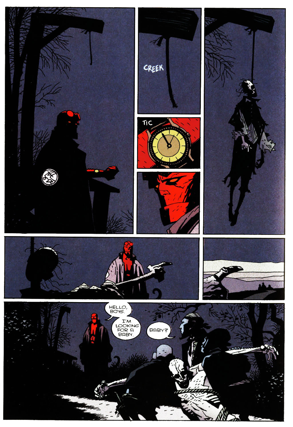 P3 (Mignola et al. 2008b: 38) P3 (Mignola et al. 2008b: 38) The reason for this “awkwardness” may be twofold: Lucifer was created in the mainstream comics environment, which means that individual issues of the comics ware for the most part “relegated” to 24 pages, in which case the authors were physically unable to divide the panel into two, with the first for example focusing on the dialogue and the second on the danger element to achieve a greater shock value of the scene. On the other hand, the panel may have been intended as such to create the lingering effect of impending danger even as you read the dialogue. The fact that the dialogue is spread on the right side of the panel and the hands appear on the (more immediately seen) left indicates that this might be the case. Although time per se in not a quality of vision, semblance of time is presented visually (cf. P2 and P3), while the interplay of space and time becomes a prominent factor both in comics as well as art, not to mention our constant daily struggle to fight off the proverbial hands of time.
If we consider the dual aspect of de Saussurian logic, reading comics is both immediate and gradual. The latter notion is probably the more obvious one. Reading comics for the most part follows a panel-to-panel progression, similar to a sentence-to-sentence stricture. Jumping from one panel to another, the reader is gradually revealing the overall picture that the comic is urging us to complete. The path of reading is directed by the author who constructed the design (like a successful chess player needs to calculate numerous moves ahead of time), but the response from the reader can be anything but linear and straightforward (as the other player uniquely responds to the position on the board). Immediate reading, on the other hand, refers to the fact that we notice pictures at a moment’s notice, since action precedes words, so the dialogue for example takes generally more time to devour. Every observed page in a comic is immediately scanned in a sort of top-down approach, moving from the most noticeable elements on the page as a whole (such as strong outlines, color, contrast and striking, unexpected shapes) towards individual panels where detailed (gradual) reading follows in greater detail. P3 (Mignola et al. 2008b: 38) Taking the above page for example (P3), the strong contrast is immediately achieved by the color red, which is noticed at once and especially because of the rest of dark, blue, melancholic tones. Upon gradual reading, you are drawn in further by the two smallest middle panels that act like the glue that keeps all but the last panel together both visually and thematically. Symbolically, the first six panels play off of the visual metaphor of the watch in the central panel by acting like a clock, moving from one element to the next. By striking midnight, the watch symbolically marks the end and a new beginning, reflecting on the dead body coming to life. The beauty of the layout is evident in the fact that we can actually read these panels in any way we want, since they all lead to the final long shot panel, where the hands of the corpse (through light contrast and position) lead the eye out of the panel into the next page. Since this design is pictorially dominant and the transitions are masterfully done, the reader can generally read through the page quite fast, but the “loop” of the two smaller red panels and the strong contrast makes you linger on these details (more and more through each rereading). Reception is obviously a complex principle that works on the most extreme subjective levels of any reader. To those for example not acquainted with Mignola’s Hellboy and distinctive expressionistic style, let alone not versed in reading comics, this page might seem merely a gritty, verbally-sparse product that you can go through quite fast. The crucial element why the page reads fast, however, is due to excellent pacing and mastery of Mignola’s craft. Misconception clearly breeds unappreciation. The followers of the Hellboy canon not only carry an unprecedentedly larger amount of emotional investment in the work as a whole, but can notice intertextual references. On a personal level, it is beyond rewarding to notice such grand elements of structure, composition and comics mastery in relation to what a newbie comics enthusiast can for example feel, but not quite understand. Rereadings, attention to detail and love of the subject matter can thus broaden one’s horizons beyond words … I would say beyond pictures as well, but it would seem counterproductive and too cheesy, so scratch that. Anyway, even art enthusiasts can for example more readily notice the spatial technicalities that are conveyed on the above panels of P3. In other words: for visually oriented readers, the art tends to dominate the initial attention, whereas prose readers not accustomed to the comic book form tend to move from one block of text […] to the next, and often miss important visual clues in the process. (Duncan and Smith 2009: 119) Perhaps the greatest attribute of reception is the fact that we can distinguish so many nuances and convey such a wide array of readings. The interplay between author and reader in comics is arguably subject even to interpretations that may or may not have been intended by the author. Over-reading can be always pesky, especially when you’re analyzing works and authors that are close to your heart and mind, but it goes without saying that when you do get it right it’s a jolt of positive energy that reaffirms your hard work was not in vain. Affective visualization allows authors to create elements that are less clearly observable (whether through subliminal elements or references to other works and the like). In such a way, the complexity of the narrative is further increased and the hermeneutic cycle propitiated. The reason for this is because pictorial portrayal varies (with author’s style the most). Mignola for example does not have a specific way to write SKELETON, or even of writing about or describing a skeleton (he does not have to), but he draws a distinct, unique skeleton that is immediately recognizable and unmistakably his. Reception of comics thus becomes an intimate process, uniting the two players like no other game. As every chess game can be played differently, more complexly forever again and again (as you adapt to the tactics used), so are comics a well of everlasting interpretive levels, since the spring of readership constantly renews and enriches its (mythic) potential. In closing this chapter of readership, the general assessment of comics as imagination-stirring objects, which has to a large extent carried over from its satirical, easy-going origins, refers back to comics as pure and simple being fun. It’s extremely pleasurable to allow your imagination to run wild with possibilities … when visualized in comics, that much better. Either through promise of an escape into more exciting, peaceful, fair, different worlds or enhancing the present world through factual means and insightful imagery, comics elucidate the human condition in a startlingly similar way as myths do. And that’s what you can call the eternal game of chess. References: Abel, J., & Madden, M. (2008). Drawing Words and Writing Pictures: Making Comics: Manga, Graphic Novels, and Beyond. New York: First Second. Abel, J., & Madden, M. (2012). Mastering Comics: Drawing Words & Writing Pictures Continued. New York: First Second. Arnheim, R. (1997a). Art and Visual Perception: A Psychology of the Creative Eye. Berkeley: University of California Press. Arnheim, R. (1997b). Visual Thinking. Berkeley: University of California Press. Dolinar, D. (1991). Hermenevtika in literarna veda. Ljubljana: ZRC SAZU - DZS. Duncan, R., & Smith, M. J. (2009). The Power of Comics: History, Form and Culture. New York: Continuum International Publishing Group Ltd. Eisner, W. (2008). Comics and Sequential Art. New York: W. W. Norton & Company. Gadamer, H.-G. (2001). Resnica in metoda. (T. Virk, Prev.) Ljubljana: Literarno-imetniško društvo Ljubljana. Garfield, J. (2011). Meaning of Life: Perspectives from the World's Great Intellectual Traditions. Chantilly, Virginia: The Great Courses. Heer, J., & Worcester, K. (Eds.). (2009). A Comics Studies Reader. Jackson: University Press of Mississippi. Jauss, H. R. (1998). Estetsko izkustvo in literarna hermenevtika. (T. Virk, Prev.) Ljubljana: Literarno-umetniško društvo Ljubljana. Komel, D. (2002). Uvod v filozofsko in kulturno hermenevtiko. Ljubljana: Filozofska fakulteta. Lopes, D. (1996). Understanding Pictures. Oxford: Oxford University Press. McCloud, S. (1993). Understanding Comics. New York: Harper Perennial. Moore, A., & Burrows, J. (2008). Alan Moore's writing for comics volume one. Rantoul: Avatar Press. Saraceni, M. (2003). The Language of Comics. New York: Routledge. Talon, D. S. (2007). Panel Discussions: Design In Sequential Art Storytelling. Raleigh, North Carolina: TwoMorrows Publishing. Virk, T. (1999). Moderne metode literarne vede in njihove filozofsko teoretske osnove: Metodologija 1. Ljubljana: Univerza v Ljubljani, Filozofksa fakulteta. Wolk, D. (2007). Reading Comics. Cambridge: Da Capo Press. 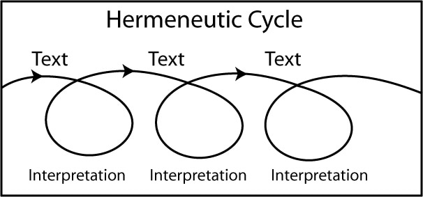 No form of communication is merely a one-way street. You always have at least two participants: the author and the reader. In the case of comics, a more personal, intimate art form, the approach towards readers is much more than obvious and becomes a shared relationship. Reading (any work of art) thus becomes a cooperative process of adding layers upon layers of comprehension and depth of a given work. The more renowned a work, the more it will partake in the conversation of public domain and the more nuanced its role in the “public unconscious” will inevitably become. Reading is the process of interplay between (at least) two participants, even somewhat resembling a chess game, a game of what the author means and what the reader reads, a game of what is envisioned in a particular way by the writer, of what gets depicted in that exact way by the artist and of what gets understood appropriately by the reader to whom (for the most part) the work is made. To continue with the chess analogy, if the author is the grandmaster who starts with the white pieces (reflective of the author’s unique position of having the upper hand in the making of the comic), your reaction is a response to his or her move (simultaneous displays not excluded), playing a continuous exchange in a game of one-upmanship until checkmate or the conclusion of the last page. The reader matches the moves of the author by his or her awareness of the position of the pieces on the board (i.e. the panels, the transitions, the characters, the plot). The subsequent handshake, however, does not indicate the end of the game, since revision and analysis (interpretation) follow in chess as well as comics. Reception of comics is obviously a process that depends the most on visual literacy. Once the reception theory or reader-response criticism opened the door to a previously unseen factor of readership, the paradigm shifted to what author’s work means specifically beyond itself and beyond the author’s perspective. We have to also take into account that the participant in any art form is exposed not just to that field of expression, but to various other mediums which in one way or another influence each other and affect the reader through artistic stimuli. The respective artistic environment creates a transference of experience beyond any single artistic exposure. This means that your method of playing the game is subject to the rules of said game AND thinking outside the (narrative) box, which can result in deeper awareness of the tactics in play. For the purpose of my research, reception essentially coincides with interpretation … as observed by the theory of hermeneutics, whose original philologically theological origins evolve into philosophically existential meanings over time. Essentially, all of this brings together the three major methodological paradigms we discuss through interpretation and analysis; the author, the work and the reader (reception). While it may seem quite obvious, the consequent result is not merely (a better) comprehension of the work, but actual communication with it. Any given work is inevitably the product that will forever be the crux of any research and the key factor in social comprehension of it. Even if you’re a genius like da Vinci or Shakespeare, it’s still your works and your output that carry your legacy. Within the pervasive hermeneutic sphere, specific focus needs to be placed on the notion of the hermeneutic cycle, which postulates that the understanding of a given work gains more concrete and specific meaning(s) with every (re)reading. The more you read, the more you know? No shit, Sherlock! But the hermeneutic meaning still differs a bit. The implication of a potentially endless frame of interpretations becomes more than just a possibility. This paradox of the (hermeneutic) cycle as an endless, conceivably meaningless loop of possibilities that cannot be factually grounded and finalized may seem scientifically daunting; yet, we must remember that such academic work is always relevant within its time-frame. Any kind of hermeneutic research offers an interplay between the past and the present. Both theoretically and pragmatically, reception (of mythology in particular) uncovers veils of understanding of the analyzed works and enriches them with a temporal dimension which renews its (endless) life and meaning. (Because once we stop reanalyzing Plato, reevaluating Dante, forgetting the great artistic, expressive nature of humanity, which spurred our understanding of ourselves and our world, we lose the connection with the past, we become lost in our present without even enjoying that elusive present moment and the future becomes a cycle not of positive reevaluation, but forceful rediscovery. While the very commercially and passively oriented world of today may not care about the greater value of Nietzsche for example, the internet as the great virtual library of our Being or even electricity as its conduit become a different matter. Intellectual and pragmatic works are as intimate as are science and religion, as they both stem from the same expressive potential and desire for comprehension that we have formed from our basic instincts of survival and reproduction.) Comprehension of specific parts of a given text depends on the understanding of the work as a whole, yet the work itself relies on the understanding of the individual parts that it is comprised of. This again seeming paradox echoes not only the Daoist unity of the individual to the whole, but stresses the interaction of the personal and the social in general. The importance of numerous readings may be very pragmatic, scientific and psychological, since humans for the most part do not possess instantaneous storage of information without any memory leaks, but on a meta-level each reading of a work is further enhanced through the growth of the reader and deeper realization of what we might already know about the text. Relating these observations to visual literacy, “hermeneutic mastery” of a particular work, the world in which it was created and the consequent world it further creates and exenterates, we can speak of a specific kind of literacy here as well, since expertise of a given subject matter becomes the only real proficient means of further evaluating its content. I’m sure we have all had the soul-sucking experience of having to labor through a book in school or college that was deemed “enlightening” by the powers that be, but we either didn’t see it (at that time) or couldn’t have cared less. Life experience comes into play as well, of course, but mastery of a given subject matter often has a funny side effect of sometimes suddenly beginning to put those pesky puzzle pieces together and seeing the bigger picture … I mean seeing the position on the chess board more clearly. I can personally acknowledge this hermeneutic comprehension through my rereading of for example Joseph Campbell’s Hero with a Thousand Faces. Having first read the work at the outset of my mythological research, numerous facts and cultural details flew by me. When returning to the text a few years later, however, as my research enhanced my understanding of mythology, the seemingly nonsensical details and nuggets of stories exemplified by Campbell, more profoundly echoed through my mythological subconscious, uncovering new layers of his work and intertextually tying various loose end. And the beauty of all of it is that Campbell’s work in general echoes the depth of mythology itself, so rereadings become the norm and the necessity (especially if you’re really trying to make heads and tails of sometimes convoluted myths). Not necessarily just for the totality of your comprehension, but for the social transference of that knowledge … so you can apply a given move/position on the board in future plays. Despite the more religious, literary background of hermeneutics, this kind of analysis can be readily applicable to comics as well, since (unlike the passive experience of movies) the reading process of a comic is active (as with literary works). This means that the reader is in charge of the “consumption” of the work in front of him or her, becoming the co-director in the interplay of intended and perceived meaning. Of course taking into consideration pacing and the flow of a comic for example, since the story may be designed to be read fast (indicating action) or with a more conservative pace, which can be reflected in both the greater amount of pictorial detail (on which the reader lingers) and more extensive (or more philosophically demanding) linguistic elements which by their symbolic nature demand greater attention from the reader. Humans have a specific ability of taking even the most outrageously different elements and trying to find a thread that allows us to connect them, again in a sense constructing a puzzle. (This echoes Kant’s philosophy of having to artificially construct the reality around us, with which we struggle, since all the information constant whizzing all around as can often feel like ideological bombardment … and is further incomplete, because of our inherent incapability of focusing on every single element around us.) To a large extent, this puzzle solving is exactly what the experience of comics can be paralleled to. Such “reading between the lines” is less obvious in writing alone, since the reader is more meticulously guided by the author, who has to describe everything the reader is to observe and construct into an image during the process of decoding the linguistic symbols. Comics allow for a more fine-tuned approach: subtle realization through the pictures, as opposed to being directly steered by the words: in other words being concisely “fed” every word, phrase and sentence. We can call this dramatization: the ability to depict information through action. This is a powerful tool that allows interestingly complex interplay between pictures and words such as intentional conflict, as will become clear further on. I should note that understanding of any given occurrence that is not directly connected to our personal being and to which we have no intrinsic power over, is crucially rooted in empathy. Empathy in this sense will not be seen as compassion per se, since this implies a degree of patronization, or in the words of the great Buddhist philosopher Shantideva as “sloppy sympathy”, which merely reflects one’s personal ego and sees the social sphere as subjugated to false/forced, uncommitted misunderstanding. I see empathy as part of larger social understanding and social undertaking. We can find parallels in the psychological theory of mind, the capacity to interpret the emotions and actions of others. Empathy thus becomes the necessary factor, or rather ability, to comprehend any kind of activity or work not merely through our default personal expectations and beliefs, but extending the subject matter to a broader, social sphere. Empathy can be thus extended beyond personal means to art in general, through which it paradoxically refers back to understanding the author and in turn his or her artistic creation. While the connection to the first methodological paradigm is quite obvious, this principle also prominently relates to the work and the reader itself. Thus, the reaction to a given work becomes more complex and holistic, since we are able to understand the complex web of social interactions better by applying our own personal views as part of the broadest possible context. TO BE CONTINUED …  This will be just a general overview of some of the differences between comics and picture books, so take it with a grain of salt, because there’s plenty of material for a more comprehensive examination, but for the purpose of clarity and further brainstorming this forthcoming morsel will have to do. But since the carrot-dangling isn’t over quite yet, I want to extend the last post about comics language/medium into this one. We’ll see how Frankensteinian it gets… The reason for this extension is that the comics/picture books dichotomy is kind of susceptive to the grey area of comprehension and classification that we still get with comics and literature. Generally, we still don’t really know where to cut the line between them and where one begins to morph into the other. Now, the (false) classification of comics within literature has been a common trend since the outburst of the graphic novel and its attempt at (forceful) earnestness and adulthood of comics, but that’s too big of an aside in this context. I would even say that the book form has been the bigger common factor in the comics/literature pairing than the linguistic elements themselves, because essentially the symbolism of letters, numbers and markings of all kinds is an inescapable norm in any art field. Just as much as scripts and storyboards have to be written down, tragedies are firstly enacted on (digital) paper and music notes are jotted down, etc. … Even drawing styles and techniques have to be inevitable viewed in textbooks (along with their explanations), regardless of pure talent and auditory teachings. Hell, if we’re technical, or rather sneaky, an artist in the comics business has to be literate, because someone has to write the script and someone has to further render it into the pictorial counterpart that’s the essence of comics. Will Eisner and Scott McCloud remain the main proponents of comics as a distinct field, as a form of visual communication. Their desire to uplift comics from the status-quo of mediocrity (a genre of a literature at best that speaks only to a juvenile audience) was supported by their respective analyses of comics itself. In turn, they ushered in a new era of comics appreciation and greatly contributed to the conscious self-awareness of comics. While the importance of both Eisner's and McCloud's work can be measured in transcended terms, they should not be safe from critique. The problem with Eisner is that he discusses comics as a literary form, as being part of literature (albeit in his time and position you can understand why). The elevation of comics as part of literature is still somewhat paradoxical. It may seem a positive step forward by those who do not understand this artform to say: “Yes, comics are now so good, they can be accepted as literature”, but the real observation lies in the distinction between the two modes of expression, as I’ve stated numerous times in my blogging blasphemy. Now, McCloud, on the other hand, at times tries to elevate the medium too much, to the point of placing “comics value” to hieroglyphs for example or just placing too much emphasis on the best of comics and forgetting that not every product is a masterpiece. Again, completely understandable from his position of opening people’s eyes to the richness of comics. I’ve fallen into this trap of reading only the “best” comics as well. (Quick rule of thumb: if you want to start reading comics, but don’t know where to begin, check the list of Eisner or Harvey Award winners and the like. But be wary of name notoriety and catering to prominent authors, like in the case of Saga over The Unwritten in recent years. Are you kidding me?! But that’s what you get with fan-based voting.) Nevertheless, the broad scope of possibilities of the medium entails both the simplicity and the complexity of comics. They can thrive as one-panel caricatures as well as be critically acclaimed works worthy of a Pulitzer, such as Maus. This dichotomy of subject matter may not be seen as flattering to comics as a serious, auspicious artform; however, this dual aspect and the relative, social nature of the “good” and the “bad” creates a unity and in turn makes comics a viable exponent of any idea that may come to pass. As such, comics can be liberal and conservative, artistic as well as purely marketable. As with all forms of expression there seems to be a reciprocal relationship between appeal and value, or commercial success and pure artistry (or comprehensive storytelling). Somewhat related, we can talk about pure/fine art and commercial art, the first reflecting a more personal, “artistic” work, and the second a work-for-hire approach, where mass consumption comes center stage. It should be noted in this context that there is no clear distinction to these terms; all of the old Renaissance masters had patrons for example, so their transcended art had both a personal as well as a commercial value. Further, in mythic terms, this disparity is between finding and following your true calling, as opposed to working and living vicariously just to make ends meet, thus denying one’s true expressive potential. This idea is, however, continuously at odds with the demands of capitalism. Now, with this interlude of sorts out of the way, let’s get into comics and picture books. Of course, this vague categorization can be observed in relation to myth and folktale, as well as myth and religion. In many cases, the works may be very similar either in nature or form and can bridge the gap between respective categories. Not to concede to the easy answer that categorization is generally arbitrary, but such similarities are a prime example of interconnection between different modes of human expression, hence complex understanding and a holistic approach prove paramount. Or, if all else fails, know your subject matter and your field, along with your potential audience … and wing the rest! In the last couple of posts I talked more about what comics are, but there is still a lingering question of what comics are not or at least should not be mistaken for in either technical or ideological means. Specifically, (and by now quite obviously) I have in mind children’s picture books. While an untrained eye may not see any real difference that would place them in a distinct fields, since both forms make use of the verbal-linguistic pattern, the material itself is arranged differently. Picture books generally take the approach where one picture equates to one panel, while comics thrive in the interplay and narration of various panels on a page, where everything from panel transitions to shot selection is extremely important. Verbal elements in comics are more directly and intrinsically arranged than in most picture books where for the most part words are placed under the full-page picture (in the old-school comic strip format). This means, that comics convey a more complex connection between the linguistic and pictorial elements, whereas pictures in picture books generally convey the same meaning as words … for the obvious pedagogical reason of strengthening the reception by reinforcing mutual verbal and pictorial meaning, with it aiding to the understanding of younger readers. By no means am I implying that words in picture books are arbitrary or obsolete; yet, they nevertheless play a minor role as compared to most comics. The irony of this observation is manifold; if you want to submit a story, you’ll need to write it down first, so the “words” part takes center stage, while the illustrations come only after. In many cases the publisher chooses its own illustrator with his or her own style that may not necessarily always fit with what you as a writer would have envisioned in the first place …of course, on the other hand, an experienced illustrator can exponentially add to your verbal story. However, because the pictorial impact of illustrations is so extensive and immediate, they can overshadow the relatively sparse words accompanying them. And because pictures are a “visual” response to the already written story, they tend not to show something differently to what was written. Now, there’s plenty of complexity, nuances and levels of reading in children’s picture books, but you’ll be hard-pressed to find intentional conflict like you do in the best of comics for example … unless it’s been envisioned by the writer a priori. (Although I’ve written articles about intentional conflict, I’ll make a future post here as well, just so clarify things a bit more,. In either case, the creation of a children’s story is intertwined with pictorio-verbal cooperation. Now, the dominance of pictures over words in some picture books raises the question of where exactly should they be placed on the literature/visual art scale or what exactly does such a pictorial work have in common with literature per se (apart from the title and additive linguistic elements). The book (again) form seems to be the governing factor, hence the reason why libraries – as traditional guardians of scripture – have more and more prominent divisions for picture books and graphic novels, which share the book form with all genres of literature. The biggest difference between comics and picture books, however, is the readership. Correspondingly, the picture books market is catered to children (and their parents … two birds, one stone type of ordeal), while comics have consequently more liberty to explore more complex and “adult” themes. Nowadays, the complexity and artistic beauty of modern picture books is not a rarity, paralleling the fact that great comics storytelling has become expected as well. As much as comics have started as publication for children, picture books are trendsetting the boundaries and becoming fascinating reads for adults as well, who have consequently already read them for the sake of the children. Of course comics can and do cater to specifically younger audiences and of course picture books can find a subtle adult niche as well. Just go to Google’s all-seeing eye and type in: Do you want to play with my balls?. Such stories surely can’t stiff you … Ahem. All in all, the approach to writing and drawing comics differs considerably to writing picture books … lovely oxymoron. Detailed comics scrips (have to) offer everything from the broadest possible description of the scene, character traits, visual details, shot selection and of course text itself. They have to do so, when the writer is not the same as the “illustrator(s)”, so the story, its intended visualization and meanings are properly rendered. While the same styles of either writing or drawing may be used in both comics and picture books, the approach is very different, as is the intended means of reading. Distribution is another matter, because that essentially depends on the publisher (and obviously demand and common denominators of subject matter and themes), especially in Slovenia, where there is no mainstream comics industry to speak of, only talented fledglings of one sort or another. This means that it’s not about the choice between comics and picture books, because you can cater to both (albeit differently) and you can express your artistry and storytelling prowess in more non-linear and non-literal ways than one. More power to all of us! References: Duncan, R., & Smith, M. J. (2009). The Power of Comics: History, Form and Culture. New York: Continuum International Publishing Group Ltd. Eisner, W. (2008). Comics and Sequential Art. New York: W. W. Norton & Company. McCloud, S. (1993). Understanding Comics. New York: Harper Perennial. Salisbury, M., & Styles, M. (2013). Children's Picturebooks: The Art of Visual Storytelling. London: Laurence King Publishing. Talon, D. S. (2004). Comics above Ground: How Sequential Art Affects Mainstream Media. Raleigh, North Carolina: TwoMorrows Publishing. |
Author
For reasons of extreme prejudice, the author of this blog wishes to remain anonymous … Archives
November 2017
Categories |
 RSS Feed
